Welcome back to The Market Mosaic, where I gauge the stock market’s next move by looking at macro, technicals, and market internals. I’ll also highlight trade ideas using this analysis.
If you find this content helpful please hit that “like” button, share this post, and become a subscriber to this always free report if you haven’t already done so!
And be sure to check out Mosaic Chart Alerts. It’s a midweek update covering chart setups among long and short trade ideas in the stock market, along with levels I’m watching.
Now for this week’s issue…
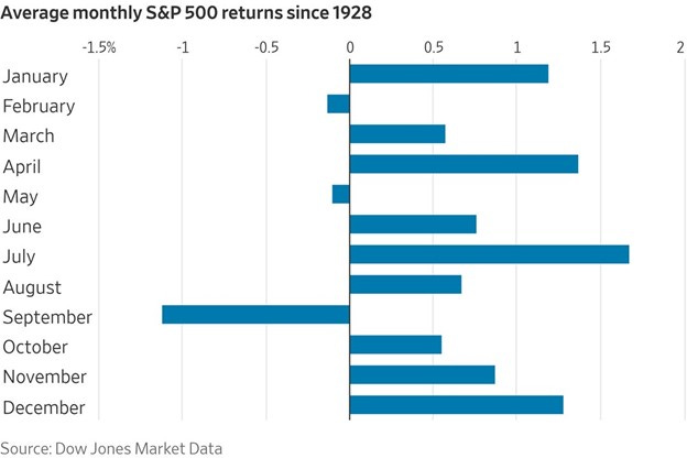
September is certainly living up to its reputation for poor stock market performance. While the first few weeks of the month delivers a higher trend historically, things tend to fall apart later in the month and into early October.
And when you look at the averages, there’s no hiding the fact that the month is the worst of the year for the S&P 500 going back to 1928. It’s also the only month to experience outright declines greater than 1% on average as you can see in the chart below.
Who knows the reason for September’s poor returns historically. This time around, it’s the threat of higher interest rates on both the short- and long-end that’s pressuring stocks. While there are signs that the labor market is finally starting to cool as I discussed last week, data elsewhere is undoubtedly strong.
Jobless claims remain near historical lows, the ISM services report is showing solid expansion and came in at the highest level in six months, while the Atlanta Fed’s Q3 GDP estimate shows growth at 5.6% annualized.
Not only is stronger growth pressuring the Fed to keep hiking rates and hold them higher for longer, but longer-dated yields are on the verge of breaking out as well. You can see the 10-year Treasury yield in the chart below is trading just below the 52-week high at 4.34%.
But despite September’s setback in the stock market to this point, bigger picture signals still suggest that the bull market remains the prevailing force in charge.
Here are a few metrics supporting the bull trend, and also how to use them for early warning that the bull market is in jeopardy.
Breadth and High Yield Still Bullish
When it comes to following the trend, stock market breadth can provide key insights about the health of the market’s direction and if participation is deteriorating.
So despite the S&P 500’s 1% drop in September (and 3% pullback off July’s highs), breadth suggests that the bigger picture bull market is still intact.
There are many ways to track breadth, and I frequently focus on shorter-term measures to monitor the trend and help inform trade selection and position sizing.
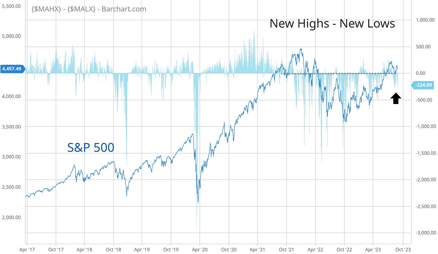
But for a higher level analysis, I simply follow 52-week net new highs, which takes new highs and subtracts new lows across the major exchanges. The chart below shows net new highs going back to the start of 2017 to highlight a couple key points.
While I find it concerning that there hasn’t been persistence in net new highs this year with the S&P 500 up 16% year-to-date, the recent drop back into negative territory isn’t triggering alarm bells just yet.
You can see in the chart that most normal pullbacks in an uptrend keep net new lows contained at -500. It’s below that level that tips a more significant trend change lower, and we’re not seeing those levels just yet.
And despite the pressure to stock prices coming from interest rates, there’s another corner of the bond market signaling calm. The extra compensation that high yield investors demand over a safe asset like a U.S. Treasury bond is called a spread, and that spread moves higher or lower based on the perception of being paid back in full from lower quality companies.
The chart below shows spreads (blue line) going back to the late 1990s compared to the stock market (red line). During the last several major bear markets, spreads are widening well before the more significant stock drawdowns occur. Spreads are currently near the low end of the historic range, where rising spreads would be a warning on the outlook.
Spreads are very sensitive to changes in the economic outlook, and widen when high yield investors grow nervous and narrow when the outlook is positive. Widening spreads also tend to lead more significant moves lower in the stock market as you can see in the chart above.
So I also track the relative performance of certain high yield categories. The chart below shows a ratio of “CCC” and below rated bonds to “BB” rated ones. In other words, how are the lowest rated junk bonds holding up with a rising line showing relative outperformance. That line has been rising in 2023, which is another positive signal on the outlook.
I believe bullish breadth and narrow spreads remain supportive of the bull market message, and will also provide early warning if the primary trend is in danger of changing.
Now What…
As for the final sign that the bull market is intact, simply follow the trend. An uptrend is marked by a series of higher highs and higher lows…exactly what we’ve had on the S&P 500 since bottoming in October as you can see in the chart below.
If there’s one potential warning sign about a change in trend, it’s the lower high made at the end of August. A follow-up move below 4360 could signal more downside ahead to possibly test the 4200 breakout level.
I’m simply highlighting how to stay objective by breaking down price and planning potential scenarios using trend analysis.
But despite the recent pullback, certain industry chart setups are playing out to the upside. I discussed here how the sheer weight of growth stocks could pull the major indexes like the S&P 500 lower and mask relative strength elsewhere.
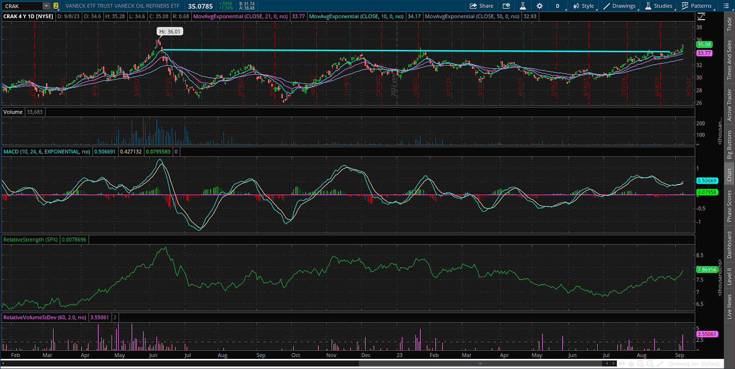
I showed you here just two weeks ago that several energy and commodity sector exchange traded funds (ETFs) were setting up to breakout, and we’ve seen good follow through on the chart patterns since then.
That includes the CRAK ETF of oil refining companies, which just over the last two trading sessions is breaking out over the $34 level on increasing volume.
As you would expect, many individual refining stocks are in the process of breaking out or setting up. That includes CVI, which is turning up to the $40 resistance level.
That’s all for this week. Widely followed consumer and producer inflation reports are due this week with the August CPI and PPI releases. While you should expect plenty of volatility around those reports, don’t lose sight of developments with market breadth and high yield spreads to know if there’s real danger ahead.
I hope you’ve enjoyed The Market Mosaic, and please share this report with your family, friends, coworkers…or anyone that would benefit from an objective look at the stock market.
And make sure you never miss an edition by subscribing here:
For updated charts, market analysis, and other trade ideas, give me a follow on Twitter: @mosaicassetco
And if you have any questions or feedback, feel free to shoot me an email at mosaicassetco@gmail.com
Disclaimer: these are not recommendations and just my thoughts and opinions…do your own due diligence! I may hold a position in the securities mentioned in this report.


