The Market Mosaic 8.11.24
Volmageddon 2.0: Has the stock market found a bottom?
Welcome back to The Market Mosaic, where I gauge the stock market’s next move by looking at macro, technicals, and market internals. I’ll also highlight trade ideas using this analysis.
If you find this content helpful please hit that “like” button, share this post, and become a subscriber if you haven’t already done so!
And be sure to check out Mosaic Chart Alerts. It’s a midweek update covering chart setups among long and short trade ideas in the stock market, along with levels I’m watching.
Now for this week’s issue…
Following concerns over a hard landing for the economy, volatility soared to its third highest level in history.
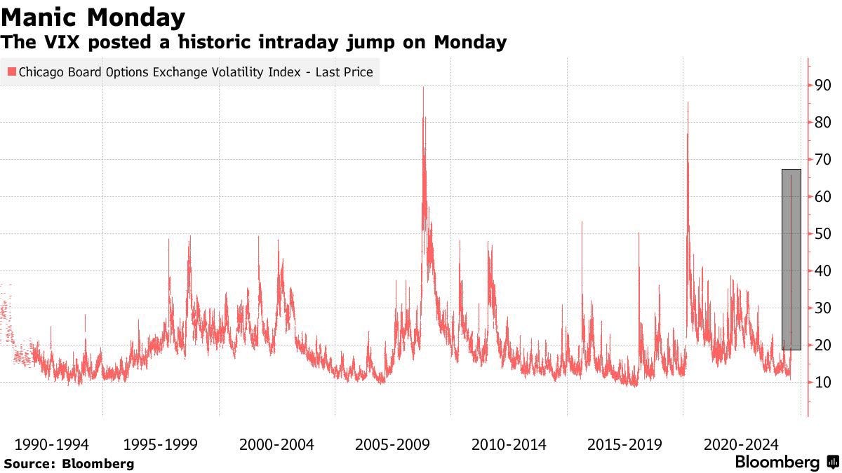
After a 172% surge in the CBOE Volatility Index (VIX) on August 5, VIX reached an intraday high of 66. VIX has only been higher during 2008’s financial crisis and the pandemic-driven lockdown of the global economy in 2020 as you can see in the chart below.
This time around, the concern is that the Federal Reserve is making yet another policy error by keeping short-term interest rates too high for too long. After the Fed refused to budge on interest rates at their July meeting, growing signs of economic weakness are emerging with a rising unemployment rate and reports of weak output from the manufacturing sector.
Panicked investors are pushing short-dated yields sharply lower, signaling they expect the Fed to start cutting rates aggressively. Yields on shorter-dated Treasury securities are falling so quickly that the yield curve is moving out of inversion for the first time since 2022 (chart below).
The chart shows the spread between the 10- and 2-year Treasury yield, with the 2-year recently falling back below the 10-year. Other “un-inversions” over the past 20 years came just ahead of recessions, which are shown with the shaded areas on the chart.
But spikes in volatility have also historically delivered strong forward returns for the S&P 500. The table below shows the largest three-day increases in the VIX since 1990, along with forward returns for the S&P 500. Among the 20 largest three-day gains in the VIX, the S&P 500 has been higher one year later in 19 instances with an average gain of 18%.

So the key question for investors now centers on the catalyst for the selloff in the S&P 500 and jump in the VIX. Are recent developments a sign of worse things to come for the economy and stock market, or is a buying opportunity at hand?
Here’s why I believe the jump in volatility comes down to underlying structural and technical positioning in the capital markets, and the evidence suggesting the economic outlook remains intact.
S&P 500’s Volmageddon 2.0
Given the current weight of the evidence, I believe last week’s spike in volatility is more structural and reflects positioning unwinds versus markets pricing a hard landing for the economy.
In last week’s Mosaic Vision Market Update, I explained how a sudden spike in volatility following an extended period of calm can deliver quick waterfall declines. That’s because institutional strategies like risk parity and volatility-targeting rush to reduce their equity exposure at the same time (please see my explanation here on how this works).
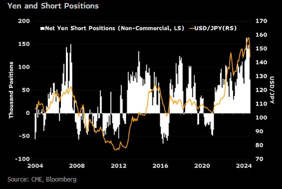
That’s also coinciding with the unwind of the Japanese yen carry trade, which is adding further selling pressure to equities. The carry trade is where investors borrow cheap funds denominated in Japanese yen, then sell yen and covert to another currency to invest in higher yielding assets or stocks.
Tracking short yen positioning (bars in the chart below) is one way to gauge the size of the carry trade, with short positions recently the highest in at least 20 years.
But when the Bank of Japan recently raised interest rates for just the second time in 17 years, that’s causing an unwind of the carry trade and selling of risk-assets to pay back yen-denominated loans.
While historic precedents for such a move in VIX is a cause for concern, the “volatility of volatility” has seen similar jumps in non-recessionary environments. Going back 10 years, the volatility of VIX (VVIX) has increased to similar levels in 2015 and 2018’s “Volmageddon” meltdown as you can see in the chart below.
During those instances, the selloff in the stock market and corresponding jump in VIX followed extended periods of calm as well (2013/2014 and 2016/2017), with the economy avoiding recession and the stock market ultimately resolving higher.
And if the spike in volatility and selloff in the stock market reflects economic concerns on the horizon, then cyclical sectors should be breaking down. But instead, key sectors leveraged to the economy are seeing shallow retracements or bouncing off important levels.
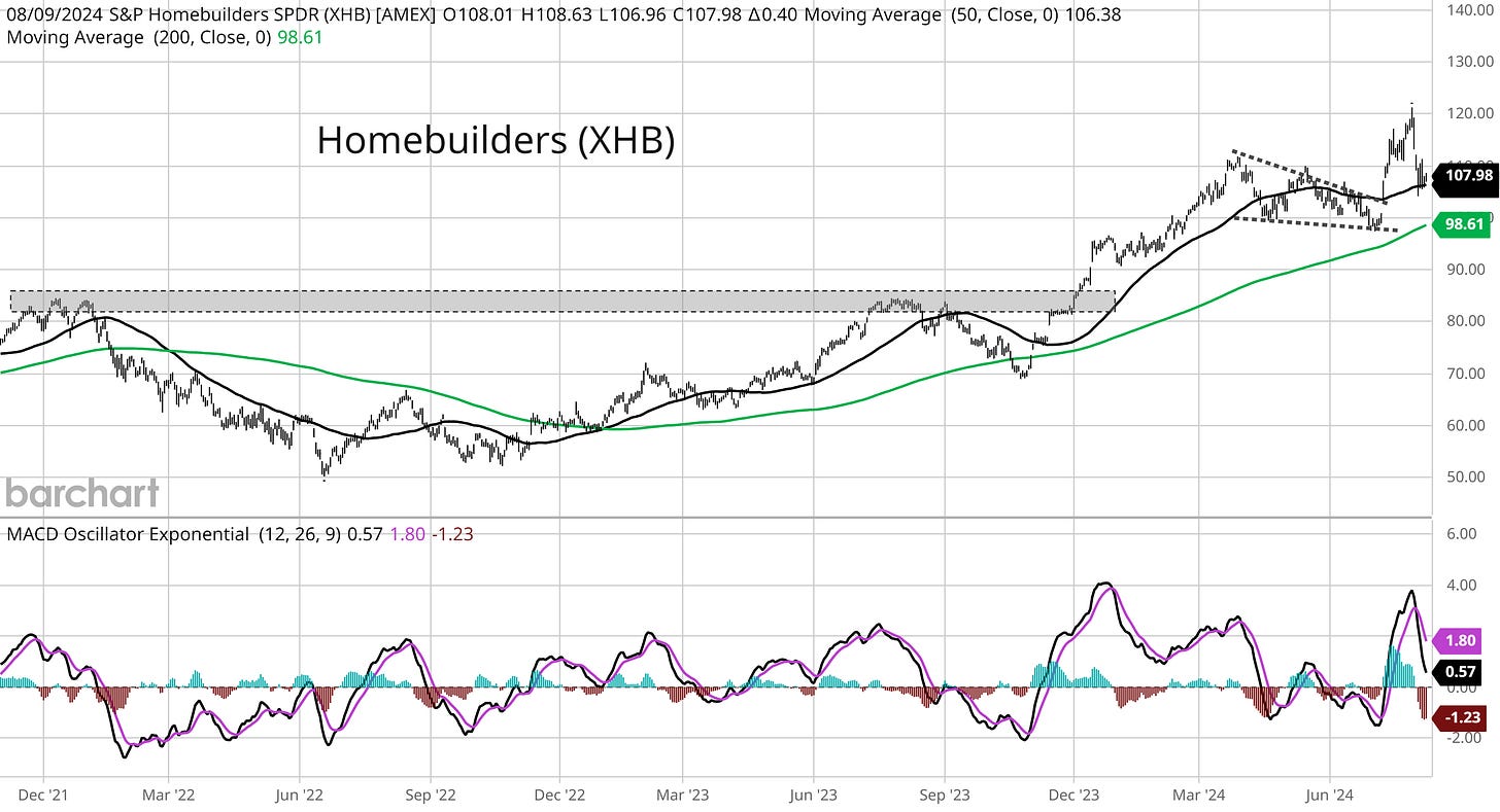
That includes small-caps and banks stocks that I posted about in last week’s reports. I’m also watching the recent action in housing stocks. The chart below shows the XHB homebuilder exchange-traded fund (ETF) going back three years.
You can see the larger XHB breakout to new all-time highs over the shaded area. Price then consolidated with a falling wedge (dashed trendlines), with XHB breaking out from that pattern in July. XHB is now pulling back to test the 50-day moving average (MA - black line), while the MACD is resetting at the zero line.
Since breaking out in late 2023, the uptrend marked by a series of higher highs and higher lows remains intact. A reversal of the uptrend in cyclical sectors like homebuilders would signal concerns over the economic outlook, but that’s not the case just yet.
At this point, I believe the surge in volatility last week is reflecting an unwind of equity positions stemming from vol-targeting strategies with added pressure from the yen carry trade. Additional confirmation from the uptrend in cyclical sectors shows the recessionary scenario is not the likely outcome (yet).
Now What…
Conditions are in place to see a rally unfold over the near-term. That includes oversold breadth across multiple time frames and a jump in bearish investor sentiment.
In last week’s Market Mosaic, I mentioned being on the lookout for oversold breadth conditions with the percent of stocks across the market trading above their 20-day MA. I specifically noted the 20% threshold being a key level to monitor, along with the MACD applied to the indicator.
You can see in the chart below that the percent trading above their 20-day dropped to 17% last week (arrow), along with the MACD in the bottom panel (circled area) reaching levels suggesting momentum is extended to the downside.
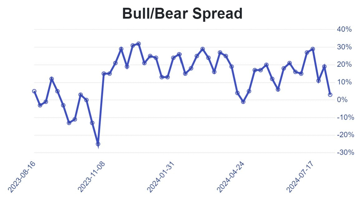
There are also growing signs of bearishness among investors. CNN’s Fear & Greed Index remains in “extreme fear” territory. The AAII survey of retail investors also showed the percent bearish at the highest level since November, with the bull/bear spread falling from elevated levels (chart below).

It’s also worth examining how the S&P 500 evolved during past periods of VIX spikes in non-recessionary environments. The chart below shows how the price action in the S&P 500 played out in 2018.
After the initial selloff that led to the spike in VIX and VVIX in early 2108, the S&P 500 rallied over a two month stretch before coming back to test the lows. The S&P 500 did something similar in 2015 as well, with the index retesting the lows from the initial selloff about a month later.
Given those precedents, I would not be surprised to see the S&P 500 come back to test the lows from last week. But at this point, I also believe the market will find its footing and that the S&P 500 will recover to new all-time highs.
That means I’m still focusing on position trading from the long side. The nice thing about the larger degree pullback in the S&P 500 is that finding stocks showing relative strength becomes easier.
If the stock market recovers, I believe the true leaders will be stocks breaking out to new highs as the major indexes are in the early stages of recovering. With that in mind, I’m looking at several new trade ideas for adding to Mosaic Chart Alerts.
That includes On Holding (ONON). The company’s earnings are expected to grow 161% this year, while quarterly sales growth over the past four quarters is averaging 44%. The stock recently broke above a nearly year-long consolidation pattern over the $35 level. As the stock back tested that level, it’s creating a new basing pattern with resistance at $44. A breakout over that level could test the post-IPO highs near $55.
That’s all for this week. The future path of monetary policy will remain in the spotlight this week with updated consumer and producer inflation reports. Along with July’s CPI and PPI reports, retail sales and housing starts will be watched closely. But I will be monitoring how volatility markets evolve, and if stocks can start recovering from oversold conditions and increasingly bearish investor sentiment.
I hope you’ve enjoyed The Market Mosaic, and please share this report with your family, friends, coworkers…or anyone that would benefit from an objective look at the stock market.
And make sure you never miss an edition by subscribing here:
For updated charts, market analysis, and other trade ideas, give me a follow on X: @mosaicassetco
And if you have any questions or feedback, feel free to shoot me an email at mosaicassetco@gmail.com
Disclaimer: these are not recommendations and just my thoughts and opinions…do your own due diligence! I may hold a position in the securities mentioned in this report.


