The Market Mosaic 7.21.24
Sector evidence of boom or bust ahead.
Welcome back to The Market Mosaic, where I gauge the stock market’s next move by looking at macro, technicals, and market internals. I’ll also highlight trade ideas using this analysis.
If you find this content helpful please hit that “like” button, share this post, and become a subscriber if you haven’t already done so!
And be sure to check out Mosaic Chart Alerts. It’s a midweek update covering chart setups among long and short trade ideas in the stock market, along with levels I’m watching.
Now for this week’s issue…
Signs of cooling inflation continue reverberating throughout the capital markets.
Following the first monthly decline in the Consumer Price Index (CPI) since May 2020, markets are quickly repricing the outlook for interest rates and monetary policy. The 2-year Treasury yield tends to lead changes in the short-term fed funds rate as you can see in the chart below.
The 2-year has stayed below fed funds since March 2023, which came ahead of the Fed’s pause on rates last July. Then the 2-year rose back toward the current level of fed funds and hit 5.0% in May. That reflected the uncertain outlook on inflation, and if the Fed would be on hold for longer than expected.
But then the 2-year turned lower and has fallen back down to 4.5%. At the same time, markets are pricing in three 0.25% rate cuts through year end which would put fed funds roughly in line with the 2-year’s current level.
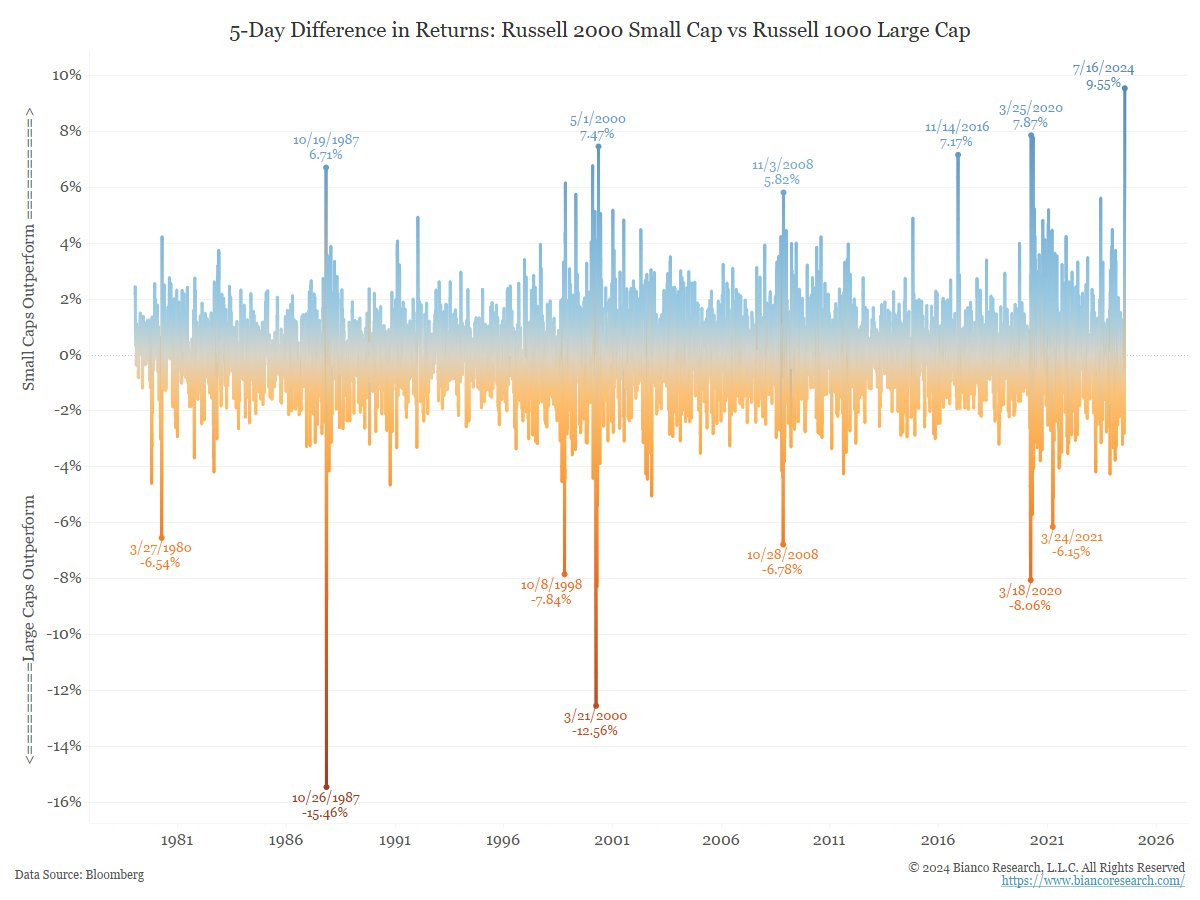
The shifting rate outlook is lighting a fire under the average stock. The Russell 2000 Index of small-caps went on a tear relative to large-caps, and outperformed the large-cap index by the most ever during a recent five-day stretch as you can see below.

Investor optimism is also surging higher, with the AAII retail investor survey showing bulls at 52.7%. That’s near the highest level over the past year. But should investors be cheering the shifting rate outlook and recent changes in market breadth?
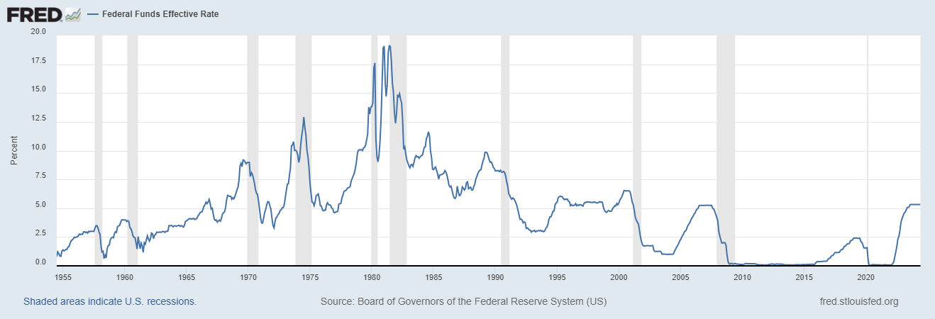
Since monetary policy has a lag effect, the Fed has a history of moving too late. You can see in the chart below that the Fed is cutting rates right around the start of every recession (shaded area) going back to 1954.
Not every cutting cycle produced a recession, but rate cuts preceded some of the worst recessions and bear markets in the S&P 500 like during the early 2000s and 2008.
So while the average stock is surging higher on hopes of easier monetary policy, historical evidence points to caution when the Fed feels the need to cut.
In order to sort through the noise and assess the probabilities of boom or bust ahead, I’m following the price action in a few key sectors.
Cyclical Sectors Leading
Tracking the price action in sectors that are sensitive to economic activity can provide clues and insights about the outlook for the economy and broader stock market.
That’s because stock prices are a discounting mechanism for future business conditions and corporate earnings. And some sectors have a track record of leading key turning points in the broader market.
Last September, I noted how a breakout in housing stocks and other cyclical sectors to new all-time highs meant the S&P 500 would ultimately follow. About four months later, the S&P 500 was making its own move to record levels.
Fast forward to today, and housing stocks are making a big move once again. You can see that in the weekly chart below of the XHB homebuilders exchange-traded fund (ETF). After breaking out to new highs, XHB rallied into April then began pulling back.
The pullback created a falling wedge pattern, while also resetting the MACD at zero while the RSI in the bottom panel held over 40. Those are good levels to see momentum reset in an uptrend. Price broke out of the wedge and XHB made new highs.
I’m also tracking the action in bank stocks. For all the headlines around imploding commercial real estate and unrealized losses sitting on bank balance sheets, you would expect bank stocks to be plunging.
After all, bank shares as tracked by the XLF financials ETF peaked in May 2007 which was about five months ahead of the S&P 500’s top heading into 2008’s financial crisis.
But not only is XLF recently moving out to new highs, an ETF more focused on just banks (XLF also holds insurance and capital markets companies) is showing constructive price action as well.
You can see in the daily chart below that the KBE bank sector ETF is taking out a resistance area around the $48 level that’s held going back to early 2022. The next key test will be the prior highs around $56. If KBE can take out that level to the upside, that’s another vote of confidence on the economic outlook.
I’m also watching the action in transportation stocks. Transports are one area I flagged several weeks ago as flashing a negative divergence. The IYT transportation ETF that tracks the sector started pulling back in March (chart below) after testing the prior highs, diverging negatively from the S&P 500 and Dow Jones Industrial Average.
But if you zoom out to a weekly chart, IYT may be putting in a higher low within the bigger uptrend which can set up a breakout to new all time highs. Similar to homebuilders above, the MACD and RSI saw bullish momentum resets on the recent pullback.
If a recession and bear market were around the corner, I would expect an early warning signal from sectors like housing and banks. Given the recent price action in those sectors, that points to evidence that the economic outlook is holding up against restrictive monetary policy. Further confirmation from a breakout in transportation stocks would add to evidence that the economy is performing well.
Now What…
Last week the S&P 500 fell nearly 2%, which was its worst weekly showing in about three months. But small-caps keep diverging positively with a gain of 1.7% on the week.
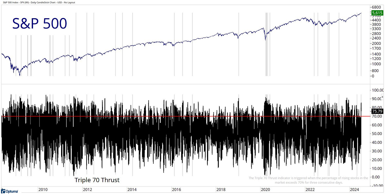
The action in the average stock has been so strong that several breadth thrusts are recently triggering. I covered the recent Whaley thrust indicator here, while another thrust indicator measures if the percent of rising stocks across the market hits 70% for three consecutive days. The chart below shows past thrust triggers (as it did last week), with the S&P 500 higher a year later 95% of the time with an average gain of 21.7%.

New 52-week highs are also surging across exchanges. You can see in the chart below that new highs jumped to their highest level in three years. That’s another bullish sign following a brief period where new lows started outpacing new highs.
While the lag effect of tight monetary policy since 2022 may eventually catch up to the economy, I still think the outlook over the next year or so remains bullish based on sector performance noted above and recent breadth thrusts pointing to strong performance in the average stock.
I also outlined three catalysts last week that can keep driving the economy and bull market over the next 12 to 18 months. Near-term, I’m also tracking the action in cryptocurrencies and related stocks to gauge investor risk sentiment.
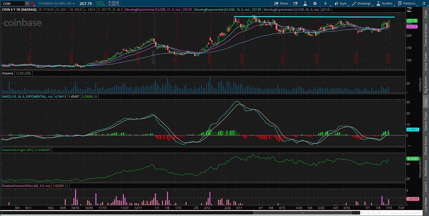
The chart below shows the setup developing for Coinbase (COIN), which has seen several quarters of strong year-over-year sales and earning growth. The stock recently completed one more pullback and is now turning back up toward resistance around $275. While it might help the setup to have one more smaller pullback off a retest of $275, I’m expecting a breakout over that level which could target 2021’s high near $350.
That’s all for this week. The coming week will feature the June PCE inflation report, which is the Fed’s preferred gauge. More evidence of disinflation would help lock in expectations for rate cuts starting with the Fed’s September meeting. This week will also see 31% of the S&P 500 reporting earnings. I’ll also be following the price action in key cyclical sectors and what it means for the economic outlook.
I hope you’ve enjoyed The Market Mosaic, and please share this report with your family, friends, coworkers…or anyone that would benefit from an objective look at the stock market.
And make sure you never miss an edition by subscribing here:
For updated charts, market analysis, and other trade ideas, give me a follow on X: @mosaicassetco
And if you have any questions or feedback, feel free to shoot me an email at mosaicassetco@gmail.com
Disclaimer: these are not recommendations and just my thoughts and opinions…do your own due diligence! I may hold a position in the securities mentioned in this report.


Thank you. I love the breadth indicators. I have been tracking something similar myself. Thanks for the info.