Welcome back to The Market Mosaic, where I gauge the stock market’s next move by looking at macro, technicals, and market internals. I’ll also highlight trade ideas using this analysis.
If you find this content helpful please hit that “like” button, share this post, and become a subscriber to this always free report if you haven’t already done so!
And be sure to check out Mosaic Chart Alerts. It’s a midweek update covering chart setups among long and short trade ideas in the stock market, along with levels I’m watching.
Now for this week’s issue…
Despite initial optimism, Friday's payrolls report couldn't keep the stock market buoyant.
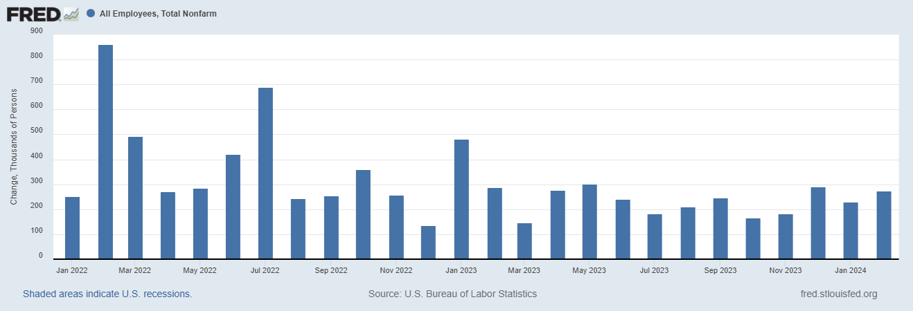
For the month of February, the economy added 275,000 jobs (chart below) which was much higher than economists were projecting. And while the unemployment rate ticked higher to 3.9%, initial jobless claims are also remaining near the low end of the historic range.
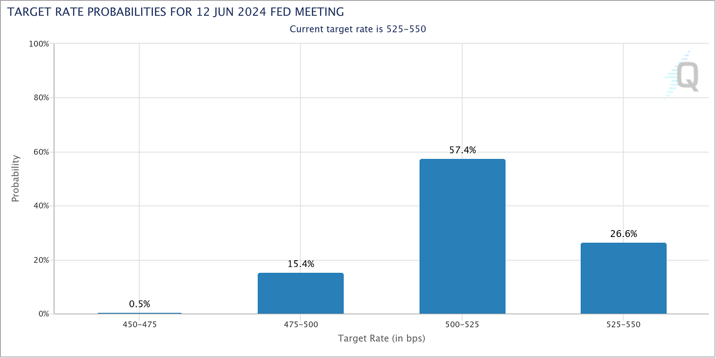
Evidence of a healthy labor market is doing little to shift views on when the Federal Reserve will start cutting interest rates. Market-implied odds continue pointing at a 73% chance that June sees the first rate reduction (chart below).
But as I’ve frequently argued, good news on the economic front should be good news for stocks. That’s because stock prices follow corporate earnings over the long run, so strong economic activity that boosts earnings should be welcome news.
And that’s exactly the reaction from stocks on Friday…at least to start the day. Both the S&P 500 and the Nasdaq Composite jumped to new highs after the report.
But by the end of the trading session, sharp reversals spread across the market and was particularly notable in leading technology stocks like Nvidia (NVDA). The stock had its worst day since last May with a 5.5% decline, resulting in a large bearish engulfing candle (arrow in the chart below).
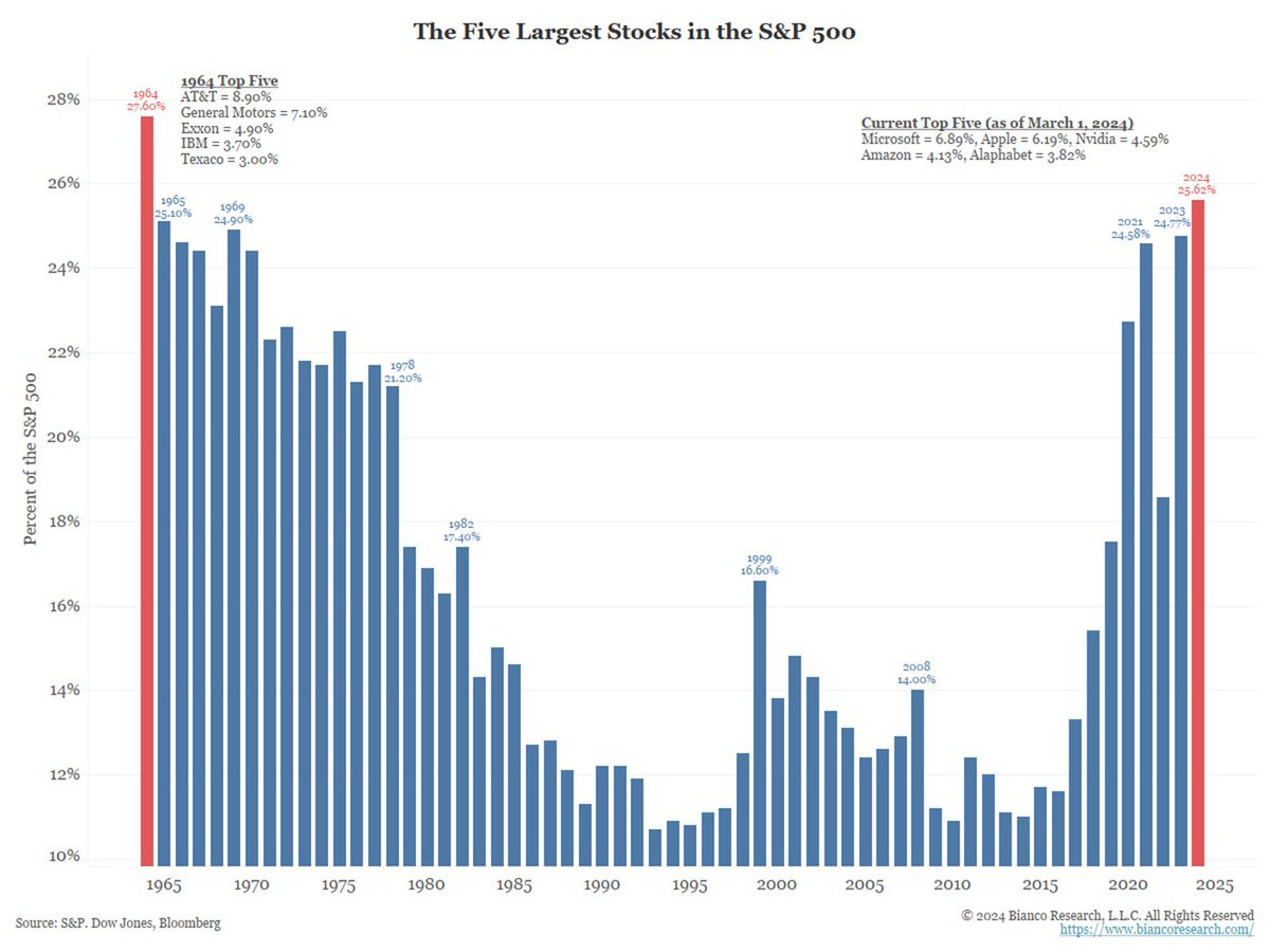
That’s reigniting fears that the rally since October has gone too far too fast, with the rally becoming more concentrated in just a few stocks including NVDA. Just take a look at the chart below, which shows the weighting in the five largest stocks in the S&P 500 by year. Now at 25%, the S&P 500 has the biggest concentration to the top five holdings in 60 years.

But is it really just a few stocks accounting for all of the stock market’s gains? Here’s what participation in the stock market’s trend looks like from a couple different angles, and if it’s time to be concerned.
More Than Just 5 Stocks
Claims that the stock market’s gains are attributable to just a few stocks are a bit misguided. Yes, the weighting methodology for market-cap weighted indexes can result in concentration among relatively few stocks as shown above.
That means a significant portion of returns among cap-weighted indexes can come from just a few positions, especially if those stocks are leading the way higher. We’ve certainly seen that since the start of 2023 with the S&P 500 as you can see below. The 10 largest stocks have accounted for 84% of the S&P’s return since the beginning of 2023.

But that doesn’t mean other stocks aren’t going up or participating in the trend. Recall that one of the most positive features of the rally since late October is the presence of breadth thrusts.
Breadth thrusts are extreme readings in the number of advancing stocks relative to declining ones, or in the volume of rising versus falling stocks. In order to get those types of figures, you need institutional money involved. It signals broad participation across the stock market, and is the kind of buying power that creates sustainable trends. The chart below highlights two extreme readings in the NYSE ratio of advancing stocks to declining ones that have occurred since this overall bull market began in late 2022.
Another positive sign of strong participation in the trend is net new 52-week highs across the stock market, which hit their highest level since late 2021 as you can see in the chart below. That’s a sign it’s more than just a few stocks moving higher. As I noted in this week’s Mosaic Chart Alerts, breakouts and follow through is making this the best trading environment in more than three years.
Expanding new highs points to another encouraging feature of the rally more recently, which is that lagging sectors and style boxes are starting to breakout from bottoming bases. You can see that with exchange-traded funds (ETFs) tracking sectors like retailers and small-caps that I discussed here just last week.
Perhaps we’re entering a period similar to the aftermath of the last great tech bubble during the dot-com era. The S&P saw increasing concentration in top holdings back then, which became a drag on the index in the aftermath of bubble bursting. During the rally from late 2002 to 2007, you can see below that the ETF tracking the Russell 2000 Index of small-cap stocks led the S&P 500 by a large margin.
That suggests a period where the average stock outperforms the cap-weighted indexes. If domestic economic growth stays strong, then it’s not difficult to envision such a scenario emerging this time around.
So yes, a small share of heavily-weighted stocks are accounting for a large chunk of index gains (especially in the S&P 500 and Nasdaq Composite). But those aren’t the only stocks going up. If large tech stocks keep pulling back here while small-caps build on their breakout, it could signal a shift in leadership that followed the last great tech bubble.
Now What…
Big picture, I believe the longer-term forces behind the uptrend are supportive of more gains ahead. But there are also breadth signals pointing to caution over the near-term.
One negative breadth divergence I’m watching is with the percent of stocks trading above their 50-day moving average. Even as the S&P 500 marches to new highs last week, this gauge of stocks in intermediate-term uptrends peaked around 85% at the end of 2023 (arrow) and has stalled around the 50% level (circled area) that you can see below.
At the same time, sentiment is running at levels indicating extreme bullishness across many indicators, like with the AAII survey of retail investors. The chart below shows the ratio of bullish investors relative to both bulls and bears combined, which is running near the highest level in three years that you can see below.
I don’t get too concerned about sentiment at extremes on its own. But when you couple extreme bullishness with breadth divergences, that can mark a near-term turning point in the trend.
I would note that breadth and sentiment are ultimately conditions and not signals. The signal ultimately comes from price. And if a trend reversal is in store, then my stops will automatically increase my cash position.
I am continuing to trade breakout setups that meet my criteria outlined in Mosaic Chart Alerts, like what you’re seeing with Samsara (IOT). The stock was consolidating gains since the start of December after moving over the $30 level. But now a post-earnings jump has delivered the next breakout over resistance around $35 to new highs.
That’s all for this week. Following last week’s jobs data, inflation will be back in the headlines with both the Consumer Price Index and Producer Price Index being released for the month of February. While investors will be fixated on what inflation data means for monetary policy and tech stocks, I’ll be watching the follow through in recent breakouts among sectors like small-caps.
I hope you’ve enjoyed The Market Mosaic, and please share this report with your family, friends, coworkers…or anyone that would benefit from an objective look at the stock market.
And make sure you never miss an edition by subscribing here:
For updated charts, market analysis, and other trade ideas, give me a follow on X: @mosaicassetco
And if you have any questions or feedback, feel free to shoot me an email at mosaicassetco@gmail.com
Disclaimer: these are not recommendations and just my thoughts and opinions…do your own due diligence! I may hold a position in the securities mentioned in this report.


