
The Market Mosaic 2.23.25
The beginning of the bull market's end?

👋Welcome back to The Market Mosaic, where I gauge the stock market’s next move by looking at macro, technicals, and market internals. I’ll also highlight trade ideas using this analysis.
If you find this content helpful please hit that “like” button, share this post, and become a subscriber if you haven’t already done so!
And be sure to check out Mosaic Traders Hub. It’s a members-only platform to alert trade ideas, track a model portfolio of open positions, and further analyze the message coming from the capital markets.
🚨You can start a 7-day free trial to the Hub by clicking here. By starting a trial, you will unlock all market updates and trade alerts reserved exclusively for members.
Now for this week’s issue…
A 700 point drop handed the Dow Jones Industrial Average its worst day of 2025, while the S&P 500 finished with a weekly loss of 1.7%.
It might be tempting to scan the headlines to find a reason for the drop. Weak consumer sentiment and housing data were among factors receiving blame for the sudden weakness in stock prices.
But the reality is that we were already tracking the potential for a pullback due to the combination of weak seasonality colliding with negative breadth divergences.
As I noted in my last report, the last two week’s of February has ranked as the worst two-week stretch for the S&P 500 since 1928. At the same time, the number of stocks trading in short-term uptrends was deteriorating quickly.
I highlighted in Mosaic Chart Alerts (and to Hub members in our chat at the start of the week) that the percentage of stocks across the market trading above their 20-day moving average (MA) was deteriorating since late January.

As shown at the arrow in the chart above, the S&P 500 made a new high on February 19 while the percent of stocks in short-term uptrends stood at just 53%. The jump in volatility is happening alongside growing geopolitical uncertainties and questions around the health of the consumer.
But there’s a chart breakdown in another corner of the market raising red flags and not being discussed anywhere. In the past, its been a timely leading indicator of key market inflection points.
This week, lets unpack several charts that show why uncertainty is surging and what I’m watching that could signal the beginning of the end of this bull market. Recent volatility is also leading to trading opportunities in a group historically sensitive to inflation.
The Chart Report
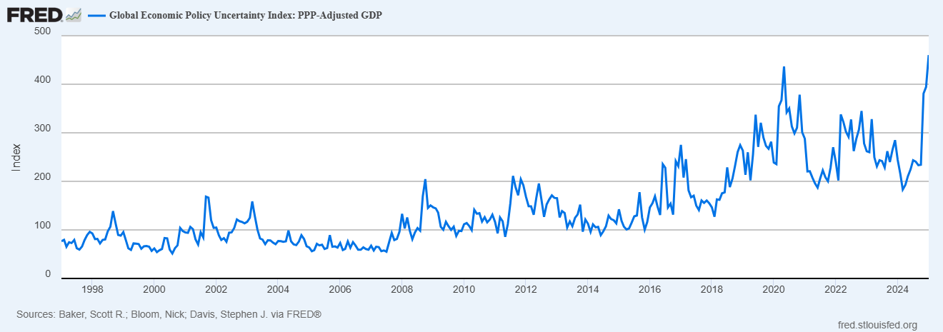
Headline noise is being amplified by a number of developments. Emerging trade wars, quick progress with artificial intelligence, and questions around the outlook for monetary policy are leading to increased uncertainties. In fact, one measure of uncertainty facing investors is at the highest level ever. The Global Economic Policy Uncertainty Index is created by scanning newspaper articles as a proxy for economic uncertainty, and has been shown to correlate with stock price volatility. The Index recently reached its highest level ever, surpassing readings seen during the pandemic.
While the pullback in the S&P 500 still has the index trading above its 50-day moving average, a cyclical sector breaking down is sending a major warning signal about the state of the economy and bull market. That’s with homebuilder stocks, which are breaking down from a head and shoulders topping pattern below. Homebuilders were among the first sectors to move to new highs ahead of the S&P 500 which reflected a positive outlook. If homebuilders peaked and revert to a downtrend of lower highs and lower lows in price, that’s a major warning signal on the outlook for the economy and bull market.

The ominous chart pattern in homebuilders doesn’t mean a recession and market crash is imminent. After all, many homebuilders peaked in 2005 during the last cycle which was two years ahead of the S&P 500 peak in 2007. I’m watching for more evidence of trouble ahead with other cyclical sectors, including high yield bonds. Companies issuing junk bonds are already on shaky financial ground, which makes their bond prices sensitive to the economic outlook. The chart below tracks the iShares iBoxx High Yield Corporate Bond ETF (HYG). You can see that HYG is trading near its high despite the recent stock market volatility.

More signs emerged last week that the recent inflation acceleration isn’t over. A report on manufacturing activity from S&P Global showed the prices paid component jumping to the highest level since the end of 2022, and often leads changes in consumer inflation. At the same time, a consumer sentiment survey by the University of Michigan showed another sharp increase in expected inflation. Consumers expect inflation will hit a 3.5% annual rate over the next five to 10 years, which is the highest level since 1995 (chart below).

Just as inflation levels and expected price levels are picking up, there are growing concerns that the impact of inflation and tariffs will present a significant drag on the economy. That might be showing up in the 10-year Treasury yield, which had risen from 3.62% last September to 4.8% in January. But despite ongoing inflation concerns, the 10-year has fallen back to 4.42% and is now diverging relative to inflation expectations in the chart below. A falling 10-year yield could be reflecting concerns surrounding the growth outlook for the economy.

The potential for a “stagflation” economic environment is a major concern for investors, where slow economic growth is coupled with high levels of inflation. But interestingly, the historical data shows that stagflation isn’t necessarily associated with poor stock market performance. The table below shows the S&P 500’s performance under different economic and inflation regimes. Since 1930, there have been 12 years that featured a slowing economy but rising inflation. The stock market’s real return was positive in 75% of those instances, with an average annual real return of 16.4% in the S&P 500.

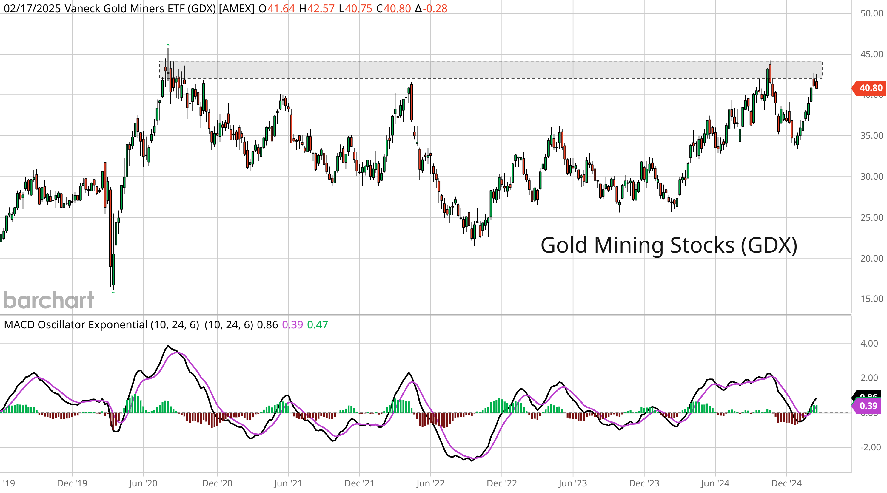
While factors driving expected inflation are clouding the economic outlook, it’s providing a boost to sectors historically correlated to inflation. Gold prices have continued their run to new record highs, and there are signs that miners could soon catch up. As a sector, precious metals and mining is the second best performer during periods of high and rising inflation. That makes the current chart setup in the VanEck Gold Miners ETF (GDX) compelling. The weekly chart below shows GDX recently testing the $43 area that has served as resistance going back to 2020. A breakout would put GDX at the highest level in over a decade.
Heard in the Hub
The Traders Hub features live trade alerts, market update videos, and other educational content for members.
Here’s a quick recap of recent alerts, market updates, and educational posts:
Tracking two key hurdles for the S&P 500.
A new trade to take advantage of surging Chinese stocks.
How VIX seasonality pointed to caution heading into last week.
A catalyst that could become another tailwind for the commodity trade.
You can follow everything we’re trading and tracking by becoming a member of the Traders Hub.
By becoming a member, you will unlock all market updates and trade alerts reserved exclusively for members.
👉You can click here to join now (along with a special offer)!
Trade Idea
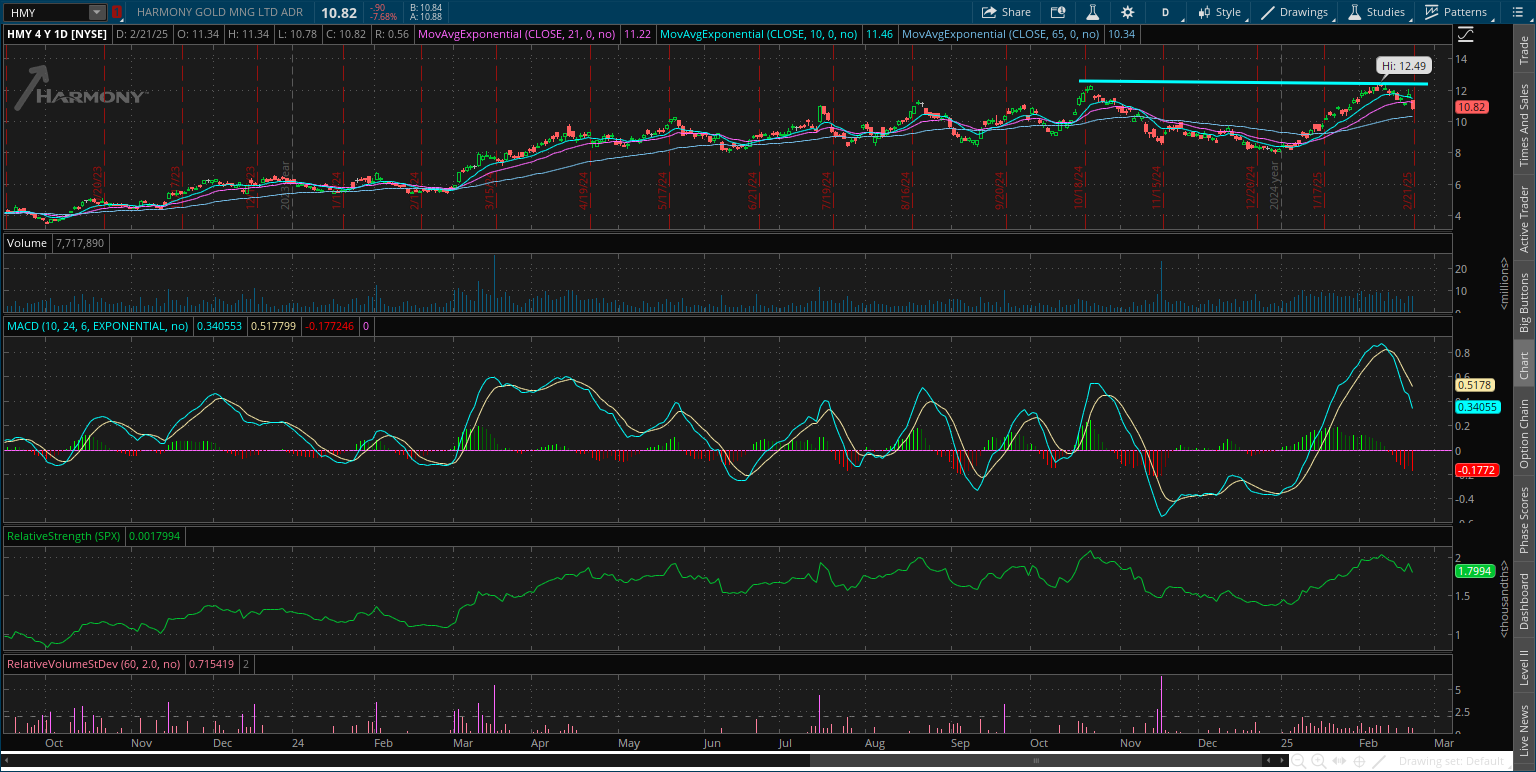
Harmony Gold Mining Company (HMY)
Watching HMY for a breakout setup in a gold miner. The stock peaked just over $12 in October, and recently testing that level again. I’m now watching for a smaller pullback that resets the MACD above zero. Looking for a breakout move over $12.50.
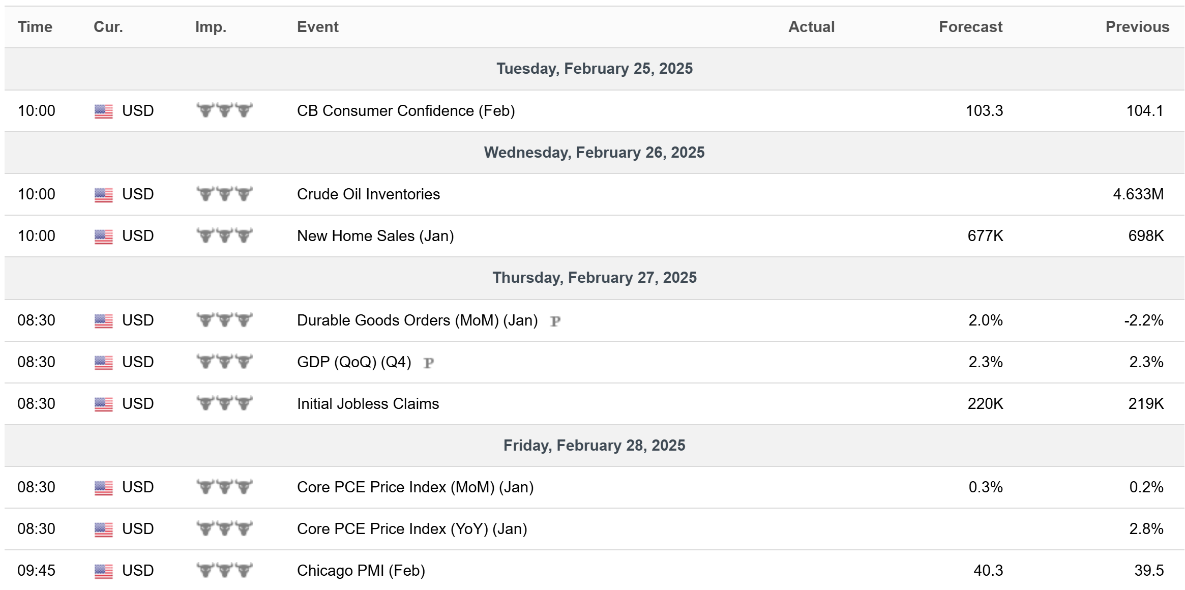
Key Upcoming Data
Economic Reports
Earnings Releases

I hope you’ve enjoyed The Market Mosaic, and please share this report with your family, friends, coworkers…or anyone that would benefit from an objective look at the stock market.
Become a member of the Traders Hub to unlock access to:
✅Model Portfolio
✅Members Only Chat
✅Trade Ideas & Live Alerts
✅Mosaic Vision Market Updates + More
Our model portfolio is built using a “core and explore” approach, including a Stock Trading Portfolio and ETF Investment Portfolio.
Come join us over at the Hub as we seek to capitalize on stocks and ETFs that are breaking out!
And if you have any questions or feedback, feel free to shoot me an email at mosaicassetco@gmail.com
Disclaimer: these are not recommendations and just my thoughts and opinions…do your own due diligence! I may hold a position in the securities mentioned in this report.