
The Market Mosaic 12.22.24
S&P 500: Will capitulation help Santa Claus deliver?

Welcome back to The Market Mosaic, where I gauge the stock market’s next move by looking at macro, technicals, and market internals. I’ll also highlight trade ideas using this analysis.
If you find this content helpful please hit that “like” button, share this post, and become a subscriber if you haven’t already done so!
And be sure to check out Mosaic Traders Hub. It’s a members-only platform to alert trade ideas, track a model portfolio of open positions, and further analyze the message coming from the capital markets.
🚨You can start a 7-day free trial to the Hub by clicking here. By starting a trial, you will unlock all content and reports reserved exclusively for members.
Now for this week’s issue…
Even Federal Reserve Chair Jerome Powell had to admit that the central bank’s inflation forecast has “kind of fallen apart.”
For months, a chorus of Fed officials voiced confidence that inflation would return to the 2% target. But back in July, signs began emerging that the disinflation trend was stalling out.
The core Consumer Price Index (CPI) rose by 3.3% year-over-year in July, and has trended sideways ever since. Other measures like the Fed’s “supercore” metric that looks at core services excluding shelter has averaged 4.3% over the past three months.
So in their last meeting of the year, the Fed reined in expectations for further rate cuts. New projections from officials show just two additional 0.25% rate cuts for all of 2025 that you can see in their Summary of Economic Projections below.

Stocks plunged in response, with the Dow Jones Industrial Average dropping over 1,100 points following the Fed’s announcement. That was the Dow’s 10th straight losing session, which was the worst streak of losses in 50 years.
Volatility markets surged higher, with the CBOE Volatility Index (VIX) jumping 74% in a single day (arrow in the chart below, while the dashed line is the long-term average). That was the third highest close for the VIX this year, and has only been higher during the sharp pullback in stocks into early August.
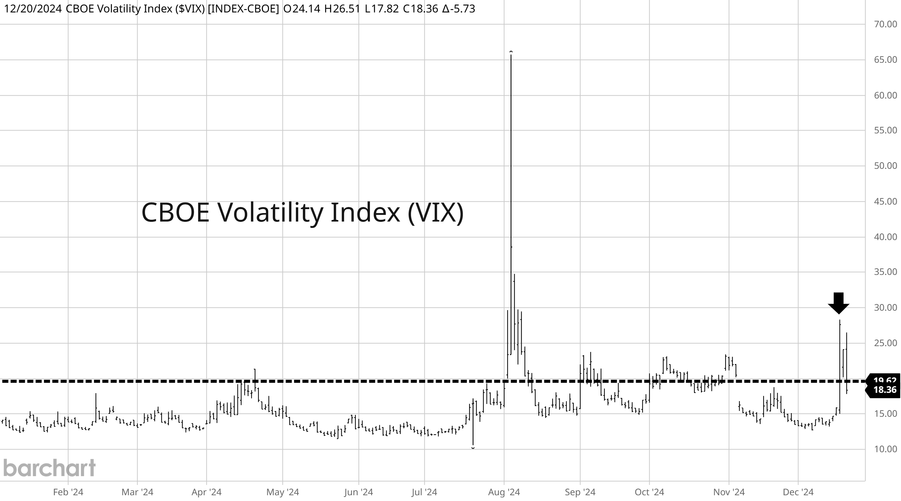
That was the second-largest single day gain in history for the VIX. But just as it looked like a full blown market meltdown was underway, several signs of capitulation began emerging across breadth and sentiment indicators.
Here’s the real reason why stocks sold off, and what I’m watching to see if a recovery can unfold into year-end.
Stocks Showing Signs of Capitulation
I have a hard time believing that the S&P 500’s single-day plunge last week was in response to a shifting rate outlook.
Signs of stalling inflation have been around for months as I’ve covered frequently, with the most recent evidence coming from the core Producer Price Index (PPI) crossing above core CPI. Historically, PPI often leads changes in consumer inflation measures and has been rising for a year now.
Plus the bond market already repriced the rate outlook before the Fed’s latest meeting. Heading into the meeting, the 2-year Treasury yield rose to a level that was just 0.60% below the current fed funds target. That’s about equivalent to the two additional 0.25% rate cuts in the Fed’s 2025 forecast. Even now the 2-year yield is signaling that just one more cut is ahead (chart below). That shows the market had already priced in the Fed’s revised outlook.

Rather, I believe the sharp drop in the S&P 500 reflects the major indexes “catching down” to the average stock. As I’ve shared, we already knew that mid-December features weak seasonality. And right on cue, the S&P went on a historic run of seeing more index constituents declining than advancing.
Culminating with last week’s pullback, there were 13 consecutive days of more stocks falling than gaining even as the S&P itself was holding near the highs. That’s the longest streak since at least 1978 shown in the chart below.

But several signs of capitulation are showing up among the average stock. Some measures of breadth are nearing their most oversold levels seen since this bull market started back in October 2022. That includes the McClellan Oscillator that compares advancing versus declining stocks on the NYSE in the chart below.

Other measures like the percent of stocks across major exchanges trading above their 20-day moving average fell to just 15% last week. That’s the second lowest level this year, and is even more oversold compared to the early August decline.
Another sign of capitulation is coming from the VIX itself. The bottom panel in the chart compares spot VIX prices to futures contracts tied to the VIX. When the line drops below zero, that means spot VIX is moving above futures. The term structure is then inverted, which is often a signal of panic seen around market bottoms.

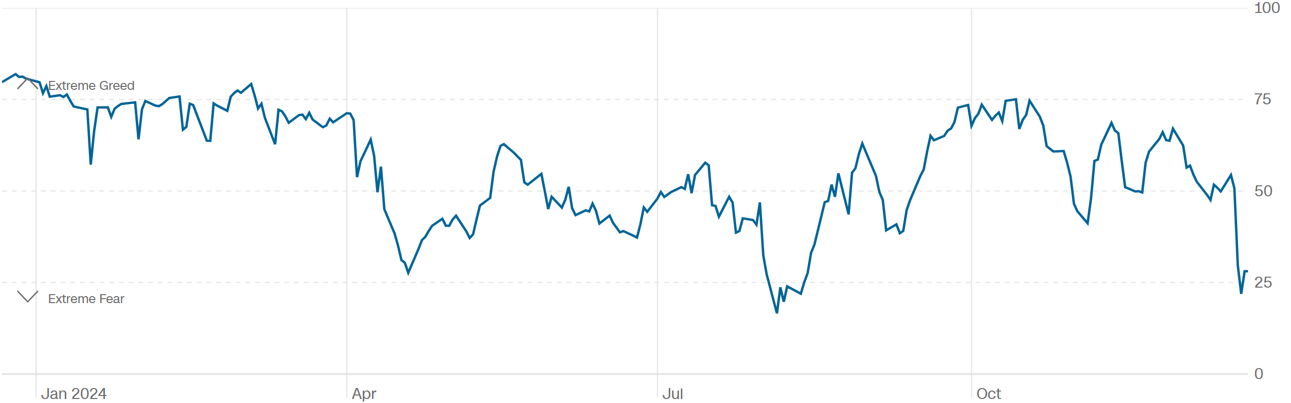
Finally, investor sentiment is seeing the pendulum swing sharply from too much greed to signs that extreme fear is the prevailing emotion. You can see in the chart below that CNN’s Fear & Greed Index dropped into “extreme fear” territory last week after the selloff.
The sharp drop in the S&P 500 and other major indexes simply reflects the pullback that was already underway across the average stock. But the quick drop is triggering historic oversold levels on breadth, while volatility markets are also pointing to capitulation.
Now What…
I continue to maintain that this rate-cutting cycle shares a lot in common with the 1995 cycle. Back then, the Fed began cutting rates as inflation cooled from the peak in CPI seen years earlier. But soon after, the Fed was forced to reconsider as inflation picked back up and the labor market remained strong.
In that episode, the Fed cut rates by only about 1.0%. Yet the stock market went on a massive bull run that culminated in the late 1990s internet bubble. I’m not implying that the S&P 500 is about to embark on a similar run. After all, valuations today are in a much different state.
But this cyclical bull market can continue as long as earnings growth supports further gains. Based on estimates from Goldman Sachs, earnings for the S&P 500 are projected to grow by about 20% over the next two years (blue line in the chart below).

So looking past all the market noise and headlines from the past week, the key question is if the economic outlook remains intact to support earnings growth. And I believe the answer is “yes” based on the lack of concern coming from high yield markets.
Despite the sharp pullback in stocks and surge in the VIX, high yield spreads have barely budged. Spreads reflect the relative cost of low-quality companies to issue debt, and widen when the economic outlook is deteriorating.
If the shifting rate outlook has negative implications for the economy, then I believe high yield spreads will transition to an uptrend. So far, spreads have continued making lower highs and lower lows since mid-2022 shortly before the cyclical bull market in stocks began (chart below).

Overall financial conditions have also stayed at much looser than average levels, which is another factor favoring the bull market heading into next year. That means I’m still favoring trades that should do well in a “risk-on” environment.
And if stocks are going to find a bottom soon following signs of capitulation noted above, then now’s the time. This week starts the Santa Claus rally that runs from the last five trading days of the year and first two of the New Year. Historically, the 7-day period has seen the S&P 500 gain 1.6% on average since 1928.
For new trades, I’m looking for chart setups making a smaller pullback considering last week’s broad weakness. That includes IREN Ltd (IREN). The company’s data center facilities are optimized for Bitcoin mining and artificial intelligence applications.
The stock tested the $16 area back in July, and is making a smaller pullback after testing that level again at the start of December, which is also resetting the MACD at the zero line. I’m watching for a breakout over $16, and will follow-up with a complete trading plan for Hub members.

That’s all for this week. The holiday-shortened week ahead will also be light on any key economic data releases. That means I’ll be closely watching the market action following recent signs of capitulation as the S&P 500 enters a favorable historical period for seasonality.
Happy Holidays!
I hope you’ve enjoyed The Market Mosaic, and please share this report with your family, friends, coworkers…or anyone that would benefit from an objective look at the stock market.
Become a member of the Traders Hub to unlock access to:
✅Model Portfolio
✅Members Only Chat
✅Trade Ideas & Live Alerts
✅Mosaic Vision Market Updates + More
Our model portfolio is built using a “core and explore” approach, including a Stock Trading Portfolio and ETF Investment Portfolio. Come join us over at the Hub as we seek to capitalize on stocks and ETFs that are breaking out!
And if you have any questions or feedback, feel free to shoot me an email at mosaicassetco@gmail.com
Disclaimer: these are not recommendations and just my thoughts and opinions…do your own due diligence! I may hold a position in the securities mentioned in this report.