The Market Mosaic 10.23.22
A peek under the stock market's hood shows short-term opportunity, but long-term caution.
Welcome back to The Market Mosaic, where I gauge the stock market’s next move by looking at trends, market internals, and the mood of the crowd. I’ll also highlight one or two trade ideas using this information.
If you find this content helpful please hit that “like” button, share this post, and become a subscriber to this always free newsletter if you haven’t already done so!
Also, be sure to check out Mosaic Chart Alerts. It’s a midweek update covering my best chart setups among long and short ideas in the stock market, along with specific levels that would trigger a trade.
Now for this week’s issue…
Ever since the latest report on consumer price inflation was released, capital markets have been on a roller coaster ride.
Recall that the consumer price index (CPI) came in higher than expected at 8.2% year-over-year in September. To make matters worse, the core index that strips out volatile food and energy prices gained 0.6% just from the prior month. That’s a sign that inflation is becoming more entrenched.
While the stock market’s daily gyrations in the aftermath of the reports gets most of the attention, the real action has been occurring in the bond market.
The yield on the 10-year Treasury has staged another big move higher ever since CPI came out, and closed at 4.21% last week. Here’s the weekly chart below going back five years to put 2022’s increase into perspective.
Surging interest rates impact stock prices in a number of ways. It makes the return on fixed income investments more attractive, which draws fund flows away from stocks.
Rising rates also weigh on stock valuations due to the way future expected profits are discounted back to today’s value. Higher interest rates translates to a lower present value of future profits.
That combination can impact how stocks are participating the market’s underlying trend, which has implications for forward returns. Here’s what I’m watching and what it says about the outlook.
The Multi-tool of Trend Analysis
Stock market breadth is just a way to measure how many securities are participating in a trend. There are many ways to utilize breadth to assess the stock market’s health, and I want to specifically discuss two methods today. One involves confirming the stock market’s recent move. Simply put, if the S&P 500 is advancing but fewer stocks are going up, that’s a warning sign. Alternatively, if the S&P 500 is falling but fewer stocks are going down, that’s a positive signal.
One way to measure participation is with the cumulative advance/decline line for securities trading on the New York Stock Exchange (NYSE A/D line). This is just a running tally of how many stocks are rising versus falling on a daily basis. It’s like comparing the performance of the average stock to an index like the S&P 500 where you want to see the average stock leading the major indexes higher.
In the chart below, the NYSE’s A/D line (bottom panel) has recently been diverging negatively from the S&P 500 (top panel). While the S&P 500 has been able to hold the June lows, the A/D line made a lower low (red circle on the chart). That illustrates weakness under the hood with the average stock. This same line flashed a warning signal back in January as the stock market peaked and turned lower. I believe this is where rising yields are having an impact, as rate-sensitive sectors and stocks come under pressure.
I also use breadth to spot near-term overbought and oversold conditions. In this regard, the percent of stocks trading above their 20-day moving average is one of my preferred indicators. I’ve included a chart below with this metric (black line) overlaid with the S&P 500 (blue line). Whenever the black line starts to push above 70%, that’s a sign of overbought conditions and to be on the lookout for a reversal lower. A reading under 30% is a sign of becoming oversold, and to watch for a rebound in share prices.
You can also use this metric to spot short-term divergences. For example, it’s a good sign if the S&P 500 is testing a recent low, and the percent above the 20-day is recovering. That’s what unfolded over the last month as this gauge dipped into extremely oversold territory. While the S&P 500 tested its recent low around 3,600, the number of stocks trading above their 20-day average was recovering as you can see with the arrows.
I want to note that I do not use any of these indicators in isolation. Breadth is just one component of my mosaic, which also incorporates trends, investor sentiment, and macro factors impacting stock prices. The intersection of these variables formulates my view on where the broader market could be heading.
Now What…
While I use breadth to help assess the near-term direction of the stock market, the big picture remains the same: we remain stuck in a bear market.
Several data points over the past week solidifies that opinion. I’ve recently showed you here how to use the Conference Board’s Leading Economic Index (LEI) to track the economy, and what it means for stock market returns. An updated LEI report below pushed the index further into negative territory. That’s a recession signal, and is the worst regime for stock market returns.
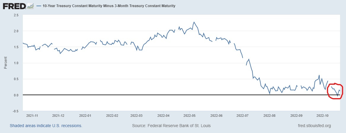
And despite the surging 10-year Treasury yield that I highlighted above, shorter-dated yields have moved higher at an even faster pace. That is keeping yield curves inverted, with my preferred measure briefly inverting last week. That’s with the spread between the 3-month and 10-year Treasury yield, and is yet another recession signal. I explained here why this is my preferred yield curve.
From a breadth standpoint, the lagging NYSE A/D line reflects the bigger picture issues facing the stock market, especially from rising interest rates. But on a short-term tactical basis, there could be more room for a bear market rally based on the percent of stocks trading above their 20-day average.
Keep in mind that epic bear market rallies can come out of nowhere, and there are some industries that are still bucking the trend. You’re seeing that in the energy space, where I’ve recently highlighted several setups.
The action during this past week has been very constructive for the sector, with many stocks breaking out to new 52-week highs. I discussed the pattern forming in TDW in this week’s Mosaic Chart Alerts, which I updated in this post below regarding the pattern:
I’m adding to the list of energy stocks that are setting up, including DVN. It’s developing a similar triangle consolidation like TDW, where price started to break through on Friday along with higher volume.
Meanwhile, the stocks most exposed to rising interest rates are high-growth companies whose net income isn’t expected until well into the future. Those stocks are the most exposed to falling valuations, and we’ve seen that in several names this week.
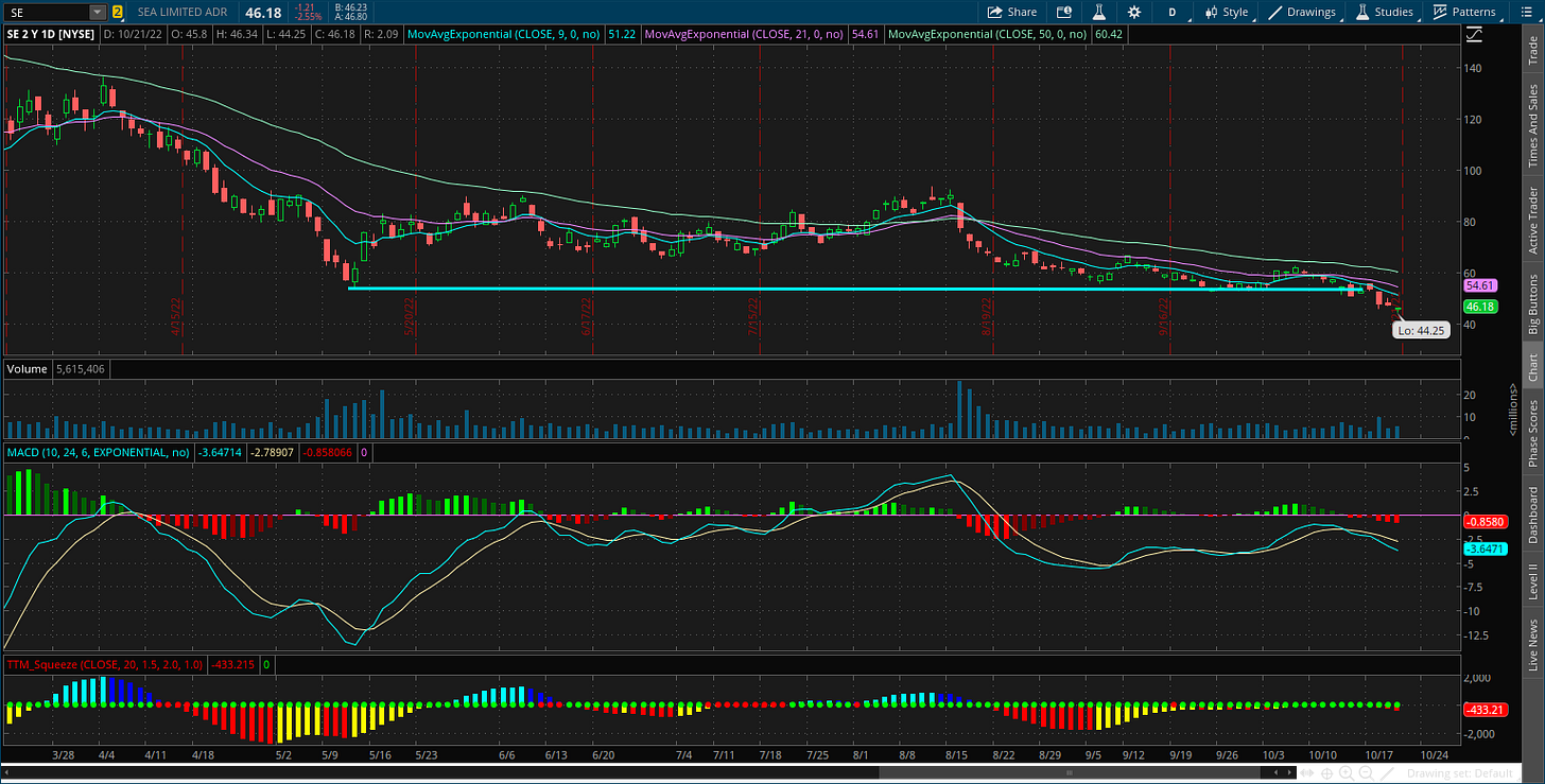
That includes SE, which I highlighted in last week’s update. The stock followed through on this pattern with a break below the $53 level.
I’m also following the short setup in crypto-linked bank SI. I suggested a test of the $55 level in the post below, which gave way in Friday’s trading:
That’s all for this week. The crosscurrent of variables impacting the stock market favors more volatility. Inflation, geopolitics, an energy crisis, earnings season, the Federal Reserve, mid-term elections…the key is to stay objective in your analysis, tactical with your trading decisions, and practice sound risk management with open positions.
I hope you’ve enjoyed this edition of The Market Mosaic, and please share this newsletter with anyone you feel could benefit from an objective look at the stock market.
And make sure you never miss an edition by subscribing here:
For updated charts, market analysis, and other trade ideas, give me a follow on twitter: @mosaicassetco
And if you have any questions or feedback, feel free to shoot me an email at mosaicassetco@gmail.com
Disclaimer: these are not recommendations and just my thoughts and opinions…do your own due diligence! I may hold a position in the securities mentioned in this newsletter.


