The Market Mosaic 9.8.24
The key to understanding stock prices.
Welcome back to The Market Mosaic, where I gauge the stock market’s next move by looking at macro, technicals, and market internals. I’ll also highlight trade ideas using this analysis.
If you find this content helpful please hit that “like” button, share this post, and become a subscriber if you haven’t already done so!
And be sure to check out Mosaic Chart Alerts. It’s a midweek update covering chart setups among long and short trade ideas in the stock market, along with levels I’m watching.
Now for this week’s issue…
Last week featured a roundup of economic reports that’s stoking recession fears and hopes for larger rate cuts.
First up was the ISM Manufacturing report. The series is constructed so that a reading above 50 indicates expansion while under 50 points to contracting activity in the manufacturing sector of the economy.
While the August figure of 47.2 was better than expected, it was the fifth consecutive month of readings under the 50 level (chart below). The new orders component, which is a leading indicator of activity, dropped to 44.6 from 47.4 in the prior month.

That was followed by a couple reports on the labor market showing weakening trends. The Job Openings and Labor Turnover survey (JOLTS) showed available positions dropping to the lowest level in over three years.
Then came the August payrolls report. While there were 142,000 jobs created during the month, that missed estimates for 161,000. The three month average for job creation fell to 116,000, which is the lowest level since 2020 (chart below).
The hope among investors is that larger interest rate cuts could be coming into view given the Fed is already voicing concerns on their full employment mandate. At one point following the payrolls report, market-implied odds favored a larger 0.50% rate cut at the Fed’s upcoming September meeting.
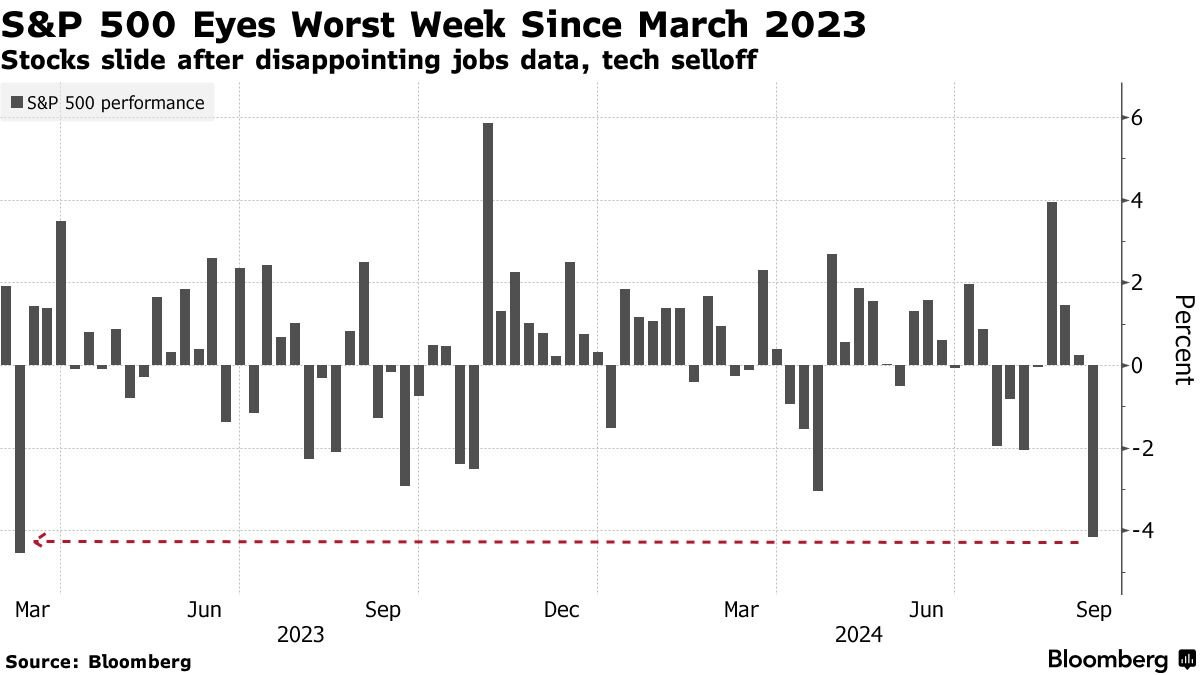
But the stock market ultimately came to the realization that bad news for the economy is also bad for stocks. The S&P 500 finished the week over 4% lower, and suffered its worst weekly loss since March 2023 as you can see below.
While investors may cheer weaker data that could accelerate the pace of rate cuts from the Fed, that optimism is misplaced as demonstrated by last week’s stock market reaction.
Here’s why bad news for the economy is bad for stocks, and how incoming data will influence the ultimate path of the S&P 500.
Stock Prices Are Driven by Earnings
It’s easy to get lost in the daily gyrations of the stock market and random headlines trying to explain performance. That’s why it’s important to step back and remember that stock prices follow earnings over the long-term.
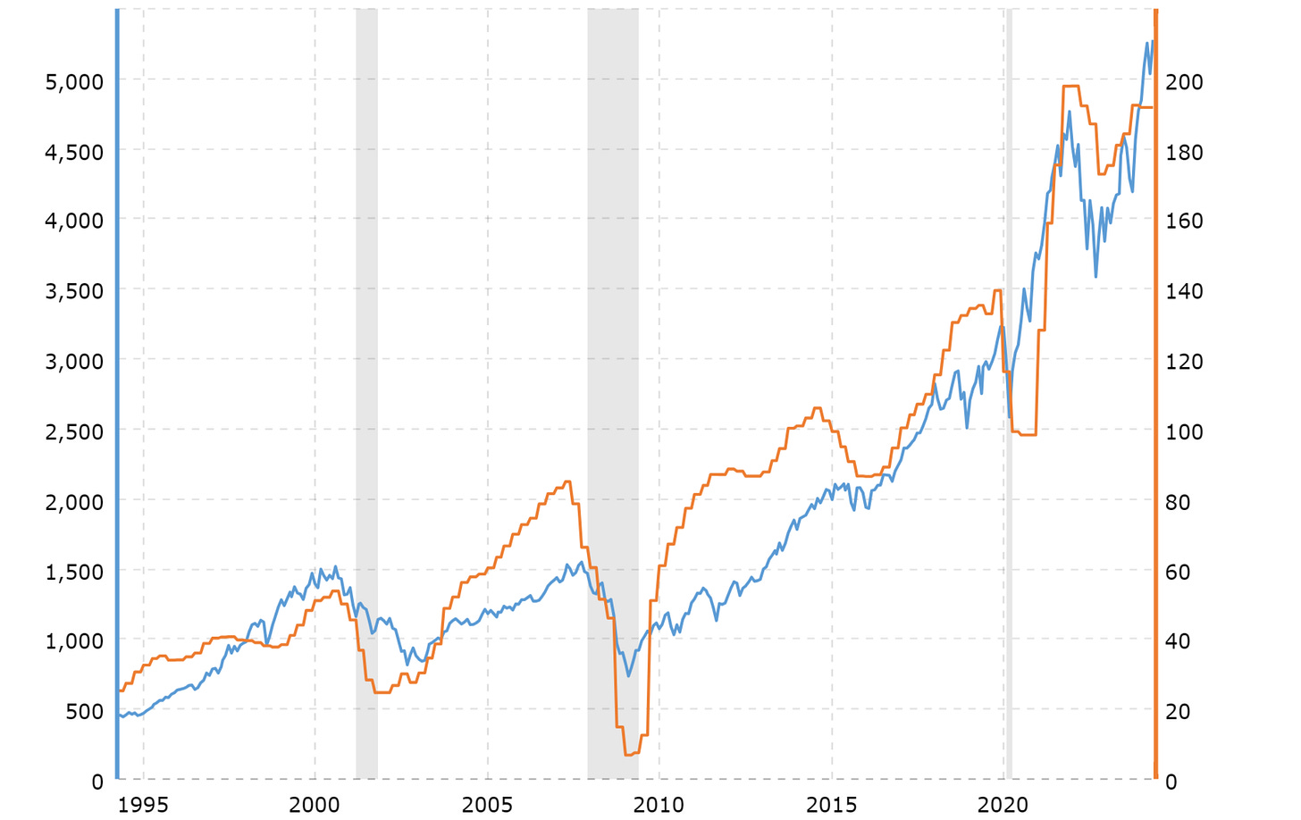
Just look at the chart below that overlays the S&P 500 Index (blue line) along with earnings per share (orange line) going back 30 years. For all time spent dissecting the S&P’s every move, figuring out the earnings picture is the key to understanding the longer-term path for stocks.
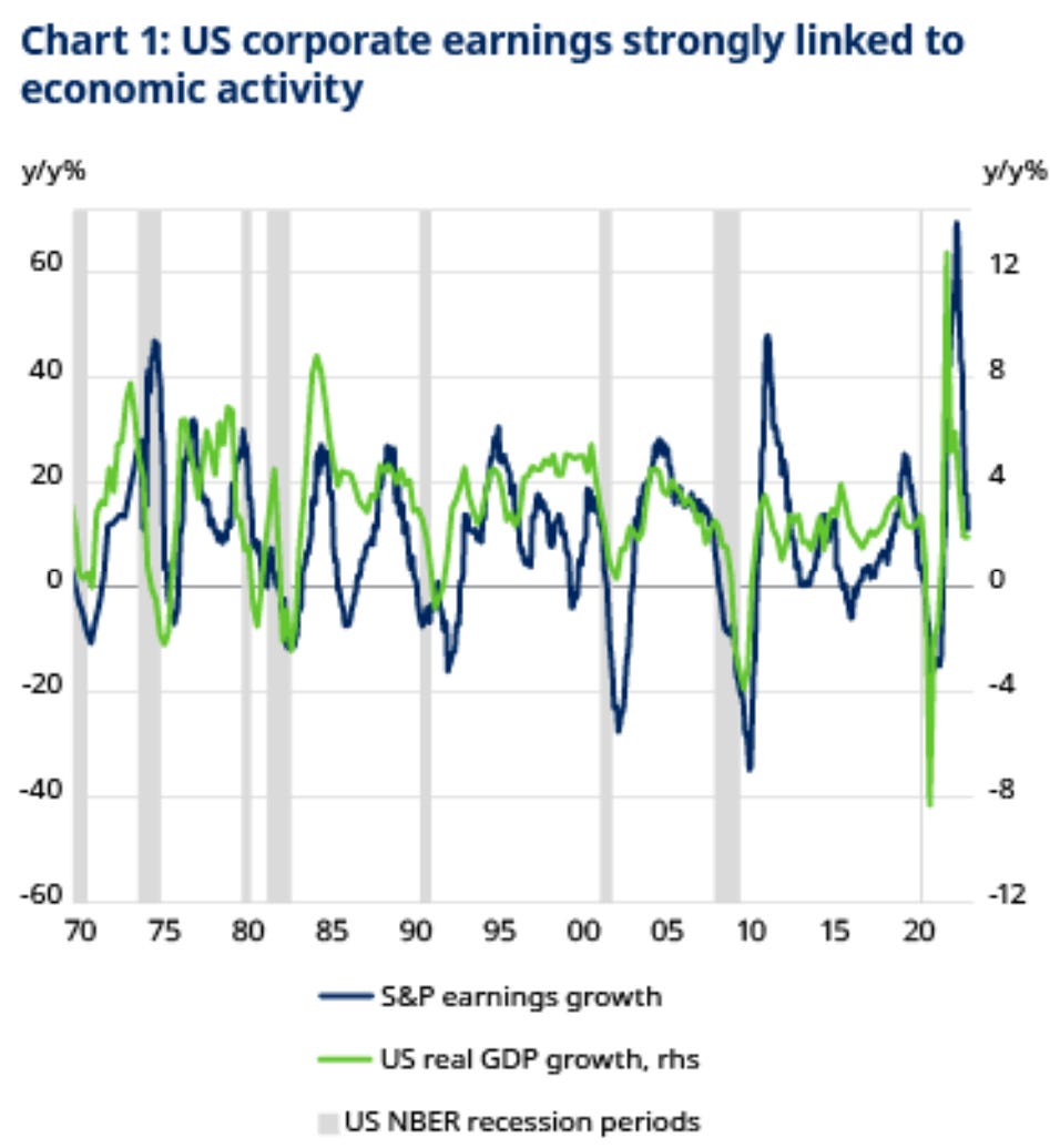
And the outlook for earnings growth is linked to economic activity. The chart below plots the year-over-year change in the S&P 500’s earnings per share (blue line) against real GDP growth (green line) going back to 1970.
You can see the correlation between corporate earnings and economic growth, with changes in economic growth also having a lead effect on corporate earnings (which shouldn’t come as a surprise).
With that in mind, history also shows that recessionary periods take a larger bite out of corporate earnings compared to non-recessionary drawdowns in earnings per share.
The chart below shows the drawdowns in S&P 500 earnings going back to 1950. While the average of all observations is a decline of 8.8%, that figure jumps to 17.2% during declines driven by recession.
That’s exactly why some of the worst bear markets in history are seen around recessionary periods, which is driven by the outsized negative impact to corporate profits.
It’s also worth keeping in mind recessions that are driven by monetary policy as interest rate cuts come into view. The Fed has a reputation for keeping interest rates too restrictive for too long, which ultimately tips the economy into recession.
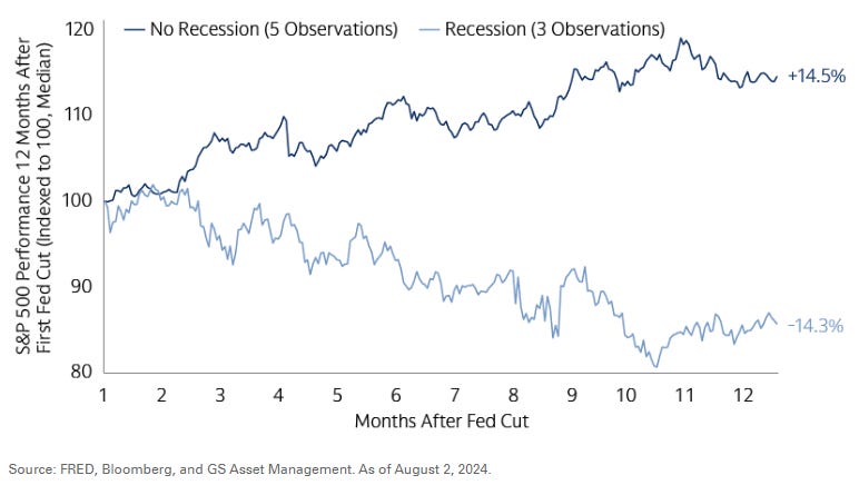
That explains why the path of the S&P 500 once the Fed starts cutting rates is dependent on recessionary outcomes. The chart below plots the S&P 500 following the Fed’s first rate cut.
The dark blue line shows the path over the next 12 months when the economy avoid recession, while the light blue line is how the S&P performs on average when a recession hits.
Given the impact of recessions on earnings and the earnings impact on stock prices, investors do not want to see further weakening in key economic data. For now, it’s worth interpreting the message coming from cyclical sectors, and remembering that the S&P 500 is entering a weak seasonal stretch.
Now What…
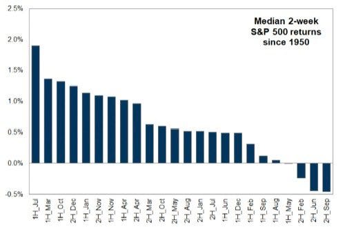
With the S&P 500 down over 4% to start the month, weak September seasonality is arriving just on time. Although negative returns for September are loaded in the second half (chart below), the month’s historical reputation as the worst for the calendar year is holding up.
As stocks pullback, it’s also worth keeping in mind the spike in volatility back in early August and sharp drop in the S&P 500. As I outlined here, past vol spikes of similar magnitude saw the S&P 500 go back and test the lows after retracing a portion of the selloff.
But at this point, I am not concerned with the economic picture and recent pullback in stocks. Stock prices are a discounting mechanism for future earnings, and cyclical sectors that are most sensitive to the economy should be transitioning to downtrends if the outlook is deteriorating.
If anything, there are bullish setups developing in sectors extremely sensitive to economic activity. Like with homebuilder stocks where bullish pennant patterns are proliferating as you can see with M/I Homes (MHO) in the chart below.
After breaking out over $140, the stock back tested that level as support. At the same time, the stock is developing a bullish pennant pattern where a breakout could target a price move of similar magnitude entering the pattern. The MACD and RSI in the bottom panels are also pointing to strong momentum (above zero and 50 respectively on the pullbacks in the pattern).
High yield bonds are also sending a positive signal on the economic outlook. High yield issuers are forced to issue debt at higher interest rates due to their already shaky financial condition.
That could be due to elevated debt levels or low levels of operating income relative to interest payments. Regardless, high yield bonds are extremely sensitive to the economic outlook due to the pressure from a deteriorating economy on their finances.
Yet high yield bonds are holding up extremely well as evidenced by the HYG exchanged-traded fund as you can see in the chart below. After pulling back alongside stocks in early August, HYG quickly recovered to new highs and is not reflecting the recent weakness in the S&P 500 following economic reports.
For my own trading plan, I’m looking for stocks showing relative strength as the S&P 500 pulls back. Companies with strong growth fundamentals that are trading in constructive basing patterns are great breakout candidates for when the indexes find their footing.
That includes another homebuilder with Century Communities (CCS) in the chart below. After moving over the $90 level, the stock is consolidating gains and back testing that level as support. The MACD is resetting at the zero line with the relative strength line holds near the high. I’m watching for a move over $108.
That’s all for this week. Following a week heavy with reports on the labor market, investor focus will shift back to price stability with both the Consumer Price Index and Producer Price Index seeing updates for the month of August this week. But I’ll be watching the action in cyclical sectors for signals on the health of the overall economy.
I hope you’ve enjoyed The Market Mosaic, and please share this report with your family, friends, coworkers…or anyone that would benefit from an objective look at the stock market.
And make sure you never miss an edition by subscribing here:
For updated charts, market analysis, and other trade ideas, give me a follow on X: @mosaicassetco
And if you have any questions or feedback, feel free to shoot me an email at mosaicassetco@gmail.com
Disclaimer: these are not recommendations and just my thoughts and opinions…do your own due diligence! I may hold a position in the securities mentioned in this report.





Very nicely written, logical, and supported with excellent charts. Nice job & thanks