The Market Mosaic 9.24.23
S&P 500: how much further will stocks drop?
Welcome back to The Market Mosaic, where I gauge the stock market’s next move by looking at macro, technicals, and market internals. I’ll also highlight trade ideas using this analysis.
If you find this content helpful please hit that “like” button, share this post, and become a subscriber to this always free report if you haven’t already done so!
And be sure to check out Mosaic Chart Alerts. It’s a midweek update covering chart setups among long and short trade ideas in the stock market, along with levels I’m watching.
Now for this week’s issue…
Following the Federal Reserve’s latest rate-setting meeting, chairman Jerome Powell commented that “the worst thing we can do is fail to restore price stability.”
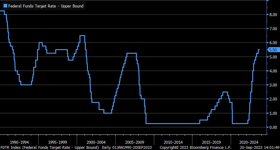
While the central bank left rates unchanged at the meeting, it stressed that rates will remain higher for longer to bring inflation down. That was the message expected by investors, with the fed funds rate staying at the highest level in over 20 years as you can see below.
But even though the Fed’s “hawkish pause” was widely anticipated, it didn’t stop the S&P 500 from turning in its worst week in six months. The index shed nearly 3% last week, breaking down from a triangle pattern that I highlighted in last week’s Market Mosaic and updated below:
While the Fed delivered no big surprises, perhaps it was the movement in other rate markets that caught stocks off guard. In the wake of the meeting, rates on both the short- and long-end jumped higher. The 10-year Treasury yield made a strong breakout over the 4.34% level (chart below), while the 2-year yield jumped to the highest level since 2006.
While damage to the S&P 500’s trend is cause for concern, I’m following other developments underneath the stock market’s hood that could signal a larger drawdown ahead. Here are the metrics I’m watching, and the levels that would suggest more downside is in store.
Animal Spirits Go Missing
Pullbacks in the stock market are a normal course of business. The S&P 500 has averaged three pullbacks of 5% every year since 1950, and so far in 2023 this most recent drawdown marks our second 5% decline.
But monitoring breadth deterioration and investor risk sentiment can provide evidence that a typical pullback could become a larger drawdown. To that end, there are a few concerning signs that are emerging this past week.
The first is with the percent of stocks trading above their 50-day moving average (MA) across the stock market. You can see in the chart below that this metric deteriorated sharply since the July peak. But there are two ways to look at this chart at the moment.
The bearish interpretation is that participation in the market’s trend also fell sharply on the rally attempt into September (circled area). In the past, such divergences have preceded larger drawdowns. But the bullish view is that the figure is reaching a very significant oversold level, similar to March when the percent above their 50-day touched 20%. After that, the S&P rose 19% into late July.
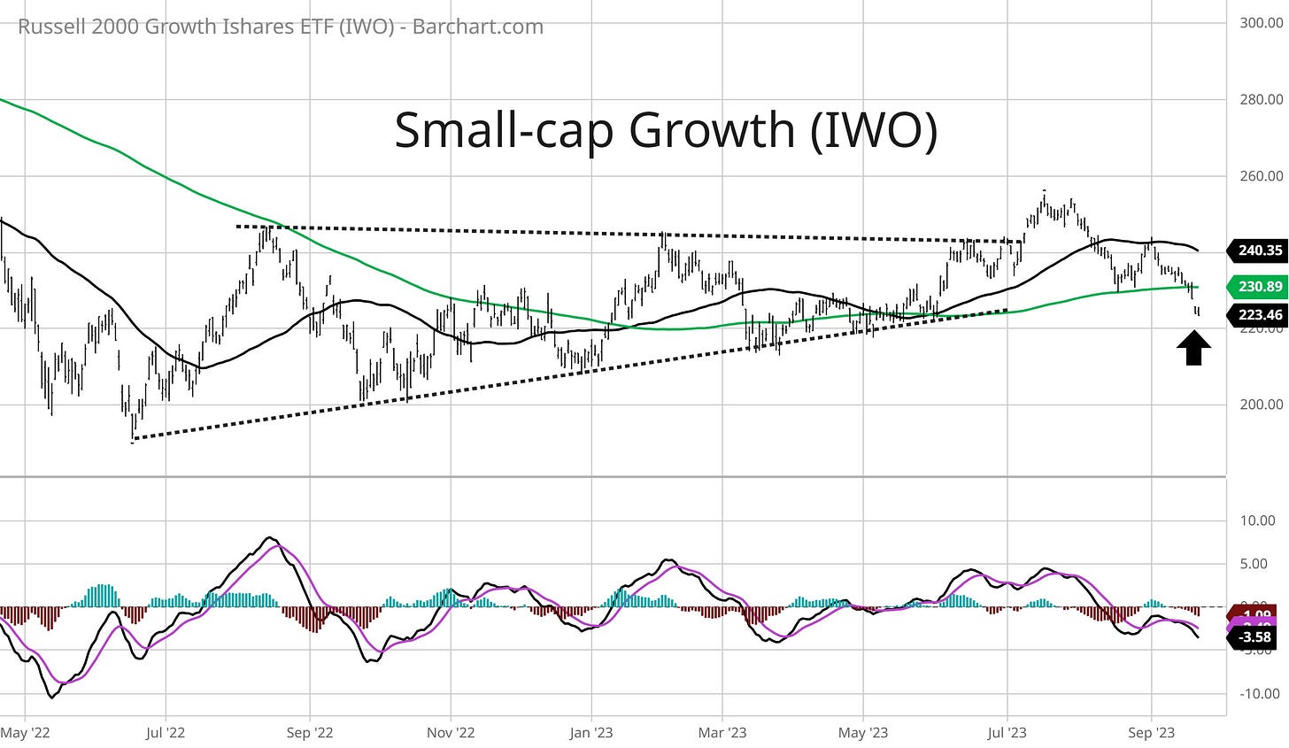
Another concerning development last week was price action in the more speculative corners of the market, like with small-cap growth. The IWO small-cap growth ETF is now slicing through the 200-day MA (green line) after failing on its breakout attempt from an ascending triangle pattern (dashed lines) in the chart below.
Perhaps it’s no surprise that speculative growth would suffer a larger drawdown here. These types of companies expect the bulk of their earnings far in the future, making their valuations more susceptible to rising interest rates. But if the stock market’s animal spirits are alive and well, then we need to see relative strength come back into this corner of the market.
Finally, I’ve frequently discussed the importance of monitoring the stock market’s net new highs/lows ever since S&P started pulling back. That’s because the level of net new lows could tip a larger drawdown should we see a meaningful expansion.
Up until this past week, net new lows stayed contained as the S&P 500 pulled back since late July. But you can see in the chart below that net new lows have expanded toward the key -500 level that I’ve discussed in recent weeks.
Based on the weight of the evidence, underlying breadth is deteriorating while price action in the more speculative corners of the market is breaking down. But at the same time, key longer-term oversold levels are being hit and one important segment of the bond market is still signaling calm.
Now What…
This difficult stretch shouldn’t come as a surprise. Over the past 20 years, the S&P 500 has a tendency to pullback from mid-September into early October. We’re also in the middle of the worst rolling 10-day window for S&P returns as you can see in the chart below (h/t to Ryan Detrick).
But the good news is that the calendar starts to get better soon. The S&P 500 finds traction in early October, then proceeds to start the best six month stretch for returns. The chart below shows the S&P 500’s calendar tendency for the past 20 years.
And if the drop in the stock market was reflecting a broader concern over the economy (and ultimately the earnings picture), I would expect to see confirmation in the high yield bond segment. But instead of junk spreads widening, spreads are staying contained even against the rising rate environment as you can see in the chart below.
Right now I’m still in a heavy cash position as breakouts are currently hard to locate. The weakness in the average stock noted above means that most setups are still trading in consolidation ranges. But as I’ve highlighted with setups in Mosaic Chart Alerts, there are still pockets of relative strength to be found.
That especially remains the case in the commodity and energy space. With the rally in oil prices since late June, energy-linked stocks are still setting up breakouts. Right now you’re seeing that with companies operating seaborne oil tankers like FRO. The stock is breaking out over the $17.75 area late last week as you can see below.
That’s all for this week. Next week’s economic calendar features housing data and the PCE inflation report for August. But if more downside returns for the stock market, I’m keeping an eye on net new lows and if junk bonds start reflecting broader concern for the economy.
I hope you’ve enjoyed The Market Mosaic, and please share this report with your family, friends, coworkers…or anyone that would benefit from an objective look at the stock market.
And make sure you never miss an edition by subscribing here:
For updated charts, market analysis, and other trade ideas, give me a follow on Twitter: @mosaicassetco
And if you have any questions or feedback, feel free to shoot me an email at mosaicassetco@gmail.com
Disclaimer: these are not recommendations and just my thoughts and opinions…do your own due diligence! I may hold a position in the securities mentioned in this report.


