
The Market Mosaic: 8.7.22
Stocks have a data dependency.

Welcome back to The Market Mosaic, where I gauge the stock market’s next move by looking at trends, market internals, and the mood of the crowd. I’ll also highlight one or two trade ideas I’m tracking using this information.
And if you find this content helpful, hit that “like” button (you know, the one that looks like a heart). Because I heart you too…
Please share this post and become a subscriber to this always free newsletter if you haven’t already done so!
Also, be sure to check out Mosaic Chart Alerts. It’s a midweek update covering my best chart setups among long and short ideas in the stock market, along with specific levels that would trigger a trade.
Now for this week’s issue…
On Friday, it was reported that 528,000 new jobs were created in the month of July…more than double what economists were expecting! The unemployment rate dropped to 3.5%, while wages also grew 5.2% compared to last year’s level.
And here’s what S&P 500 stock index futures did immediately after the news broke:

Wait, what?
Yes, we’re in that environment where good news for the economy is bad news for the stock market. That’s because investors are still trying to decipher Fed Chair Powell’s recent dovish pivot, especially as several Fed officials tried to walk back his comments this past week.
Like when San Francisco Fed President Mary Daly said “if we just see inflation roaring ahead undauntedly, the labor market showing no signs of slowing, then we'll be in a different position where a 75-basis-point increase might be more appropriate…”
In other words, the Fed is moving into a data dependency mode. So just like on Friday, investors are going to pore over every economic release to divine clues about how quickly the Fed will raise rates and taper the $8.8 trillion balance sheet.
Here’s what I can tell you about all of this: trying to trade off economic and news headlines is a path to ruin! That’s why I focus on my process of evaluating trends, participation, and the mood of the crowd.
But I still put stock (no pun intended) in certain economic indicators to help guide my directional bias. Here’s a couple empirically tested economic factors that can help you tune out the noise and make better trading decisions.
Depend on This Data
I learned a long time ago not to trade on economic and news headlines. Even if you told me in advance Friday’s jobs figure, I don’t know if I would’ve got the market reaction correct (stocks ultimately recovered after that initial plunge!).
And most data points are lagging indicators, reflecting what’s already happened versus what lays ahead. But that’s not to say I completely dismiss economic reports. Instead, through experience and testing I’ve come to rely on a shortlist of indicators that historically demonstrate predictive power for future stock market returns. Here’s a couple that I utilize.
The Big Picture: Jobless Claims/Commodities Ratio
In the Federal Reserve Reform Act of 1977, Congress tasked the Fed with their dual mandate of maximum employment and price stability. As most economists will tell you, and put forth in the Philips Curve, there’s a tradeoff in achieving that mandate. Too much focus on boosting employment risks high inflation. Too much focus on stamping out inflation will damage the economy and labor market. As a result, Fed officials must find an equilibrium that runs not too hot or cold on either mandate.
So that’s why I focus on both elements of the Fed’s dual mandate to determine where the imbalance exists and what that could mean for monetary policy and ultimately stocks. A look at commodity prices reveals inflationary pressures, while initial jobless claims provides a high frequency and real-time gauge of the labor market. A ratio of these data series tells you a lot about the state of the Fed’s dual mandate.
The chart below is a z-score of that ratio, which is just a way to measure how far the ratio is straying from its average reading. I use this to evaluate the really big picture, and pay most attention to extreme high or low data points to anticipate Fed pivots. There’s some variability around the pandemic, but this ratio is still indicating a major imbalance that’s skewed toward high inflation and a strong labor market.

The Federal Reserve is a major driver of liquidity, and liquidity is the lifeblood of asset prices. Right now, this ratio is clearly signaling that the Fed isn’t finished tightening, and is a big reason why I believe we’re still stuck in a bear market.
Getting Tactical: PMI New Orders Minus Inventories
Aside from the big picture, I’m also interested in metrics that can provide insight about the stock market’s directional trend over the intermediate-term. As a position trader, that’s my typical horizon for holding a stock.
A long time ago, I researched how to use the underlying components of a purchasing managers’ index (PMI) to spot changes in economic activity. These PMI’s are surveys of companies operating in the manufacturing and services sector of the economy, and are used to track expansion or contraction in those sectors.
There’s also details within those reports, like trends in employment and pricing pressures. I’m specifically interested in tracking the spread between new orders and inventories. A high level of new orders coupled with low levels of inventories (indicating a need to restock shelves) is bullish for economic activity and thus corporate profits.
Right now, we’re seeing the exact opposite of that. In the manufacturing report from the Institute for Supply Management (ISM), new orders have dropped quickly while inventories are sitting at high levels. That translates to less production as orders slow and firm’s work off excess inventories.
Here’s a chart from @3F_Research on twitter that tracks how the S&P 500 has performed over time when the ISM new orders to inventories spread is wide or narrow. The difference in returns is incredible!

Now What…
The economic reports I discussed above supplement my core process of evaluating the stock market through trend, underlying breadth, and sentiment of investors. Big picture, I still have a bearish lean looking ahead. But as I discussed last week, you can see some pretty epic rallies in the midst of a bear and I won’t ignore trading opportunities if my buy criteria are met.
We’ve seen good follow thru with prior positions highlighted here or in Mosaic Chart Alerts with ENPH and GPC. I’ve also noted how DY and EVH were starting to move out of their chart pattern, and there are still several great setups that I’m monitoring.
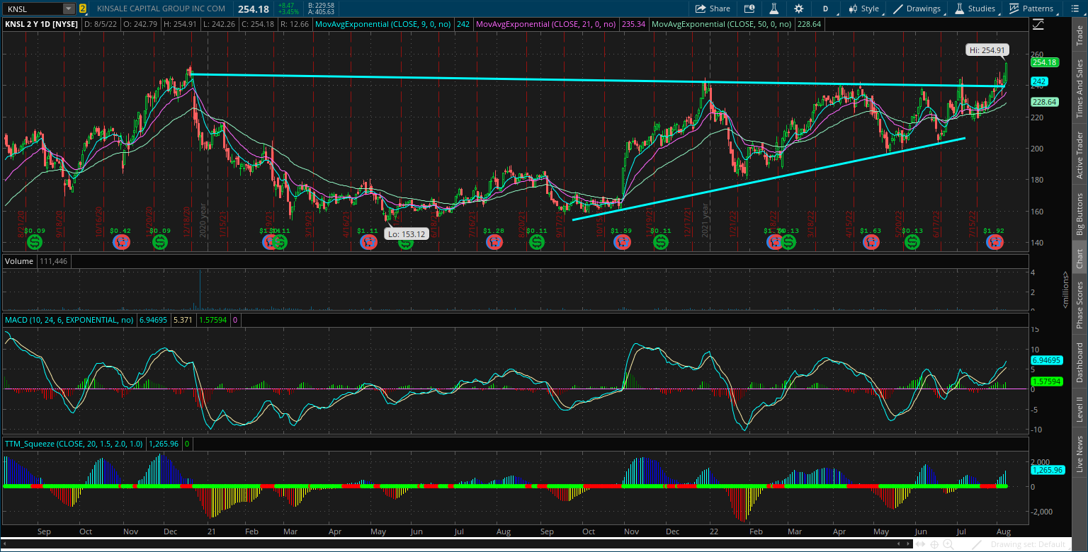
One of my favorite setups is still with KNSL that I highlighted last week. The stock is moving out of its short-term basing pattern, so now I’m watching for a breakout over the prior high at $252.
I’m also putting HII on my watchlist. Here’s the weekly chart, where we’ve seen the stock breakout from a symmetrical triangle pattern. Next I want to see a close above the $230 level, which could open the door for HII to trade back toward the prior high at $280.

I don’t have any new short setups to highlight this week, but I do want to conclude with a chart of the S&P 500 and what I’m watching ahead. We’ve had a strong rally since mid-June, but the stock market is getting extended on several measures. The S&P is 5% above its 50-day moving average (black line), while the MACD is hitting levels that suggests mean-reversion is in store. I would look for a retest of the 50-day moving average, and how market internals are evolving should that occur.

In my base case scenario, a test of the 50-day moving average would reset other momentum indicators like the MACD and RSI. Then look for a continuation of the bear market rally that takes the S&P 500 back to the 200-day moving average (green line). We had several tests of the 200-day moving average during the dot-com bear, and I can’t think of a better way to fool most investors that the worst is over!
That’s all for this week. I’m staying nimble and flexible in this market. If the stock market looks weak on a test of the 50-day, then I would expect to start seeing breakdowns from bear flag patterns. If this is a pause in the uptrend, then I would expect recent long trades to hold support at their breakout level. Plan your trade and trade your plan as they say, and follow the price action above all else!
I hope you’ve enjoyed this edition of The Market Mosaic, and please share this newsletter with anyone you feel could benefit from an objective look at the stock market.
Make sure you never miss an edition by subscribing here.
For updated charts, market analysis, and other trade ideas, give me a follow on twitter: @mosaicassetco
And if you have any questions or feedback, feel free to shoot me an email at mosaicassetco@gmail.com
Disclaimer: these are not recommendations and just my thoughts and opinions…do your own due diligence! I may hold a position in the securities mentioned in this newsletter.