The Market Mosaic 8.4.24
S&P 500: Capitulation or more downside ahead?
Welcome back to The Market Mosaic, where I gauge the stock market’s next move by looking at macro, technicals, and market internals. I’ll also highlight trade ideas using this analysis.
If you find this content helpful please hit that “like” button, share this post, and become a subscriber if you haven’t already done so!
And be sure to check out Mosaic Chart Alerts. It’s a midweek update covering chart setups among long and short trade ideas in the stock market, along with levels I’m watching.
Now for this week’s issue…
Investors initially cheered signs that the Federal Reserve is serious about cutting rates starting in September.
But then recession fears and the unwinding of a popular trade sent the S&P 500 to its third weekly loss and pushed the Nasdaq into correction territory with a 10% decline from the July 10 peak.
Last week’s rate-setting meeting by the Fed and comments from Fed Chair Jerome Powell showed the central bank is becoming attentive to the economic risks by keeping interest rates too high for too long. Although the Fed kept rates at their current level, Powell specifically nodded to recent weakening in labor market indicators.
But then reality set in that the Fed has a history of policy errors by not adjusting the level of interest rates soon enough. That followed a dismal report on the U.S. manufacturing sector and rising unemployment.
The ISM Manufacturing gauge looks at activity in the manufacturing sector of the economy. The series is constructed so that a reading above 50 indicates expansion while below 50 points to contracting activity. The headline figure fell to 46.8, which is the lowest level in eight months as you can see below.

Then came the payrolls report for the month of July. While payrolls gained 114,000 in July, the figure badly missed expectations for 175,000. But the biggest concern was the ongoing rise in the unemployment rate.
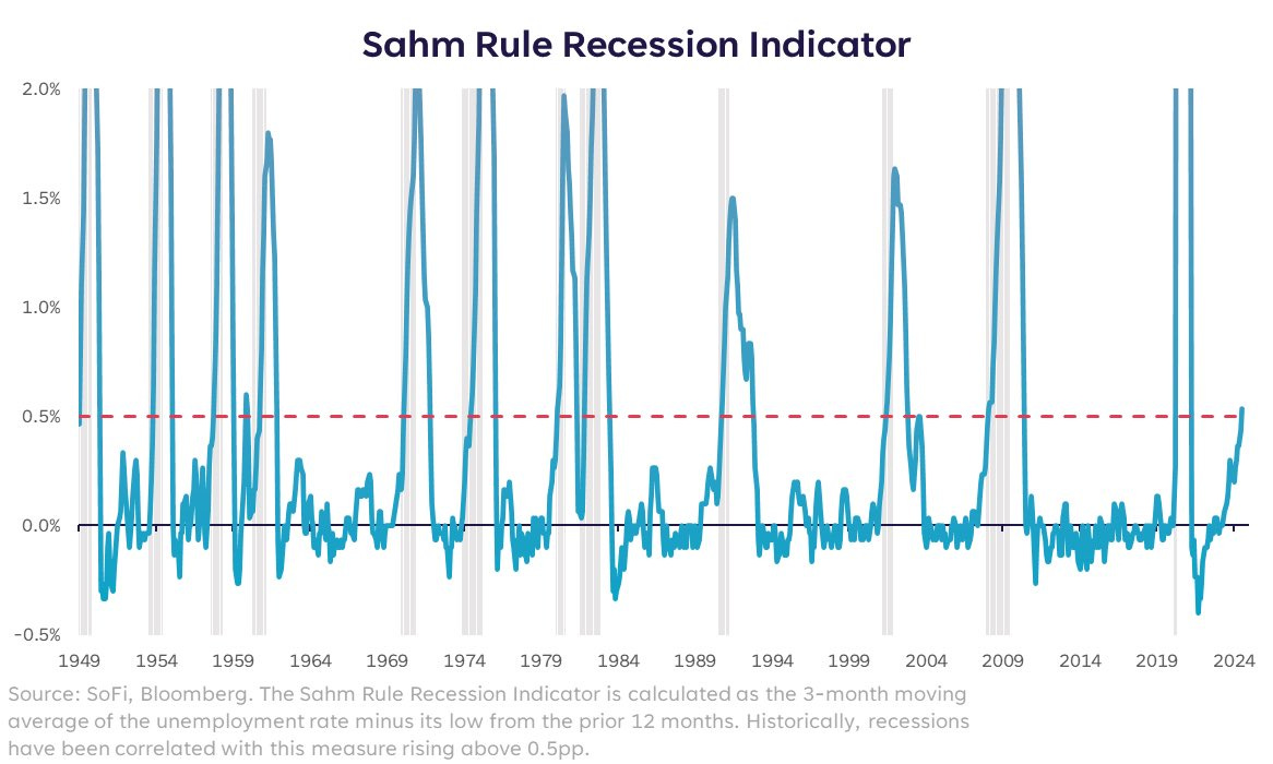
The unemployment rate unexpectedly rose to 4.3%, and triggered a recession signal called the Sahm rule. The Sahm rule looks at a moving average of the unemployment rate compared to the lowest level over the past year. When the average moves 0.5% higher from the low (red line in the chart below), that’s treated as a recession signal.

Actions by other central banks are reverberating throughout the capital markets as well. Following signs of rising inflation, the Bank of Japan raised interest rates last week for only the second time in 17 years.
That’s forcing an unwind of a long-popular “carry trade” where institutional investors borrow funds cheaply in Japanese yen and then turn around and invest in higher yielding and riskier assets (including stocks).
Rising interest rates in Japan are making it more expensive to borrow, and is forcing an unwind of the carry trade which is weighing on risk assets like stocks. The rapid surge in the value of the yen against the U.S. dollar (a falling line in the chart below indicates the yen is strengthening) has many fearing an unwind is underway. That’s coincided with the selloff in the S&P 500.
The price action across the markets is a sharp reversal from the recent improvement in the average stock. But the increase in stock market volatility is producing several signals typically seen around durable bottoms.
Volatility can be utilized to signal peak fear and panic, similar to other investor sentiment indicators. Here are the emerging signs of panic in volatility markets, and metrics I’m tracking to tip if the pullback is nearing its end.
Capitulation Signals in Volatility Markets
In last week’s Market Mosaic, I laid out key levels to watch on the S&P 500 and how the CBOE Volatility Index (VIX) could fuel further selling.
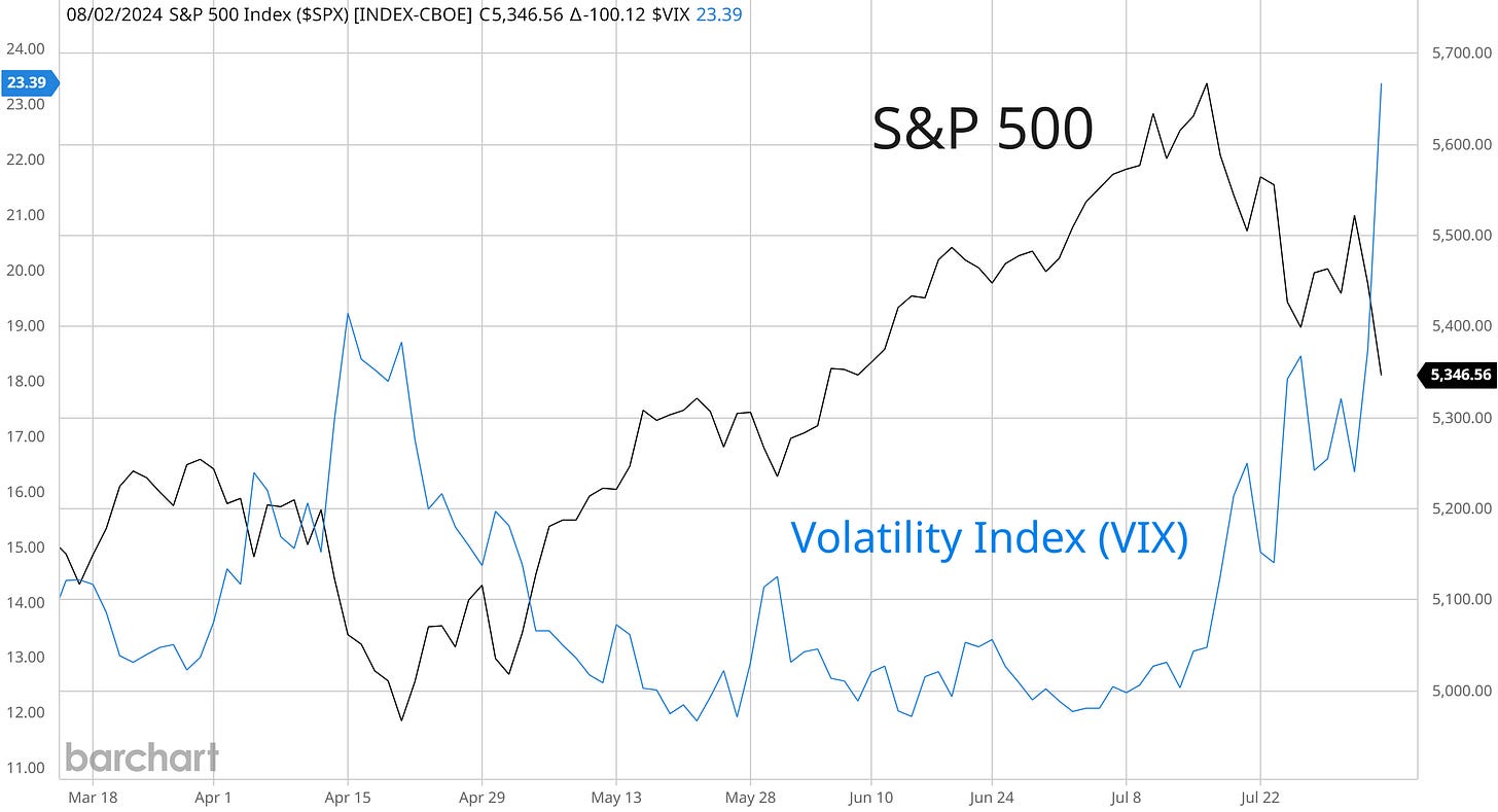
Recall that the VIX measures implied volatility on the S&P 500, and that volatility levels can create a feedback loop that fuels selling pressure for stocks. That’s because institutional strategies like risk-parity and volatility-targeting seek to maintain a constant risk budget in their portfolios.
When stock market volatility starts jumping, these strategies are usually forced to sell equities to stay within their budget. Selling leads to more volatility, and the negative feedback loop can create sharp sell-offs in the stock market like last week (chart below).
The jump in VIX over the 20 level is a major red flag. But within volatility markets, there are several capitulation signals emerging that have historically marked peak panic and at least a near-term bottom in the stock market downtrend.
That includes the term structure of VIX futures. There are futures contracts linked to the VIX, where the futures curve is normally in contango. That means futures expiring further out in time tend to be priced higher than the current month contract, so the futures curve (the term structure) is upward sloping.
But when investors start to panic, near-term VIX futures jump higher at a quicker pace than contracts expiring further out. That means the term structure starts flattening, or even inverting when the current month VIX future trades higher than contracts expiring further out. Historically, that’s been a good sign of capitulation.
The chart below plots the term structure using the current month VIX futures compared the futures contract expiring 3 months out. The bottom line is the term structure, where a rising line means the futures curve is flattening. That line is the highest since October 2022’s bear market bottom.
We can also track the volatility of the VIX (VVIX) itself, which I monitor as a capitulation indicator when a selloff picks up steam. Following the decline in the S&P 500 late last week, the VVIX jumped to levels only seen five times in the past five years.
You can see in the chart below that VVIX is spiking higher over the past two trading sessions, reflecting the rapid rate of change higher in the VIX index. You can also see in the chart that volatility tends to cluster and then subsides. That reflects calm returning to equity markets.
I’m not placing any trades or adjusting my portfolio based solely on signs of capitulation in volatility markets. Ultimately, the price action needs to confirm that a bottom is in place. But given the action in volatility markets late last week, a near-term low in stocks could be forming.
Now What…
Since last year, I’ve maintained a generally bullish outlook on the economy and stock market despite many bearish forecasters and metrics like the inverted yield curve warning of recession ahead.
A big driver of my outlook was the action in cyclical sectors like housing stocks and semiconductors. I’m a firm believer that the stock market is a discounting mechanism for future business conditions and earnings, and that sectors most sensitive to economic activity will provide an early warning if there’s trouble ahead.
Recent breakouts in areas like housing, banks, and small-caps were the latest round of evidence that the outlook is still intact. But last week’s sharp reversal across sectors is concerning, with key levels now being tested.
The chart below shows the KBE bank sector exchange-traded fund (ETF). Following a breakout from a basing pattern, it’s common for price to back test the breakout level similar to KBE below with the price action around the shaded area. What was previously price resistance should now serve as support.
You’re seeing a similar test of support with small-caps and the IWM ETF after breaking out from a bullish pennant pattern. These are key levels that need to hold. If we start seeing failed breakouts in cyclical sectors, then I will need to reconsider my view especially given the recent weakening of more economic data points.
In the near-term, I’m also watching for an oversold breadth condition to develop especially given the signs of capitulation discussed above. The percent of stocks trading above their 20-day moving average across the market is quickly turning lower as you can see below.
Currently at 31%, watch for this breadth measure to hit 20% or lower that has historically marked an oversold condition. Investor sentiment is also growing more bearish at the same time.
CNN’s Fear & Greed Index, which is created from seven market based indicators, is close to tipping into “extreme fear” territory and hit the lowest level since the end of the S&P 500’s correction in October last year.
With the recent action across the market, not many stocks from my watchlist shared in Mosaic Chart Alerts are breaking out. That means I’m being patient and carrying a heavy cash position until price action starts firming up. But my trading plan remains the same, and that’s targeting stocks with strong growth fundamentals, a sound chart basing pattern, and relative strength in price momentum.
One stock bucking the trend last week was with MercadoLibre (MELI). After posting 103% quarterly earnings growth on a revenue increase of 42% to $5 billion, the stock jumped back toward resistance at the $1,800 level (chart below). The stock has been basing since January, and is creating a series of smaller pullbacks on each test of $1,800. That’s a good sign of accumulation, where I’m now watching for the breakout over that level.
That’s all for this week. The pace of key economic reports and corporate earnings releases will be slower this coming week. But given the spike in volatility and selloff across the indexes last week, expect more large swings in either direction in the days ahead. I’ll be following the volatility metrics outlined above, and if signs of capitulation can put in a bottom for the S&P 500.
I hope you’ve enjoyed The Market Mosaic, and please share this report with your family, friends, coworkers…or anyone that would benefit from an objective look at the stock market.
And make sure you never miss an edition by subscribing here:
For updated charts, market analysis, and other trade ideas, give me a follow on X: @mosaicassetco
And if you have any questions or feedback, feel free to shoot me an email at mosaicassetco@gmail.com
Disclaimer: these are not recommendations and just my thoughts and opinions…do your own due diligence! I may hold a position in the securities mentioned in this report.


Wow. Great points made. May I add one more? My very own indicator. The Nasdaq 100 had 50 stocks in oversold territory on Friday. Over 50% oversold must leave mostly quality stocks left in the overbought range, which will be harder to pull into oversold. Making a base or a turnaround possible.
IMHO. Thanks for all you do.
Very nice