The Market Mosaic 6.9.24
S&P 500: Growing cracks in the rally's foundation.
Welcome back to The Market Mosaic, where I gauge the stock market’s next move by looking at macro, technicals, and market internals. I’ll also highlight trade ideas using this analysis.
If you find this content helpful please hit that “like” button, share this post, and become a subscriber to this always free report if you haven’t already done so!
And be sure to check out Mosaic Chart Alerts. It’s a midweek update covering chart setups among long and short trade ideas in the stock market, along with levels I’m watching.
Now for this week’s issue…
The latest round of key economic reports featured something for bulls and bears alike. But trends underneath the stock market’s hood are raising red flags.
The week ended with what appeared to be a blowout payrolls report for the month of May. The report showed that the economy added 272,000 jobs for the month which blew past expectations for 190,000.
But the unemployment rate ticked higher to 4%, hitting that level for the first time since January 2022. The increase was driven by the separate household survey of employment, which showed a large drop for the month. The chart below shows the growing divergence between the different measures of employment.

While the payrolls report may have been a mixed bag, the most concerning macro report on the week came from the ISM Manufacturing survey. That purchasing managers’ index (PMI) is structured so that a reading above 50 points to expansion and below 50 indicates contracting activity.
The headline figure for the manufacturing ISM was worse than expected at 48.7. But it’s the evolution of underlying components that’s more important. That includes new orders which is a useful gauge of future activity. It fell to 45.5, which is the lowest level in a year (chart below).
But on balance, last week’s data did little to shift the outlook for monetary policy in the U.S. An interest rate cut by the Federal Reserve is still a coin flip for September, while market-implied odds are still forecasting one cut for 2024.
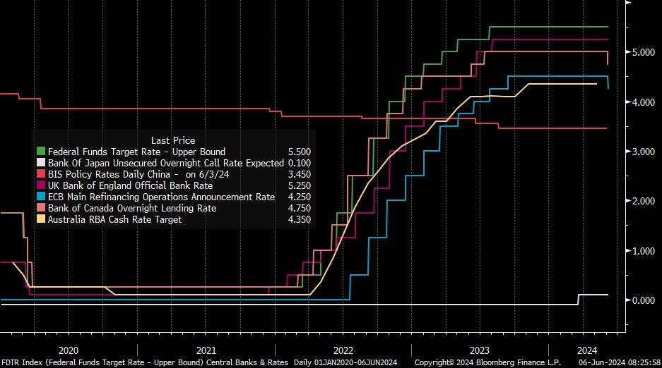
Meanwhile, other central banks around the world are starting to move forward with easing policy. The chart below shows the short-term policy rate for major central banks around the world. The European central bank cut rates by a quarter-point last week, and is moving to ease policy before the Fed for the first time in 25 years.

But while investors were being bombarded with economic headlines, the most concerning development is happening underneath the stock market’s surface.
There’s a worsening pullback in the number of stocks participating in the S&P 500’s recent gains. By some measures, the pullback in the average stock is the worst since just before 2022’s bear market.
Growing Cracks in the Rally’s Foundation
Last week, Nvidia (NVDA) became the third company in history to surpass a $3 trillion market capitalization, helping the S&P 500’s streak of fresh all-time highs this year.
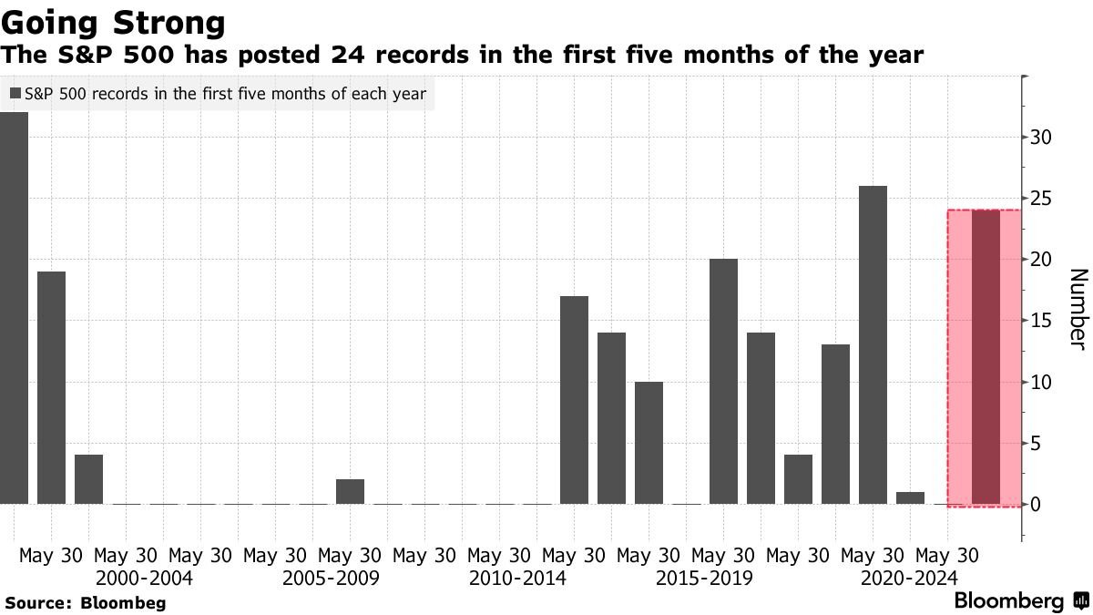
Just through the end of May, the S&P 500 has seen 24 new record highs in the first five months of 2024. Over a five month stretch, that’s the second most new highs in over 20 years as you can see in the chart below.
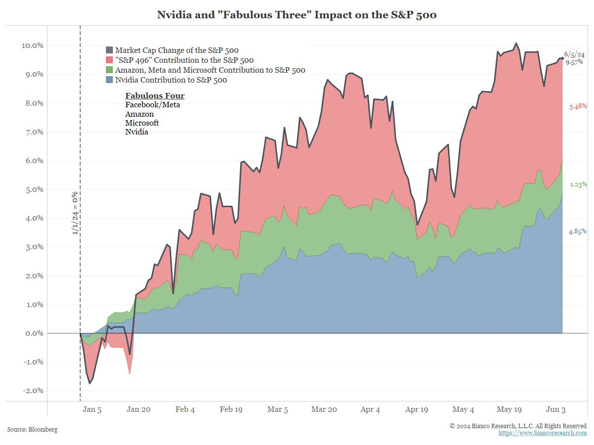
But the big drivers behind the S&P’s year-to-date gain are becoming more concentrated even beyond the “Magnificent 7”. Now it’s coming down to less than a handful of stocks driving most of the S&P 500’s gain on the year.
The chart below shows the contribution to the S&P 500’s year-to-date return through June 5 by various stocks. Nvidia alone has driven a little over half the index’s gain. Add in Amazon, Meta, and Microsoft and that figure rises to 64%.

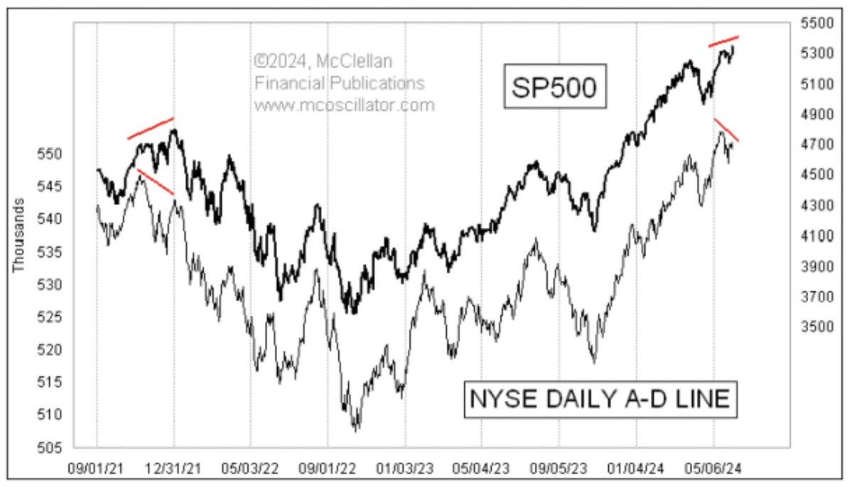
There are other signs of narrowing participation as well. One way of tracking the performance of the average stock is with the NYSE cumulative advance/decline (A/D) line. This simply takes the issues traded on the NYSE and nets stocks moving higher on a given day versus those trading lower.
That result is added to a running tally, where ideally the NYSE A/D line is keeping pace with the major indexes like the S&P 500. But the biggest negative divergence since early 2021’s peak is developing that you can see in the chart below.

While the S&P 500 is moving out to new highs, the NYSE A/D line peaked on May 15 and is moving lower. The last time the NYSE A/D line started diverging while the S&P 500 was making new highs was just ahead of 2022’s bear market where the S&P fell 25% from peak to trough.
There’s also a worrying trend of more new 52-week lows than new 52-week highs since the end of May. Net new 52-week highs (chart below) has mostly followed the trend in the S&P 500, especially when the index started making record highs back in January. That’s exactly what you want to see.
What you don’t want see is new 52-week lows outpacing new highs as the S&P 500 is moving out to new high ground. But look at the circled area on the chart and you can see that we’ve stayed in a net new low regime even as the S&P has recovered.
As I’ve frequently said before, breadth divergences are conditions to be aware of (whether positive or negative). Breadth signals are not precise timing tools, and don’t always produce the expected directional impact on major indexes.
But with the recent breadth deterioration in mind, I’m following a couple other key segments of the capital markets for confirmation that the rally can continue or is at risk of stalling out.
Now What…
While the action in the average stock is cause for concern, other speculative areas like high yield are holding up well and confirming the rally in the S&P 500.
In fact, a cumulative A/D line (bottom panel in the chart below) for underlying holdings in the HYG high yield exchange-traded fund (ETF) is leading HYG higher which is a very bullish sign. That’s because the performance of high yield bonds are extremely sensitive to the economic outlook.
I’m also following other areas of the capital markets for risk sentiment. In this week’s chart report, I highlighted the setup in Bitcoin which continues moving up favorably on the right side of its base. I’m still watching for a breakout over $74,000 to new highs.
Another chart that bears close watch is with the U.S. Dollar Index. A falling dollar tends to be a risk-on signal, and is also typically bullish for commodities and energy sectors. The dollar recently broke below the triangle consolidation pattern shown below with the dashed trendlines.
The dollar rallied following the payrolls report and is now back testing the lower trendline as resistance, which is also right around the 50- and 200-day moving average (black and green line respectively). A rejection off the trendline and move below 104 would be a bullish sign for stocks and commodities.
In addition, there are signs that breadth is already becoming oversold like with the percent of stocks trading above their 20-day moving average across exchanges. That figure now stands at 30% as you can see below. Extensions down toward the 20% level or lower have often marked oversold levels in the past.
I also track the MACD applied to this indicator, which is now well below zero and could reach oversold levels in the coming week. I would be surprised if the average stock starts rallying from an oversold condition without a downside reaction first in the S&P 500.
While fresh breakouts in watchlist stocks have been harder to identify with breadth weakening, some setups are still following through. That includes Pinterest (PINS) which moved above the long trigger level at $43 as you can see below. The relative strength line is near a new high while volume is increasing over the past couple trading sessions. Be sure to check out my Substack chat feature where I alert chart setups in real time.
That’s all for this week. Fresh on the heels of the May payrolls report, the coming week will see a Fed rate setting meeting along with updated looks at both consumer and producer price inflation. Those events will provide key clues if the Fed is about to join other central banks in cutting rates. But I’ll be more interested in how the average stock responds against the backdrop of weakening breadth.
I hope you’ve enjoyed The Market Mosaic, and please share this report with your family, friends, coworkers…or anyone that would benefit from an objective look at the stock market.
And make sure you never miss an edition by subscribing here:
For updated charts, market analysis, and other trade ideas, give me a follow on X: @mosaicassetco
And if you have any questions or feedback, feel free to shoot me an email at mosaicassetco@gmail.com
Disclaimer: these are not recommendations and just my thoughts and opinions…do your own due diligence! I may hold a position in the securities mentioned in this report.


