The Market Mosaic 6.23.24
Bullish signs for the average stock.
Welcome back to The Market Mosaic, where I gauge the stock market’s next move by looking at macro, technicals, and market internals. I’ll also highlight trade ideas using this analysis.
If you find this content helpful please hit that “like” button, share this post, and become a subscriber to this always free report if you haven’t already done so!
And be sure to check out Mosaic Chart Alerts. It’s a midweek update covering chart setups among long and short trade ideas in the stock market, along with levels I’m watching.
Now for this week’s issue…
Mega-cap technology companies are driving the S&P 500 to new all-time highs.
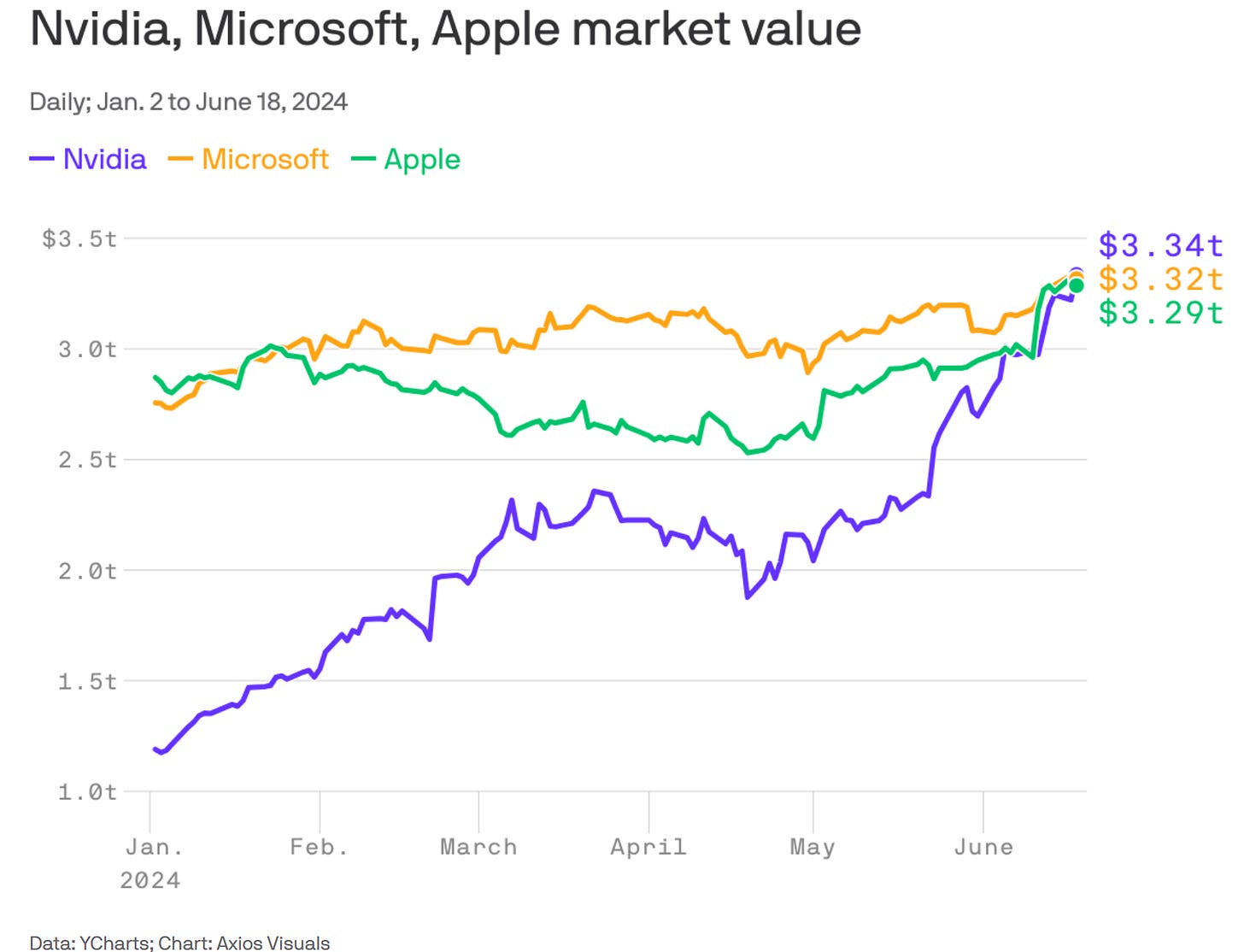
A couple week’s ago, it was Apple’s 10% jump in just two days that helped briefly drive the company past Microsoft as the world’s most valuable public company.
But Nvidia wasn’t about to be outdone. Over the last 10 trading sessions, Nvidia has gained as much as 11%. Nvidia also briefly took the crown as the world’s most valuable listed company.
Regardless of who holds the top spot, the combined market capitalization of Nvidia, Microsoft, and Apple is now approaching $10 trillion, with the chart below plotting their respective market caps throughout the year.
That’s helping push the market-cap weighted S&P 500 to 31 record closing highs so far this year. But over the past month, new highs for the average stock are tough to come by.
Across 20 trading days since the end of May, 16 of those trading sessions has seen more 52-week new lows than new highs across the major stock exchanges. You can see that in the chart below, where net new lows are expanding further over the past week.
Other measures show gains are becoming more concentrated in the largest stocks. The chart below plots the four week change in the S&P 500 against cumulative advancing versus declining stocks in the index.
You can see the arrow pointing to the June 14 data point, showing the S&P 500 gaining while more stocks fell than gained over that period. That was the worst four week stretch in over 20 years for cumulative net decliners relative to the S&P 500’s gains.
But while there are plenty of bearish takes around narrowing leadership, there are signs emerging that the pullback in the average stock is running its course and breadth can start improving again. Here are three charts I’m watching to track if the average stock can catch up to the major indexes.
Bullish Signs for the Average Stock
Narrowing leadership in the stock market is certainly cause for concern. The foundation of a bull market advance is supported by strong participation across the average stock.
After all, the most recent leg of the bull market that started last October displayed several breadth thrusts early on. Breadth thrusts are marked by a surge in stocks advancing relative to those declining, and can be monitored through things like the NYSE advance/decline ratio or with Zweig breadth thrusts that I reviewed here late last year.
But just like breadth can mark the early stages of a strong advance, narrowing breadth can often be a warning sign of trouble ahead. Like what I showed you with the NYSE advance-decline line a couple weeks ago here.
However, red flags from narrow leadership doesn’t always deliver a decline in the major indexes. And the average stock can catch up to the indexes as opposed to the indexes “catching down”.
And there are several signs I’m watching that the pullback in the average stock has run its course. That includes the percent of stocks trading above their 20-day moving average. About a week ago, this metric stood at just 26% as you can see in the chart below at the arrow. That’s near oversold levels that we’ve seen around the 20% mark over the past year.
I also apply the MACD to this indicator as another way to identify overbought and oversold breadth readings. You can see in the chart that the MACD is just starting to turn higher from an oversold level and is making a bullish crossover on the signal line.
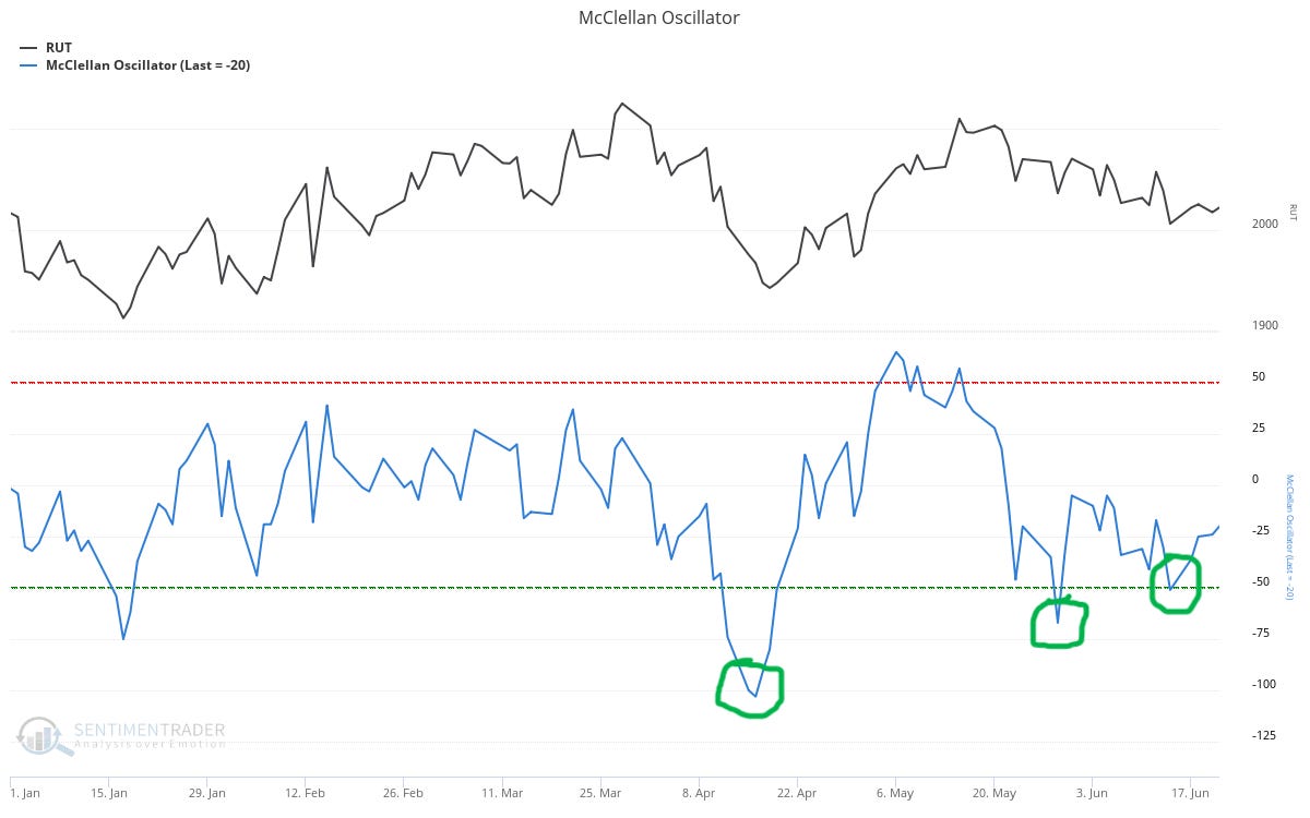
I’m also paying attention to the McClellan Oscillator. This metric looks at advancing versus declining issues on the NYSE over a trailing period. I’m including the Russell 2000 Index of small-cap stocks in the top panel as a way to gauge the average stock.
The oscillator made a low on the year back in April. Since then, it’s made a series of higher lows that you can see with the circles. Ideally, a bullish divergence forms when you have the oscillator making higher lows as the average stock makes lower lows. You can see in the chart that the most recent higher low occurred as the Russell 2000 kept pulling back.
Finally, I’m watching a bullish chart pattern forming in the RSP exchange-traded fund (ETF) that tracks an equal-weight version of the S&P 500 in the chart below. This ETF aims to hold each stock in the S&P 500 in equal proportions, and had been keeping pace with the market cap-weighted S&P until the last couple months.
But you can see that RSP peaked out late March and has not confirmed the new highs in the cap-weighted S&P 500. But since the March peak, there are a couple things that have my attention.
First, RSP is creating a bullish triangle consolidation pattern that you can see with the dashed trendlines. As price is nearing the apex of the formation, the MACD made a higher low and is resetting at the zero line. The RSI in the bottom panel also made a bullish divergence with a recent higher low compared to the pullback in late May.
I’ll say again that breadth is a condition and not a signal. What matters now is watching the price action in the indexes like the S&P 500 and among the average stock. This is also where an actively managed watchlist like in Mosaic Chart Alerts can help monitor the market. The feedback from breakout setups I’m tracking can confirm turning points in breadth.
Now What…
I’ve maintained that the bull market can stay intact so long as the corporate earnings outlook remains positive, which means a growing economy is crucial.
And last week featured more signs that the economy is moving ahead. That includes the most recent purchasing mangers’ index (PMI) from S&P Global, which is constructed so that a reading over 50 indicates expansion while below 50 shows contracting activity.
In the most recent report, the manufacturing PMI rose slightly to 51.7 while the services PMI increased to 55.1. The composite PMI that combines both hit 54.6, which is a 26-month high. The chart below plots the composite PMI along with GDP growth.
We also received another update on leading economic indicators with the Conference Board’s LEI Index, which is sending mixed signals. While headlines focus on the 0.5% monthly decline in May, I place greatest importance on the year-over-year rate of change (blue line in the chart below). The year-over-year change is still accelerating off a negative level, which historically is the strongest regime for forward stock returns.
I still believe the weight of the evidence points to a positive outlook for the economy, which will be necessary to boost earnings growth for the average stock. The chart below shows annual earnings growth for small-caps is expected to accelerate significantly over the coming quarters.
Earnings growth is also critical when I’m screening for stocks to buy. While I highlight chart patterns and setups in Mosaic Chart Alerts, my process begins by screening for companies with strong growth fundamentals across both sales and earnings.
That’s why I’m closely following the action in Nu Holdings (NU). Year-over-year sales growth has been over 60% for the past four quarters, while earnings growth over the same period has been triple digits. The stock is basing since late March with resistance at $12.50. NU is recently moving higher after making a smaller retracement in the pattern and is nearing resistance at $12.50.
That’s all for this week. The week ahead features several speakers from the Federal Reserve along with an updated look at the Fed’s preferred inflation measure with May’s PCE report. While the outlook for monetary policy will be a hot topic, I’ll be following the price action in the average stock.
P.S.
I want to make sure you can find my updated thoughts and analysis on trade ideas.
Using Substack’s Chat feature, I’m posting about the setups I cover in The Market Mosaic and Mosaic Chart Alerts that are breaking out and meeting my criteria for taking a position.
You’ll need Substack’s app, which you can access by clicking this link. You can also access the Chat on my website.
Simply go to the Chat if you want to follow along…I look forward to seeing you there!
I hope you’ve enjoyed The Market Mosaic, and please share this report with your family, friends, coworkers…or anyone that would benefit from an objective look at the stock market.
And make sure you never miss an edition by subscribing here:
For updated charts, market analysis, and other trade ideas, give me a follow on X: @mosaicassetco
And if you have any questions or feedback, feel free to shoot me an email at mosaicassetco@gmail.com
Disclaimer: these are not recommendations and just my thoughts and opinions…do your own due diligence! I may hold a position in the securities mentioned in this report.


That LEI turning upwards is underappreciated and not something you hear a lot of people talking about. Thanks for including it!
Earnings growth will be the single rope which the broader market will have to cling on – definitely keep watching!