The Market Mosaic 4.7.24
Stock rotation hinting at rising inflation?
Welcome back to The Market Mosaic, where I gauge the stock market’s next move by looking at macro, technicals, and market internals. I’ll also highlight trade ideas using this analysis.
If you find this content helpful please hit that “like” button, share this post, and become a subscriber to this always free report if you haven’t already done so!
And be sure to check out Mosaic Chart Alerts. It’s a midweek update covering chart setups among long and short trade ideas in the stock market, along with levels I’m watching.
Now for this week’s issue…
Last week’s main event for investors was the March payrolls report, and it didn’t disappoint.
There were 303,000 jobs added during the month (chart below), which blew past every single economist estimate (the consensus view was for 200,000). The unemployment rate ticked down to 3.8%, while the past two months of job gains were revised higher.
The spotlight now shifts to a pair of inflation reports next week, with updated data on both the Consumer Price Index (CPI) and Producer Price Index (PPI).
Full employment and price stability comprise the Federal Reserve’s two mandates. Since the former is humming along just fine, investor focus now shifts to the latter for any changes to the outlook for monetary policy.
More specifically, investors will seek more signs of disinflation marked by a slowing rate of change in price gains. That’s needed in order to keep interest rate cuts on deck for later this year.
The Fed’s own Cleveland district may contain some good news on that front. The district maintains a model that looks at real-time data to track and forecast CPI, and its most recent output below shows April core CPI falling to 3.7% in March then to 3.6% so far in April compared to 3.8% in February. The headline CPI figure is estimated to increase slightly in March before falling to 3.3% in April.
But a rotation underway in a key segment of the capital markets is painting a very different picture for the inflation outlook.
Historically, stock market sectors behave very differently under varying inflation regimes. That’s why the latest batch of breakouts could be signaling a shift in the trend of disinflation that’s persisted for nearly two years.
Sector Rotation Pointing to Higher Inflation
I’m a firm believer that stock prices discount future business and economic conditions. And those price signals can be even more significant when a large group of stocks in the same industry or sector are displaying similar setups and momentum.
In recent weeks, I’ve been highlighting the developing setups and breakouts across several commodities and related producers. Originally starting with gold’s breakout that I’ve tracked since November, other commodities are joining the upside as well.
That includes silver prices, which you can see in the weekly chart below. Silver is breaking above the $26 per ounce level, which is resistance in an ascending triangle pattern. Based on the height of the pattern, the measuring objective for silver could target the $34 level.
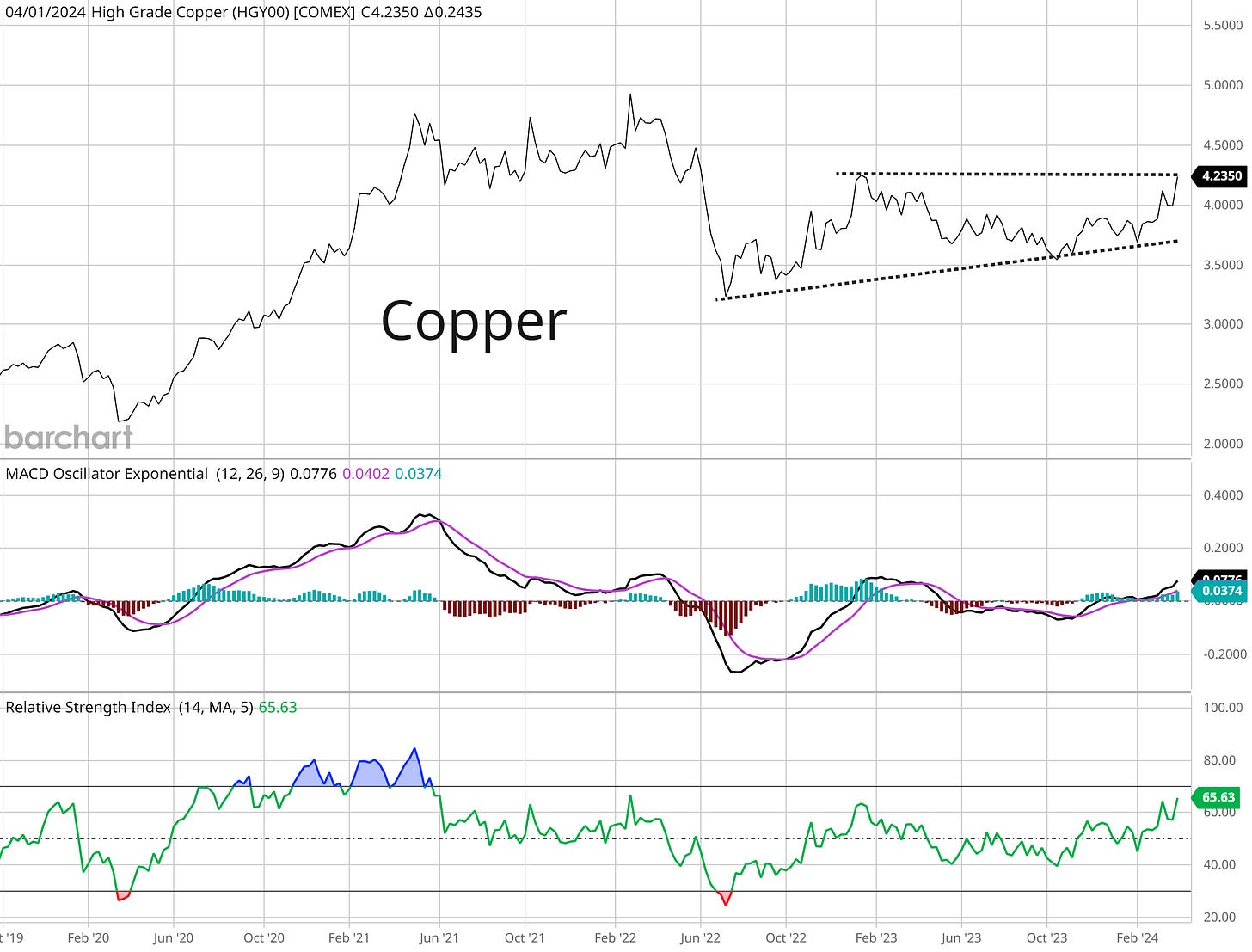
Other commodities beyond precious metals are joining the upside as well. That includes commodities with more traditional industrial uses (versus gold’s reputation as a store of value with limited end market use), like what you’re now seeing with the price of copper.
Copper miners like Freeport-McMoRan (FCX) and Southern Copper (SCCO) are breaking out of basing patterns that stretch back years in some cases. Copper itself is now on the move as well, and is testing resistance near the $4.25 level after rallying 15% in the past two months.
But the breakouts and setups across the commodity sector could be delivering an important message about the inflation outlook as well.
The chart below shows the performance of various equity sectors over the past 50 years during periods of high and rising inflationary environments. The y-axis in the chart shows the magnitude of sector performance, while the x-axis displays how often a sector delivers positive real returns in an inflationary environment.

Two sectors stand out above all others, including the energy sector along with precious metals and mining. Those are the two top performing sectors in a rising inflation environment, with energy also having the highest win rate historically.
And when it comes to inflation’s impact on commodity prices, it’s all about the rate of change in inflation data rather than just the level. One criticism of commodity performance over the past couple years is that prices have lagged badly even though inflation is historically elevated.
But it’s the rate of change in inflation that correlates better to the performance of commodities. The chart below shows the year-over-year rate of change (ROC) in the CPI (red line) compared to a commodity price index (blue line). Commodity prices are more impacted by the ROC in inflation rather than the absolute level.
The collective performance of stocks across the commodity space are signaling that a key rotation in the stock market is underway. And it’s one that potentially contains significant implications for the inflation outlook and ability for the Fed to execute its dovish pivot toward cutting interest rates.
Now What…
In last week’s Market Mosaic, I made the case for commodities partially on the view that falling short-term rates in a non-recessionary environment is a strong macro backdrop for the commodity trade.
Fed officials have collectively maintained their outlook for three rate cuts this year. And even with last week’s rise in Treasury yields across maturities, the 2-year Treasury yield remains firmly below fed funds.
But I am watching one pattern that could start changing that picture. The chart below shows the 2-year yield going back two years. The 2-year yield has risen from a recent low of around 4.20% to 4.73% currently. And recently, the 2-year yield is creating an ascending triangle pattern that you can see with the dashed trend lines.
If the 2-year breaks out of the pattern, it could target the 5.0% level and reflect a market becoming more concerned about reaccelerating inflation that also puts the Fed on hold regarding rate cuts.
That presents a dilemma for the commodity backdrop. While rising inflation is a positive catalyst for commodity performance noted above, rising short-term yields that signals a Fed on hold removes a bullish catalyst. So then which one matters more?
To answer that question, I ultimately turn to the price action and the charts I highlighted above. Along with gold and silver’s breakout action, more commodity sectors and related producers are now moving out of consolidation patterns.
And above all else, I believe we remain in a bull market and that sector rotation is a healthy part of any bull market advance since more stocks are participating in the uptrend (better breadth).
A rotation could also signal mean-reversion in some of the more prominent leaders of this bull market phase, with some leaders showing cracks in their uptrend like with Nvidia (NVDA) in the chart below.
Last week, NVDA closed below the 21-day exponential moving average for the first time since breaking out of its most recent base at the start of January that produced an 82% gain. That doesn’t necessarily mean that NVDA’s bull run is completely finished, but a new consolidation and basing phase can emerge.
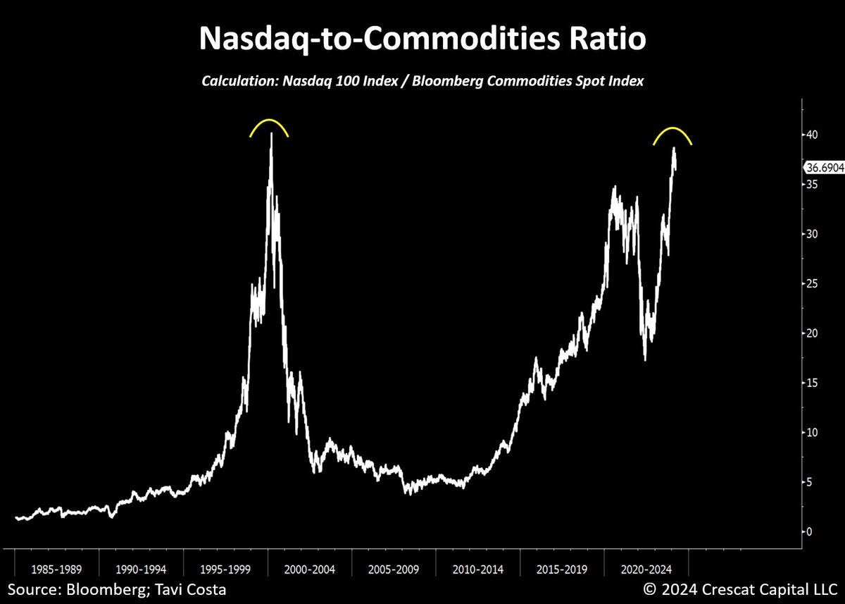
At the same time, a ratio comparing the Nasdaq 100 Index to commodities is recently touching levels last seen during the dot-com bubble. The last time the ratio hit this level, leading tech stocks mean-reverted lower while commodities went on a major bull run heading into 2008’s financial crisis.

If commodities keep performing, I’m watching several related producers like the recent breakout in IamGold (IAG). Since recently peaking in May 2023, the stock went to make a saucer-type consolidation pattern. Price tested resistance at the $3.30 level in March, then pulled back which also reset the MACD at the zero line. Price recently gapped above that resistance level on a surge in volume.
That’s all for this week. As mentioned above, next week will feature updated inflation reports with both the CPI and PPI coming out for March. The week will also see several Fed speakers along with the start of first quarter earnings season with several big banks reporting. But I’ll be closely watching for more clues from commodity and bond markets that inflation could start accelerating again.
I hope you’ve enjoyed The Market Mosaic, and please share this report with your family, friends, coworkers…or anyone that would benefit from an objective look at the stock market.
And make sure you never miss an edition by subscribing here:
For updated charts, market analysis, and other trade ideas, give me a follow on X: @mosaicassetco
And if you have any questions or feedback, feel free to shoot me an email at mosaicassetco@gmail.com
Disclaimer: these are not recommendations and just my thoughts and opinions…do your own due diligence! I may hold a position in the securities mentioned in this report.


Great great work. Appreciate it!
Thanks - great digest. The copper piece is v. interesting - if Chinese plants are getting closer to issuing joint production cuts as a response, then surely there's only one way the price is going anytime soon.