The Market Mosaic 4.17.22
A tale of two markets...
Welcome back to The Market Mosaic, where I gauge the stock market’s next move by looking at trends, market internals, and the mood of the crowd. I also search for information contained in sector movements and other areas of the capital markets. Finally, I’ll highlight one or two trade ideas using this information.
And if you find this content helpful, please like, share, and subscribe!
Let’s start this week by looking at the S&P 500. The chart below is busy, but there are several important levels to monitor here. Price had been wedged between the 50- and 200-day moving average for several trading sessions. Friday’s weakness led to a close below the 50-day, but it’s not uncommon to see the index fake just above or below an important level then reverse. The index is also right at the 50% retracement of the rally off the March lows, all while the MACD is resetting at the zero line after becoming too extended. So far this is a normal pullback working off over-extended momentum.
At the same time, my favorite indicator of near-term trend is reaching oversold territory. The percentage of stocks trading above their 20-day moving average touched 30% this past week. I prefer 20% or lower to indicate more extreme levels of oversold, but we’re getting close.
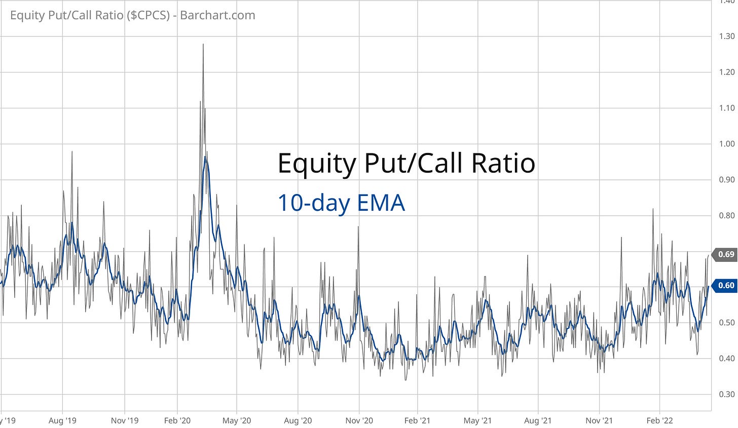
Investor sentiment also shows fear levels picking up. The 10-day moving average of the put/call ratio is reaching **somewhat** heightened levels. This indicator is near the highest levels seen since the pandemic bear market, but can spike much higher during more meaningful bottoms. I think 4Q2018 is good analogue, when the 10-day average hit .85 compared to .60 now.
So, the S&P 500 is trading in proximity to important support levels as momentum resets, near-term oversold conditions are starting to flash, and bearish sentiment is picking up. All good signs that a tradable low is near.
But…
The action in higher beta groups does not indicate “risk-on” sentiment is returning to the stock market. I see quite the opposite, and it’s useful to look at a few individual equities to understand what I mean.
Let’s take AMD for example. I’ve been flagging this $100 support level for quite some time on my Twitter feed. Then last week the chorus of those highlighting the $100 break down reached fever pitch. So I honestly expected that the break of $100 could be a fake out, with a move right back above. Instead, price tested $100 resistance for a couple days then rejected back lower. Not a good look for this prior leader.
Other growth stocks are threatening to break down once again as well. There are too many charts to list here, but check out names like TTD, APPS, CHWY, SNOW, and LCID to see what I mean. These stocks got destroyed on Thursday, and appear to be breaking below short-term support levels just as MACD is recharging for another move. The chart below of LCID is a good example of this type of action.
Crypto is another area I monitor for risk-taking, or lack thereof. Here’s a chart of Ethereum futures. The four-hour chart looks like a bear flag about to break down. Bitcoin has a similar look, which means more downside in the short-term if these patterns follow through.
That’s bringing crypto-linked stocks like MARA back to key support levels. MARA keeps testing the $20 level, and is closing in once again. The more often a price level is tested, the more likely it will give way…and this one for MARA has been tested a lot over the past year.
And keep an eye on crypto-bank SI and the $100 level…the setup looks similar to what has evolved with AMD.
The bottom line here is that speculative areas of the capital markets need ample liquidity to thrive, and that liquidity is set to evaporate quickly as the Fed reins in easy policy.
But there are pockets of strength in this market, and the easiest way to find them are to focus on sectors showing relative strength and moving out to new highs.
These are the areas I want to own…especially if the broader market starts to turn around. Many stocks are already moving higher despite the action in the S&P 500. I highlighted GOLD last week, and gold stocks keep showing relative strength. For a broader gold mining ETF, the move in GDXJ looks like it’s just getting started.
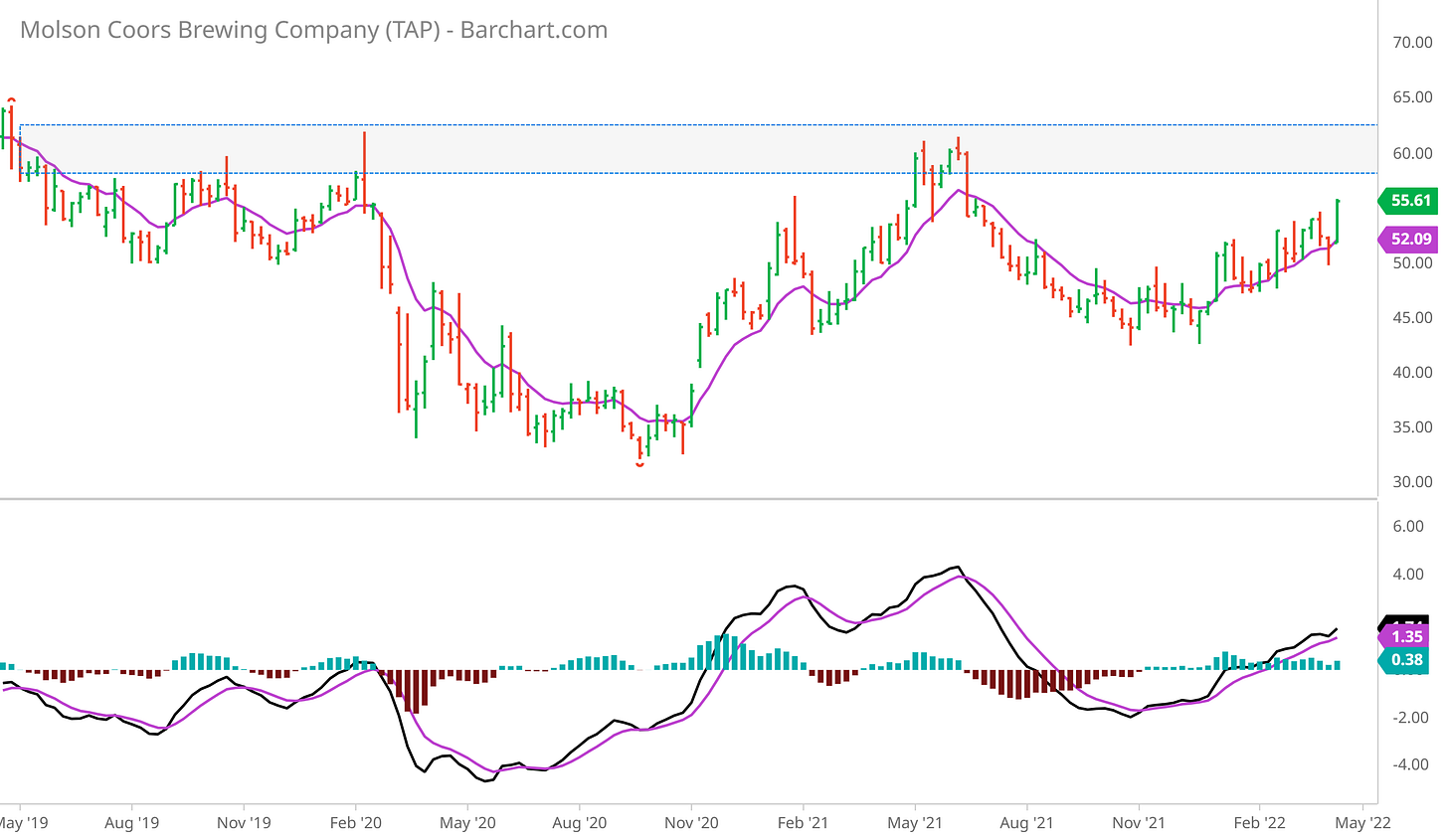
TAP is another that caught my attention late last week, and not just because I enjoy beer! Here’s the weekly chart, where a nice move higher last week occurred on expanding volume. I’m looking for a return to the $60 level, and a possible breakout there.
That’s all for this week. I hope you’ve enjoyed this edition of The Market Mosaic, and please share this newsletter with anyone that could benefit from an objective look at the stock market.
For updated charts and other trade ideas, follow me on Twitter: @MosaicAssetCo
And make sure you never miss an edition by subscribing here:
Disclaimer: these are not recommendations and just my thoughts and opinions…do your own due diligence! I may hold a position in the securities mentioned in this newsletter.


