The Market Mosaic 4.14.24
How stocks can power through higher inflation.
Welcome back to The Market Mosaic, where I gauge the stock market’s next move by looking at macro, technicals, and market internals. I’ll also highlight trade ideas using this analysis.
If you find this content helpful please hit that “like” button, share this post, and become a subscriber to this always free report if you haven’t already done so!
And be sure to check out Mosaic Chart Alerts. It’s a midweek update covering chart setups among long and short trade ideas in the stock market, along with levels I’m watching.
Now for this week’s issue…
The disinflation trend and outlook for interest rate cuts are in question following last week’s inflation reports.
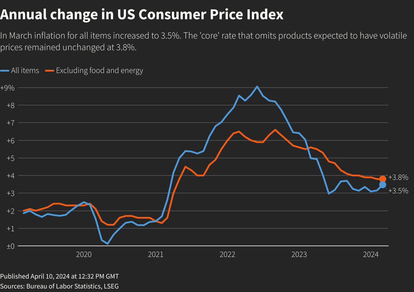
The Consumer Price Index (CPI) increased by 3.5% in March compared to last year, which was slightly higher than economist forecasts. Following CPI’s yearly rate of change (ROC) peak in mid-2022, the disinflation trend bottomed last June with the ROC slowly turning higher since then.
And it’s not just the recent rally in commodity prices to blame. The core CPI measure that strips out food and energy prices also accelerated slightly last month with a year-over-year increase of 3.8%. The chart below shows the year-over-year change in the CPI (blue line) and core CPI (orange line).
While the Producer Price Index (PPI) was tamer with an increase of 2.1% in March compared to last year, that’s the largest increase in the PPI in nearly a year.
Coupled with a blowout March jobs report showing a gain of 303,000 payrolls and other indicators showing the economy is firing on most cylinders, the outlook for interest rate cuts by the Federal Reserve is in serious jeopardy.
Market-implied odds now show investors pricing just two rate cuts in 2024 as you can see in the table below. That’s down from as many as seven rate cuts being projected back in December.
Signals from other corners of the fixed income market are shifting as well, like with the 2-year Treasury yield. The 2-year often leads changes in the fed funds rate, and last week I highlighted a concerning chart pattern setting up.
The 2-year is breaking out from a short-term ascending triangle, which I stated could target the 5% level and that’s exactly what happened as you can see in the chart below. With the 2-year moving closer to the current level of fed funds (right now at a range of 5.25% - 5.50%), that’s another sign that rate cuts could be on hold.
The most recent leg of this bull market rally that started in late October coincided with expectations that the Fed could pursue looser monetary policy in 2024. At one point, rate cuts were expected as soon as the Fed’s meeting last month.
But evidence of a solid economy and reaccelerating inflation is jeopardizing that catalyst to the outlook. Here’s what the shifting rate picture means for stocks, and if the bull market still has room to run.
How Stocks Can Handle Higher Rates
Ever since the S&P 500 found a bottom on October 12, 2022 following that year’s bear market, the index has gained 43% with this rally now 18 months old.
If the inflation-driven outlook for higher interest rates and tight monetary policy means this cyclical bull market is finished, it would be quite truncated by both gain magnitude and time compared to past rallies.
The chart below plots cyclical bull markets going back to 1921, and highlights the median bull market gain and duration. While this current bull market is tracking toward the median gain thus far, it’s only about 60% of the median bull market duration which lasts around 30 months.

While this bull market is young compared to historical norms, there’s a lot of focus on the negative pressure interest rates can pose to stocks. The problem with high and rising interest rates is that future corporate profits are worth less in today’s dollars, while more attractive returns on fixed income securities presents competition for investor capital.
But stock prices can overcome that pressure from rates if corporate earnings can keep recovering. I’ve argued recently that several leading indicators are pointing a coming boost in economic activity.
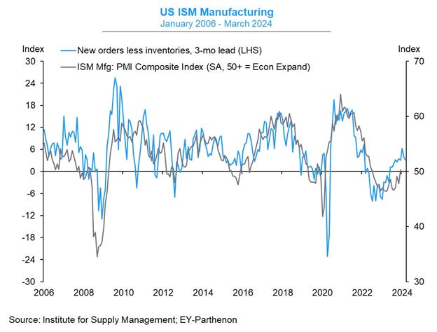
We recently received another sign with the Manufacturing ISM report. The ISM is a purchasing managers’ index, which surveys business managers on things like order and employment trends. They’re designed so that a reading above 50 indicates expansion while below 50 points to contraction.
Not only did the headline figure climb back above 50 for the first time in 18 months, but key underlying components that serve as leading indicators are improving as well. One of my favorite gauges compares new orders to inventories (blue line), which is overlaid with the ISM figure (gray line) in the chart below.
A high level of new orders and low level of customer inventories (indicating restocking demand) is historically positive for economic activity and can lead changes in the headline ISM figure, suggesting there’s more room for manufacturing sector expansion.
Similar to many economic indicators showing an improving rate of change, forward corporate earnings estimates are projected to inflect higher as well. The chart below shows the quarterly year-over-year growth rate in earnings per share for the S&P 500.
After bottoming out in the second quarter last year, the ROC in earnings is expected to continue improving overall. Also notice that growth rates have been consistently exceeding estimates (the green diamonds in the chart) at the start of earnings season.
Eventually, tight monetary policy and higher rates will catch up to the economy. That’s when the really big drawdowns in stock prices can occur with a corresponding plunge in corporate profits. But for right now, the weight of the evidence suggests that the ongoing recovery in economic growth and corporate earnings is underway.
Now What…
With last week’s pullback, the S&P 500 is now down 2.5% from the peak at the end of March. With such a favorable stretch in the stock market and easy trading environment for the past six months, it’s worth remembering that pullbacks and corrections are common even during bull markets. Going back to 1928, the average year sees the S&P experience seven 3% pullbacks and three 5% corrections (table below).

The current market certainly feels worse than being down less than 3%, and by some measures that’s the case. The average stock is pulling back sharply below key short-term moving averages, like what you’re seeing with the percent of stocks trading above their 20-day moving average across the market.
The chart below shows a quick dive in the percent of stocks trading in short-term uptrends, and is now stands at just 23%. But you’ll also notice that the 20% level can mark an oversold breadth condition historically.
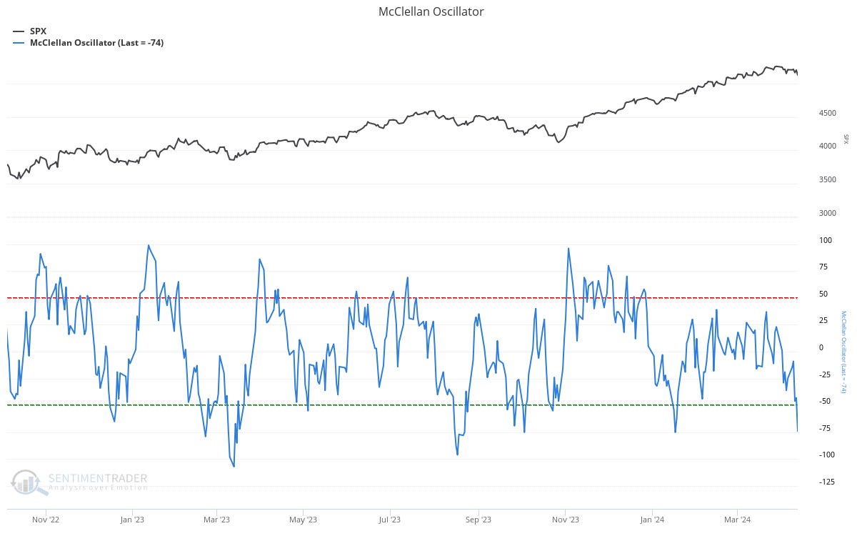
Another oversold breadth metric is showing up with the McClellan Oscillator. This metric compares advancing and declining stocks on the NYSE over a trailing period, and is near the lowest levels of the past couple years as you can see in the bottom panel of the chart below compared to the S&P 500 in the top panel.
Ideally with these breadth metrics, you start to see positive divergences where the average stock holds up better than the indexes like the S&P 500…similar to what transpired in both breadth charts leading up to the October rally.
The pullback is also resetting bullish investor sentiment in some metrics. CNN’s Fear and Greed Index is comprised of seven market-based indicators like the Volatility Index (VIX) and put versus call options. You can see in the chart below that the index teetering on fear territory (which starts at an index reading of 45).
For now, I’m viewing this pullback as nothing more than a correction in the bull market trend. Based on historic precedents from past bull markets along with evidence that economic activity can lead to further recovery in corporate earnings, I still think this rally has further to run.
I’m watching how breadth metrics and evolving investor sentiment can impact the near-term outlook, while looking for stocks in new basing patterns that are demonstrating price strength against the recent weakness in stock indexes.
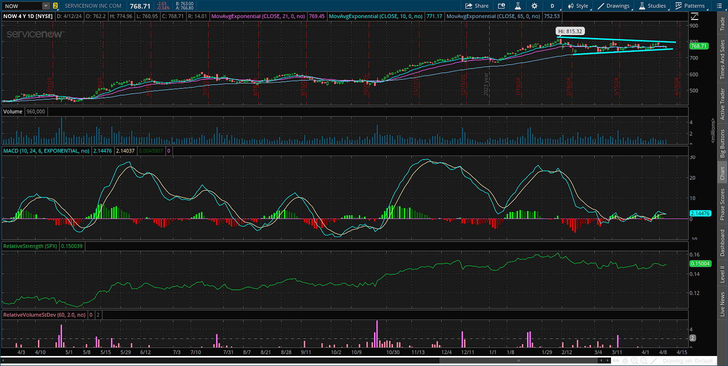
Stocks with strong growth fundamentals that are also showing relative strength while consolidating are the next potential leaders when the rally resumes. That includes ServiceNow (NOW) which has been basing for the past two months following a new all-time high. After reaching the $815 level, the stock is creating a triangle continuation pattern. At the same time, quarterly sales growth has consistently been 20%+ while earnings growth is expected to hit triple digits in the next couple quarters.
That’s all for this week. The next several weeks will confirm if the earnings outlook is intact, with 44 companies in the S&P 500 scheduled to report earnings next week and will pick up from there. Growing geopolitical tensions are back in focus as well. I will be closely watching how trends under the hood evolve, and if breadth and sentiment can tip the next move higher in this bull market.
I hope you’ve enjoyed The Market Mosaic, and please share this report with your family, friends, coworkers…or anyone that would benefit from an objective look at the stock market.
And make sure you never miss an edition by subscribing here:
For updated charts, market analysis, and other trade ideas, give me a follow on X: @mosaicassetco
And if you have any questions or feedback, feel free to shoot me an email at mosaicassetco@gmail.com
Disclaimer: these are not recommendations and just my thoughts and opinions…do your own due diligence! I may hold a position in the securities mentioned in this report.


