
The Market Mosaic 2.2.25
Chart Report: Commodities setting up key breakouts.

Welcome back to The Market Mosaic, where I gauge the stock market’s next move by looking at macro, technicals, and market internals. I’ll also highlight trade ideas using this analysis.
If you find this content helpful please hit that “like” button, share this post, and become a subscriber if you haven’t already done so!
And be sure to check out Mosaic Traders Hub. It’s a members-only platform to alert trade ideas, track a model portfolio of open positions, and further analyze the message coming from the capital markets.
🚨You can start a 7-day free trial to the Hub by clicking here. By starting a trial, you will unlock all content and reports reserved exclusively for members.
📢For today’s update, I’m trying out a new report format. If you’re anything like me, you love the insights that charts and other visuals can deliver.
So today, I want to highlight several key charts I’m watching for the economy and capital markets. I’ll provide a short writeup on each chart, and how it’s impacting the near-term outlook or trading opportunities in the making.
After that, you can find a bonus trade idea on a chart setup that I’m monitoring along with a trading plan.
The Chart Report
Last week featured an updated look at the Personal Consumption Expenditures (PCE) inflation report. The Fed’s preferred inflation gauge is inflecting higher similar to other measures of inflation, and has accelerated for three months in a row. The year-over-year rate of change in the headline figure (orange line) and core measure (blue line) that strips out food and energy prices has been moving higher since September and remains above the Fed’s 2% inflation target as you can see below.

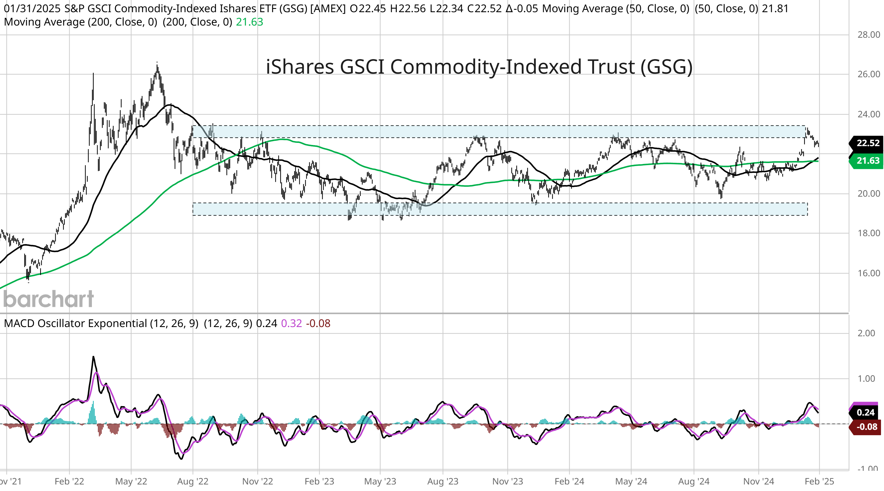
Sectors and asset classes sensitive to rising inflation are potentially setting up major breakouts. The chart below shows the iShares S&P GSCI Commodity-Indexed Trust ETF (GSG). After recently testing the high-end of a range stretching back over two years, momentum became extended and GSG is pulling back. But note the 50-day moving average (MA - black line) is crossing above the 200-day (green line), while the MACD is seeing a bullish reset above the zero line. The small retracement off a key resistance level could setup a major breakout over the $23 level.
Another commodity sensitive to inflation is building on a major breakout that started at the end of 2023. Gold prices peaked just over the $2,000 per ounce level in 2020, and tested that level on three occasions before breaking out in December 2023. After a three month consolidation, gold prices are now hitting a new record high at over $2,800 per ounce. But another major breakout could be in the making. Adjusted for the money supply, gold prices are still about 80% below the peak. But that ratio is testing trendline resistance that goes back over 40 years in the chart below.

A commodity chart could be sending an important signal about the state of the global economy. The chart below shows the Invesco DB Base Metals Fund (DBB). The fund holds an approximate equal weight across copper, zinc, and aluminum futures. Those metals are utilized in a variety of industrial and construction end markets, which makes their prices sensitive to economic developments. You can see that DBB is creating a symmetrical triangle pattern since peaking last May. Triangles are typically continuation patterns, which means they resolve in the direction preceding the pattern. You would expect a breakout higher in this case, which could target the prior highs near $24.

Despite the recent uptick in market volatility, high yield bonds are also sending a positive message about the economic outlook. Total return indexes are hitting fresh all-time highs ahead of the stock market indexes. High yield spreads are also hovering near historic lows. Spreads represent the level of additional compensation investors demand over a safer security like Treasury bonds. When that spread widens, it shows investors becoming more concerned about the economic outlook by demanding more compensation to lend to risky companies. But low spreads reflect a positive outlook, with spreads currently hovering near historic lows in the chart below.

Better performance in the average stock during January is triggering a breadth thrust on the S&P 500. The chart below looks at a ratio of the 10-day cumulative sum of advancing stocks relative to declining issues. That ratio jumped above 2 at the end of January, which triggered the thrust signal. When triggered, the S&P 500 historically experiences a rally over the next two months 90% of the time, while the equal-weight version of the S&P typically outperforms as well.

Despite volatility around AI stocks and tariff headlines during the final week of January, the month still finished with a gain of 2.7%. During previous years where January experienced a 2% or higher gain, the calendar year finished higher 88% of the time with a median gain of 19.3%. The gains also bode well for the January barometer, which refers to the historical tendency for the S&P’s calendar year performance to directionally match January’s returns. The chart below plots the S&P 500’s path since 1950 based on January’s performance and if the month finishes higher or lower.

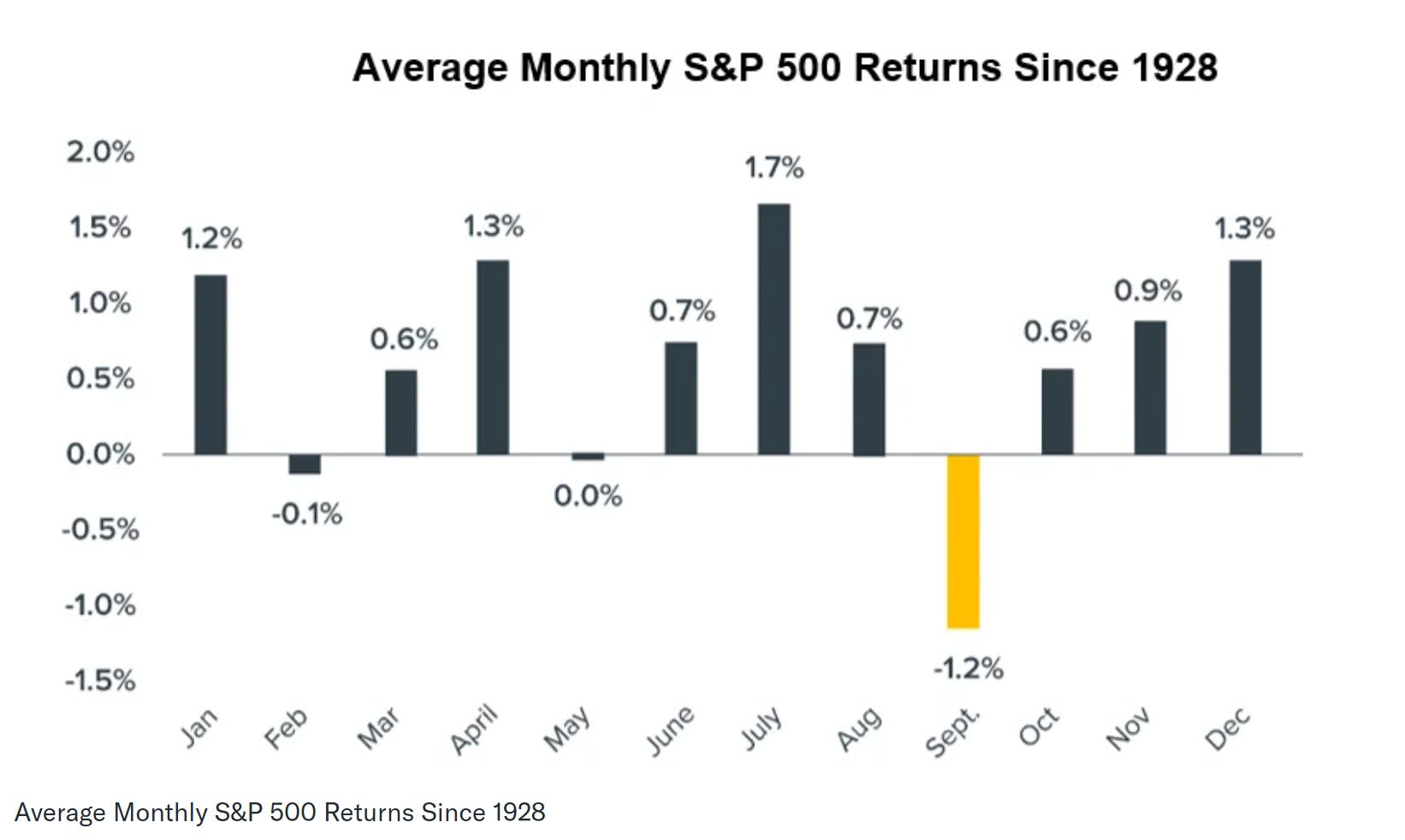
If the S&P 500 is going to follow through on the historical implications of a strong January, it’ll have to contend with a poor incoming period of seasonality first. Going back to 1945, February is one of the worst calendar months for S&P 500 average returns. It has a slight negative return since 1928, and is the second worst month of the year after September. But historically, February is a tale of two halves. The first half tends to be bullish with rising price levels, which are then given back during the second half.
Heard in the Hub
The Traders Hub features live trade alerts, market update videos, and other educational content for members.
Here’s a quick recap of recent alerts, market updates, and educational posts:
The key level to watch on the Mag 7 ETF.
There’s more to the AI stock volatility than DeepSeek.
My rule for evaluating price action after a plunge at the open.
A trade idea to take advantage of the $500 billion Stargate AI venture.
You can follow everything we’re trading and tracking by starting a 7-day free trial here. By starting a trial, you will unlock all content and reports created exclusively for members.
Trade Idea
SharkNinja (SN)
Creating a new basing pattern since October with a resistance level around $110. Recently coming up to test that level again, but with the MACD showing momentum is extended. I would like to see one more smaller pullback that resets the MACD above the zero line before breaking out.

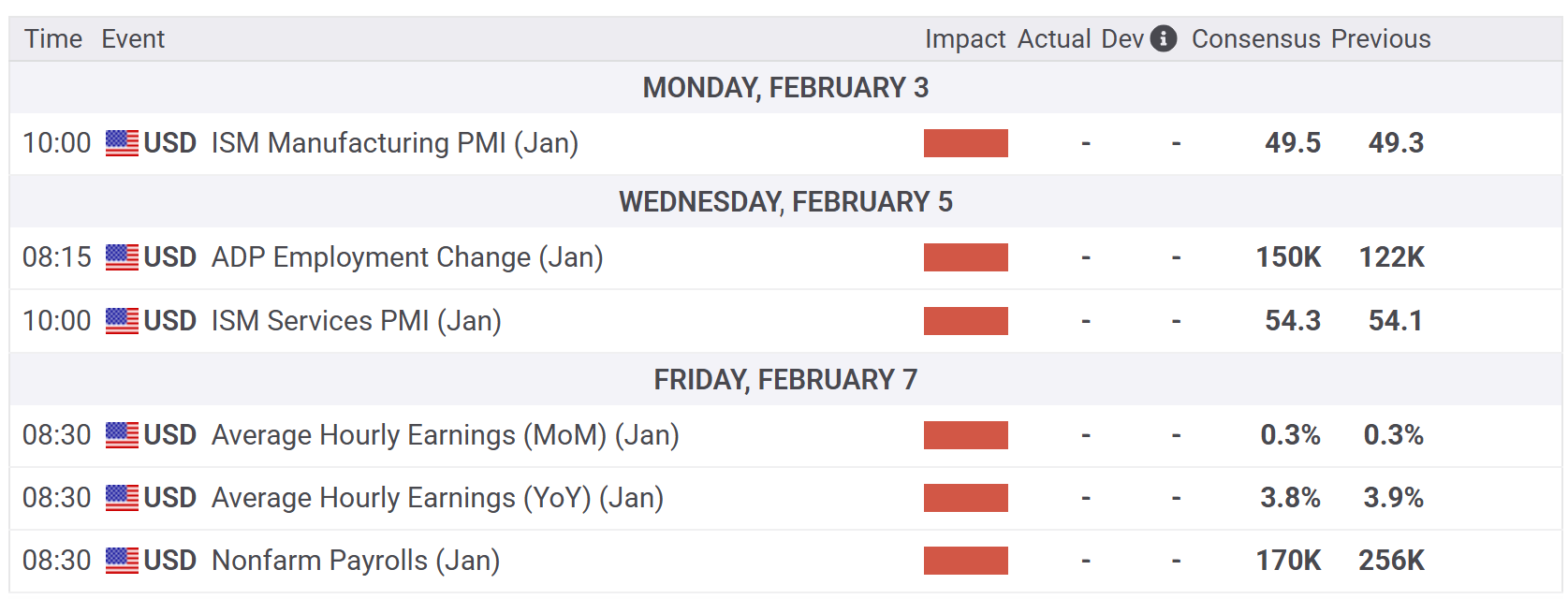
Key Upcoming Data
Earnings Releases

Economic Reports
I hope you’ve enjoyed The Market Mosaic, and please share this report with your family, friends, coworkers…or anyone that would benefit from an objective look at the stock market.
Become a member of the Traders Hub to unlock access to:
✅Model Portfolio
✅Members Only Chat
✅Trade Ideas & Live Alerts
✅Mosaic Vision Market Updates + More
Our model portfolio is built using a “core and explore” approach, including a Stock Trading Portfolio and ETF Investment Portfolio. Come join us over at the Hub as we seek to capitalize on stocks and ETFs that are breaking out!
And if you have any questions or feedback, feel free to shoot me an email at mosaicassetco@gmail.com
Disclaimer: these are not recommendations and just my thoughts and opinions…do your own due diligence! I may hold a position in the securities mentioned in this report.