
The Market Mosaic 12.8.24
A perfect (bullish) storm brewing for small-caps.

Welcome back to The Market Mosaic, where I gauge the stock market’s next move by looking at macro, technicals, and market internals. I’ll also highlight trade ideas using this analysis.
If you find this content helpful please hit that “like” button, share this post, and become a subscriber if you haven’t already done so!
And be sure to check out Mosaic Traders Hub. It’s a members-only platform to alert trade ideas, track a model portfolio of open positions, and further analyze the message coming from the capital markets.
You can start a 7-day free trial to the Hub by clicking here. By starting a trial, you will unlock all content and reports reserved exclusively for members.
Now for this week’s issue…
A “Goldilocks” backdrop for the economy that’s not too hot or too cold is igniting bullish investor sentiment and animal spirits.
That means growth is staying strong enough to keep any recession fears contained. At the same time, growth isn’t so strong that the Federal Reserve’s recent easing campaign gets cut short.
For instance, the November payrolls report showed a strong rebound from October’s dismal figure, which was negatively impacted by hurricanes in the South and a strike at Boeing.
November payrolls showed the addition of 217,000 jobs, which suggests October’s weak data point was indeed a blip. But at the same time, the household survey used to calculate the unemployment rate showed a loss of 355,000 jobs.
That caused the unemployment rate to tick up slightly to 4.2%. The chart below shows the monthly gain in the establishment survey (orange bars, which is the jobs figure you hear about in the financial media) and the household survey (blue bars).

The mixed report means more rate cuts by the Fed are extremely likely based on market-implied odds. Odds now show an 86% chance that the Fed cuts by another 0.25% at their final meeting of the year next week. That’s up from 66% the week before the jobs report.
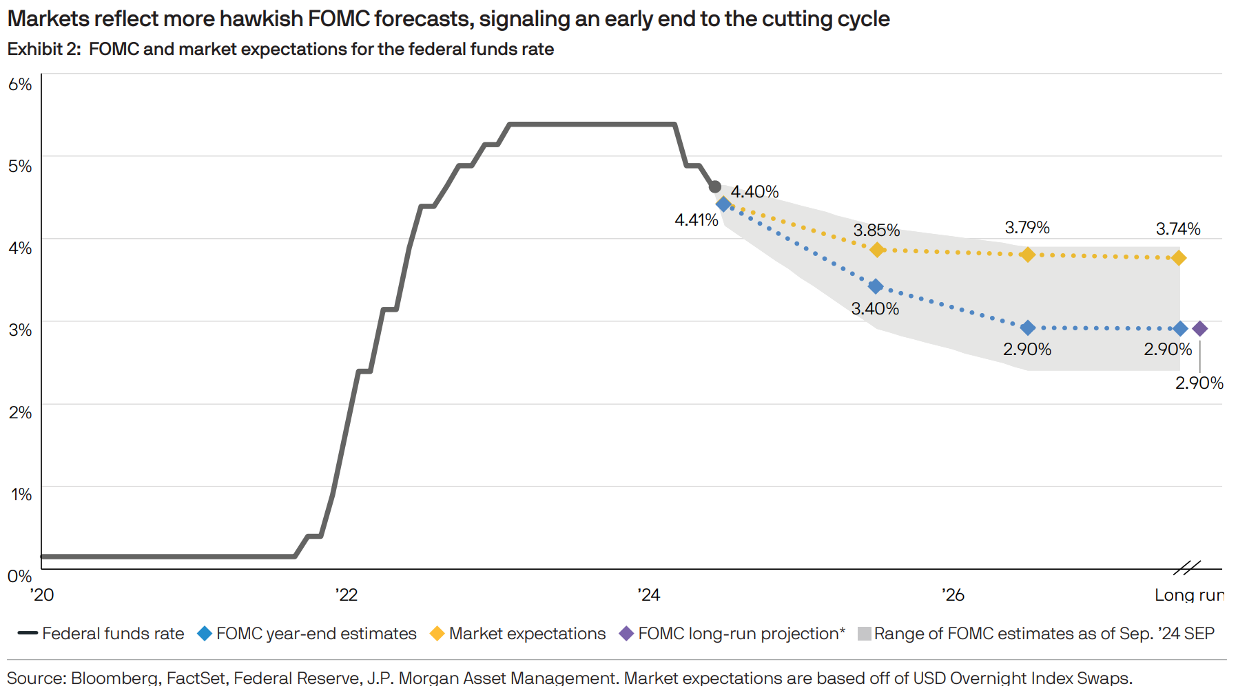
The chart below shows the projected forward path for the fed funds rate into next year and beyond from market-based estimates (yellow line) and Fed forecasts (blue line).
But despite the mixed data on the jobs front, an updated report on service sector activity showed expansion for the fifth consecutive month. Figures tracking retail sales are staying strong as well, with one measure recently jumping to a gain of 7.4% year-over-year (that I shared here).
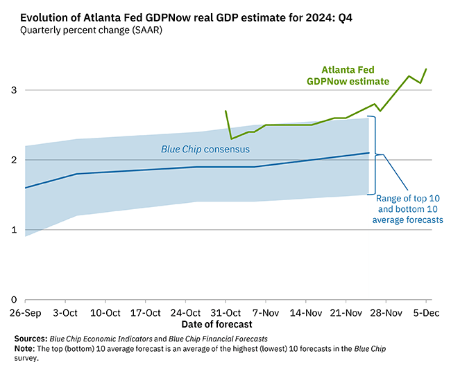
That’s sending the Atlanta Fed’s estimate for current quarter GDP growth to new highs. As you can see below, estimates for 4Q annualized GDP growth now stands at 3.3% and is well ahead of economist estimates.
A combination of a strong growth outlook and ongoing Fed easing cycle is driving bullish animal spirits among investors. That’s showing up in various corners of the capital markets, like in cryptocurrencies where Bitcoin is recently crossing above the $100,000 threshold.
But another corner of the markets also stands to benefit from the catalysts driving the risk-on rally ahead.
A Perfect Bullish Storm for Small-Caps
Signs of a strong economy and ongoing easing by the Fed is unleashing animal spirits among investors. You’re seeing that show up in positioning data and fund flows.
For instance, equity exposure among asset managers is running at the highest level in five years. And the chart below shows monthly net fund flows into U.S. equities, which hit nearly $140 billion in November. That’s the highest amount on record.

While some are questioning the durability of the rally with so much optimism being reflected in positioning, I believe a perfect storm of bullish catalysts are lining up for the small-cap trade.
The combination of ongoing economic growth, Fed easing cycle, and risk-on sentiment can help small-caps build on their recent historic breakout. The weekly chart below shows the iShares Russell 2000 ETF (IWM) that tracks the Russell 2000 Index of small-cap stocks.

Small-caps recently joined the other major indexes in moving out to new record highs. But it could just be the beginning of a huge move. First, recall that small-caps significantly outperform all other capitalization ranges once the Fed starts cutting rates.
The chart below compares small-caps to mid- and large-cap stocks over different forward periods once the Fed begins an easing cycle. Historic data back to 1954 shows that smalls outperform mid- and large-caps over various forward periods out at least a year. Recall that the Fed started a new cutting campaign in September.

That outperformance likely reflects stimulative policy for the economy, where small-caps receive a larger share of revenues from domestic sources relative to large-caps. At the same time, small-caps carry more floating rate debt than other cap ranges. Falling interest costs benefit the bottom line as well.
And for all the fund flows coming into equities in search of investment opportunities, it’s worth noting that small-caps are one of the only market sectors currently trading cheaper than their historic average as you can see below.

The chart plots the current P/E ratio based on earnings expected over the next 12 months against the 10-year historical average. You can see the S&P 600 small-cap index is the only sector shown that’s trading below its average.
Finally, the recent surge in small-cap performance has been a reliable momentum signal for forward returns looking back. The Russell 2000 returned 10.9% in November, which was the 22nd time its ever gained over 10% in a single month.
The chart below shows past instances when the Russell gained 10% or more in a month. Forward returns were higher 12 months later by nearly 16% on average, with a 73% win rate.

While the new highs in Bitcoin and members of the “Magnificent 7” are capturing investor attention and news headlines, small-caps could present an overlooked opportunity heading into next year.
Now What…
Another capital markets segment reflecting a positive outlook for the economy is with high yield bonds (also called junk bonds). Companies issuing high yield debt are already of lower financial quality, which makes their debt costs sensitive to the economic outlook.
Those debt costs show up as credit spreads, which is the cost of high yield debt above a safer asset like U.S. Treasury securities. When that spread widens, that means investors are demanding additional compensation to lend to high yield issuers. That’s usually because a deteriorating economic outlook increases the risk of defaulting.
When spreads narrow, that means debt costs are coming down and usually reflects a positive outlook for the economy. Spreads are currently running near their tightest level of the past 28 years (chart below).

In the high yield sector, I also track the relative performance of certain rating categories. That includes a ratio of “CCC” and below rated bonds to “BB” rated ones.
In other words, how are the lowest rated junk bonds holding up with a rising line showing relative outperformance to higher rated junk bonds. That line is recently hitting the highest level in over five years, which is another positive signal on the outlook from companies most sensitive to economic activity.

The confirmation on the economic outlook coming from high yield should be another positive factor favoring the risk-on rally including the small-cap trade. I have several small-caps included in the model portfolio for members of the Traders Hub, and others remain on our focus list of setups as well.
That includes a setup in Newmark Group (NMRK). After breaking out from a larger base in July, the stock is consolidating the gains since October and forming a new pattern. Resistance at the $16 level has been tested several times in a tight base, with the MACD turning higher from zero. A breakout alert and trade plan will be sent to members.

That’s all for this week. Following last week’s mixed jobs report, the Fed’s other mandate will be under the spotlight this week with updated reports on the Consumer Price Index (CPI) and Producer Price Index (PPI). While the outlook for further rate cuts will be assessed, I will be watching for small-caps to build on their recent breakout.
I hope you’ve enjoyed The Market Mosaic, and please share this report with your family, friends, coworkers…or anyone that would benefit from an objective look at the stock market.
Become a member of the Traders Hub to unlock access to:
✅Model Portfolio
✅Members Only Chat
✅Mosaic Chart Alerts
✅Trade Ideas & Live Alerts
✅Mosaic Vision Market Updates + More
We’re alerting and tracking trades in our model portfolio, including Bitcoin and other cyclical sectors that are breaking out.
We recently locked in a 32% gain on a Bitcoin ETF in less than one month, and captured a 73% partial gain on a growth stock where the trailed position is now up triple-digits.
Our model portfolio is built using a “core and explore” approach, including a Stock Trading Portfolio and ETF Investment Portfolio. Come join us over at the Hub as we seek to capitalize on stocks and ETFs that are breaking out!
And if you have any questions or feedback, feel free to shoot me an email at mosaicassetco@gmail.com
Disclaimer: these are not recommendations and just my thoughts and opinions…do your own due diligence! I may hold a position in the securities mentioned in this report.
Your one graph led me to check:
Indexes with stocks up >10% in the last month
Russel 2000 - 17%
Whole Mkt 13%
SPY 8%
Thanks.