The Market Mosaic 12.3.23
Rate cuts: bullish or bearish for stocks?
Welcome back to The Market Mosaic, where I gauge the stock market’s next move by looking at macro, technicals, and market internals. I’ll also highlight trade ideas using this analysis.
If you find this content helpful please hit that “like” button, share this post, and become a subscriber to this always free report if you haven’t already done so!
And be sure to check out Mosaic Chart Alerts. It’s a midweek update covering chart setups among long and short trade ideas in the stock market, along with levels I’m watching.
Now for this week’s issue…
Speakers from the Federal Reserve took center stage last week, which featured something for monetary doves and hawks alike.
Fed Governor Christopher Waller surprised investors when he struck a dovish tone, highlighting his confidence that inflation would return to target in the months ahead. If that scenario plays out, Waller even mentioned that rate cuts could follow as soon as this spring.
But others sought to reinforce the Fed’s commitment to fighting inflation and counter Waller’s comments, including Fed Chair Jerome Powell. In a speech on Friday, Powell tried to reiterate the central bank’s hawkish stance by repeating more rate hikes could be coming, and that talks around rate cuts were premature.
Despite conflicting signals from Fed officials over the path of interest rates, investors are fixating on the dovish outcome. That’s especially the case following last week’s PCE inflation report that’s now just above the Fed’s 2% target on a three month annualized basis in the chart below (h/t Nick Timiraos).
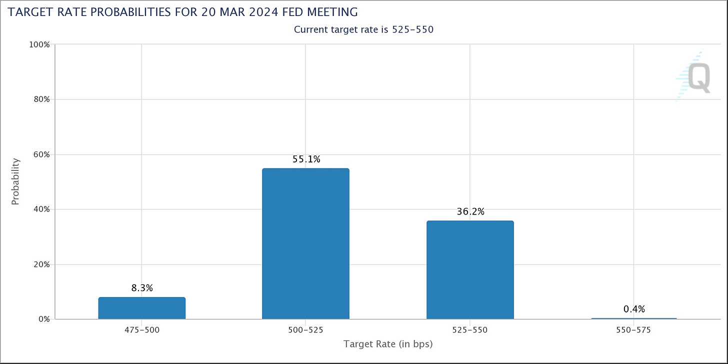
Between more signs of moderating inflation and Waller’s comments entertaining rate cuts, that brought forward market-implied expectations for rate cuts. Investors are now assigning 63% odds that rates will be reduced at the Fed’s March meeting (chart below).
And the prospect of rate cuts is keeping the stock market rally going, while fueling more speculative corners of the market that are particularly sensitive to rate policy. Small-cap growth stocks as measured by the IWO small-cap growth ETF rallied another 2.7% last week…reclaiming the 200-day moving average (MA - green line) as you can see in the chart below.
The knee-jerk reaction to potential rate cuts is igniting animal spirits among investors. But are rate cuts ultimately a good or bad thing for stocks?
The historic record is mixed, and ultimately comes down to the much discussed “r” word. Here’s how the outlook for recession will drive the stock market reaction to possible rate cuts, and what market-based evidence suggests will happen next.
Rate Cuts and Recessions
While investors are cheering the prospect of rate cuts happening soon, they aren’t always a good thing. Rate cuts often signal that the Fed went too far with restrictive monetary policy and broke something in the economy.
After all, the Fed started cutting in August 2007 ahead of the financial crisis. Just two months later, the S&P 500 peaked and would go on to fall 50% as the global economy sank into crisis.
Look at the historical track record of stock market performance following the peak in rates, and the results are indeed mixed. The chart below from Fidelity shows how stocks have performed in the years following the peak in past Fed rate hiking cycles.
And if there’s one pattern that stands out in the chart, it’s that the path of stocks around rate peaks ultimately comes down to recession and the impact on corporate earnings. More recent cycles like 2000, 2006, and 2019 were marked by recession (while 2019’s aftermath was impacted by the response to the pandemic).
Today, it’s hard not to find calls for recession. It seems the only question is if we’re heading for a “soft” or “hard” landing in the economy. If that’s the case, then investors shouldn’t be so optimistic if the Fed starts cutting rates.
But market-based signals simply aren’t aligning with predictions of an economic downturn. Most economic data is backward-looking or coincident at best, so I rely on the stock market’s discounting mechanism for clues on the economy's outlook.
That includes key cyclical stock market sectors, like housing stocks, semiconductors, and transportation companies. Take a look at all three sectors, and it’s hard to paint a bearish picture for the economy.
The ITB home construction ETF is making a new all-time high this past week, while the SMH semiconductor ETF hit fresh highs at the end of November (chart below). Both sectors having clear links to the health of the economy.
While the IYT transportation ETF remains well below the prior high, I find that ETF to be misleading for tracking the sector. That’s because IYT holds airline stocks like Delta and Southwest, making it hard to get a pure read on freight demand.
Instead, I’m following trucking freight stocks like SAIA (SAIA chart below) and Old Dominion Freight Line (ODFL) that look like their basing for a big breakout. Shipping container stocks like Euroseas (ESEA) and Danaos (DAC) are working up the right side of their chart patterns as well.
I also closely follow the action in the high yield bond sector. Companies issuing high-yield debt are already on shaky financial ground, so investors in junk debt are quick to demand extra compensation if the economic outlook is deteriorating.
That shows up in the form of spreads on high yield debt, which is the additional borrowing costs over safer debt like risk-free Treasury securities. And spreads are falling back near the lows following 2022’s spike higher as you can see below.
Again, it’s hard to be bearish on the economy when stocks across cyclical sectors are breaking out or setting up to do so. At the same time, high yield investors are signaling a positive outlook as well with spreads being compressed.
Now What…
Developments under the stock market’s hood are trending in the right direction. Positive breadth divergences at the end of October were followed by breadth thrusts, and now we’re seeing a more persistent trend of net new 52-week highs across the stock market as I posted about below:
I’m now watching for further breadth expansion, with net new highs ideally pushing toward and sustaining 250+ that has marked other bull market trends over the past decade. It will take further recovery in the average stock to make that happen, with an economic backdrop that’s supportive as well.
Another positive development from less stock market volatility, falling interest rates, and declining high yield spreads is with financial conditions. Financial conditions measure the cost and availability of credit, with cheap and easy credit boosting economic activity. The Chicago Fed’s own measure of financial conditions is showing the loosest conditions since the start of 2022 (when the Fed started hiking rates) as you can see below.
The prospect of falling interest rates and rallying cyclical sectors is leading to a big improvement in risk-on sentiment. That’s why IPO bases are a growing focus for my trade setups.
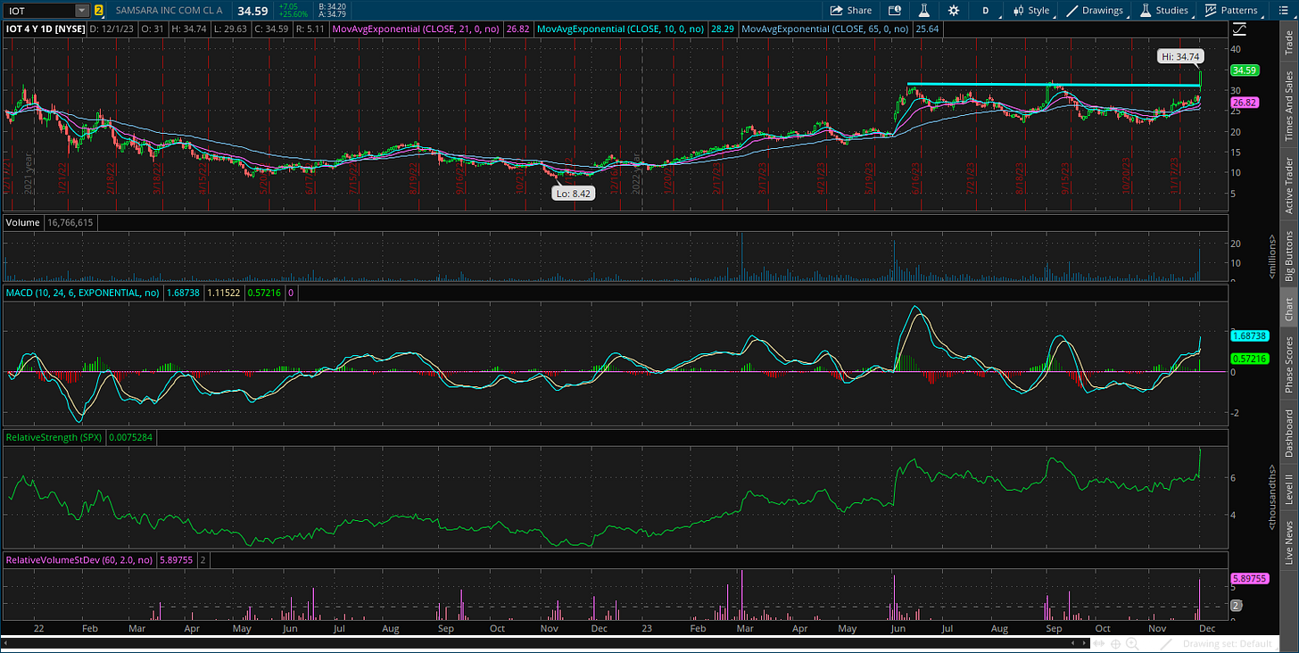
I prefer IPO’s with a year or more of “seasoning” to establish defined areas of support and resistance, and allow proper chart bases to form. I’ve been posting more IPO bases in Mosaic Chart Alerts, like the setup with IOT. The stock was basing just below the post-IPO high around $32 since June, creating a well-defined resistance level. Following a strong earnings report the stock is breaking out to new highs.
That’s all for this week. Following a flurry of Fed speakers and conflicting messages on the path of interest rate policy, the upcoming Fed meeting on 12/13 takes on increased importance. We’ll get November’s payrolls report next week ahead of that meeting, but I will be more interested in following the stock market’s leading indicators of economic activity.
I hope you’ve enjoyed The Market Mosaic, and please share this report with your family, friends, coworkers…or anyone that would benefit from an objective look at the stock market.
And make sure you never miss an edition by subscribing here:
For updated charts, market analysis, and other trade ideas, give me a follow on Twitter: @mosaicassetco
And if you have any questions or feedback, feel free to shoot me an email at mosaicassetco@gmail.com
Disclaimer: these are not recommendations and just my thoughts and opinions…do your own due diligence! I may hold a position in the securities mentioned in this report.


Great post! Thanks for your hard work :)
Interesting to see the Chicago Fed chart about financial conditions. Just last Friday (Dec 1) Jay Powell said that financial conditions are in restrictive territory, while the chart points to loose conditions and they are getting even looser. What do you think about this discrepancy?