The Market Mosaic 10.22.23
Can the S&P 500 hold key support?
Welcome back to The Market Mosaic, where I gauge the stock market’s next move by looking at macro, technicals, and market internals. I’ll also highlight trade ideas using this analysis.
If you find this content helpful please hit that “like” button, share this post, and become a subscriber to this always free report if you haven’t already done so!
And be sure to check out Mosaic Chart Alerts. It’s a midweek update covering chart setups among long and short trade ideas in the stock market, along with levels I’m watching.
Now for this week’s issue…
Happy Sunday! This weekend, I’m changing up my usual post just a bit. First, I’m going to highlight a few of the most important charts I’m watching for the stock market today, and how they are impacting the near-term outlook.
Next, I have a quick summary and links to recent posts that remain impactful for monitoring the capital markets. And after that, you can find a few bonus trade ideas at the end.
Big Picture
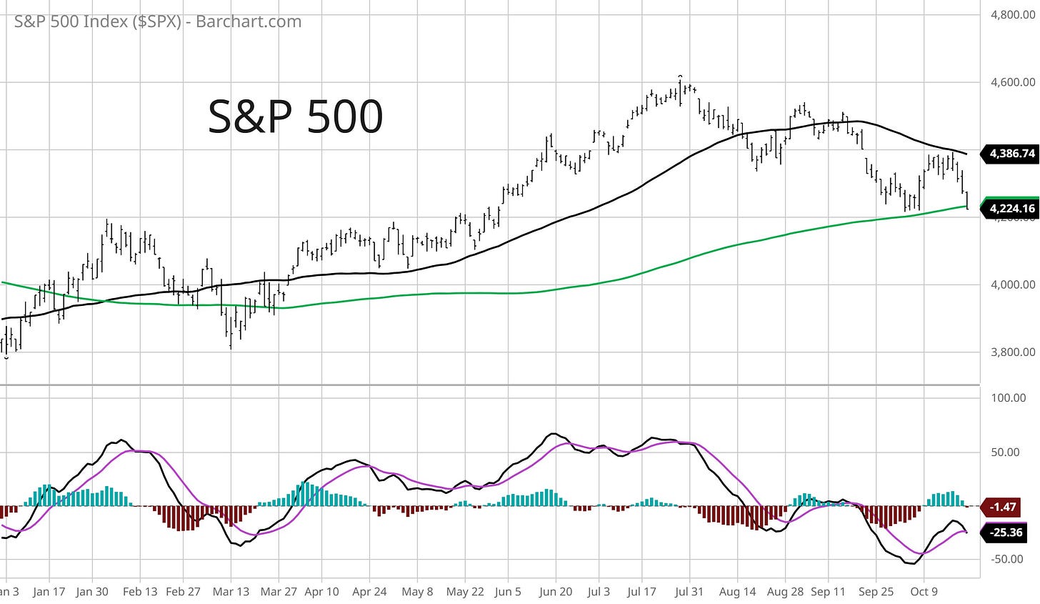
After testing the 200-day moving average (MA - green line) at the start of October, my hope was that a higher low could been realized and transition the S&P 500 back to an uptrend as we enter a favorable seasonal period. But weakness late last week has the S&P back at the key MA along with price support at the 4200 breakout level from June.
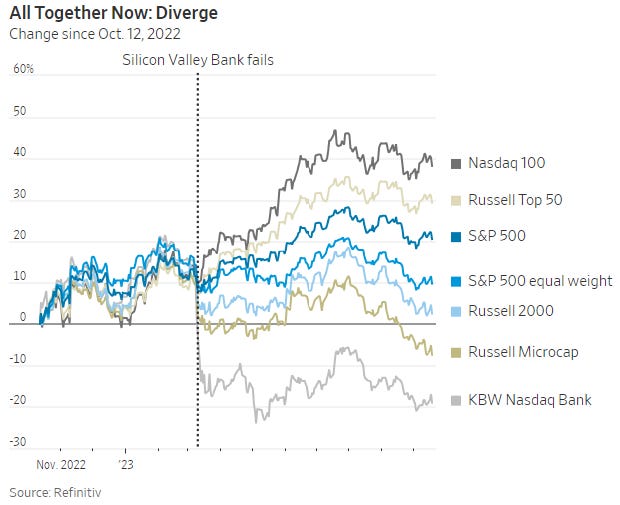
Price weakness in the S&P 500 isn’t anything new for many other market segments. Much has been made of the “Magnificent' Seven’s” performance this year, as mega-cap stocks like Google and Microsoft prop up capitalization-weighted indexes. But as you can see in the chart below from the Wall Street Journal, performance since last October’s low has been uneven. It’s worth noting that dispersion in returns became more noticeable following the bank crisis that emerged in March.
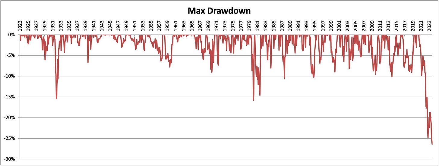
While large-cap stock indexes are holding onto gains, the action in longer-dated bonds has been downright brutal as interest rates rise to their highest levels in 16 years. The chart below from Callum Thomas (originally by Meb Faber) shows the current drawdown for the 10-year Treasury price hitting over 25%, which makes it the worst in history in nominal terms.
Last week featured several speakers from the Federal Reserve, including chair Jerome Powell. In a nod to the impact from rising interest rates on the long-end, Powell hinted that tighter financial conditions could mean less need for further rate hikes. But despite the jump interest rates and plunging bond prices, the Fed’s own gauge (from the Chicago district) suggests that financial conditions have eased this year and remain looser than average.
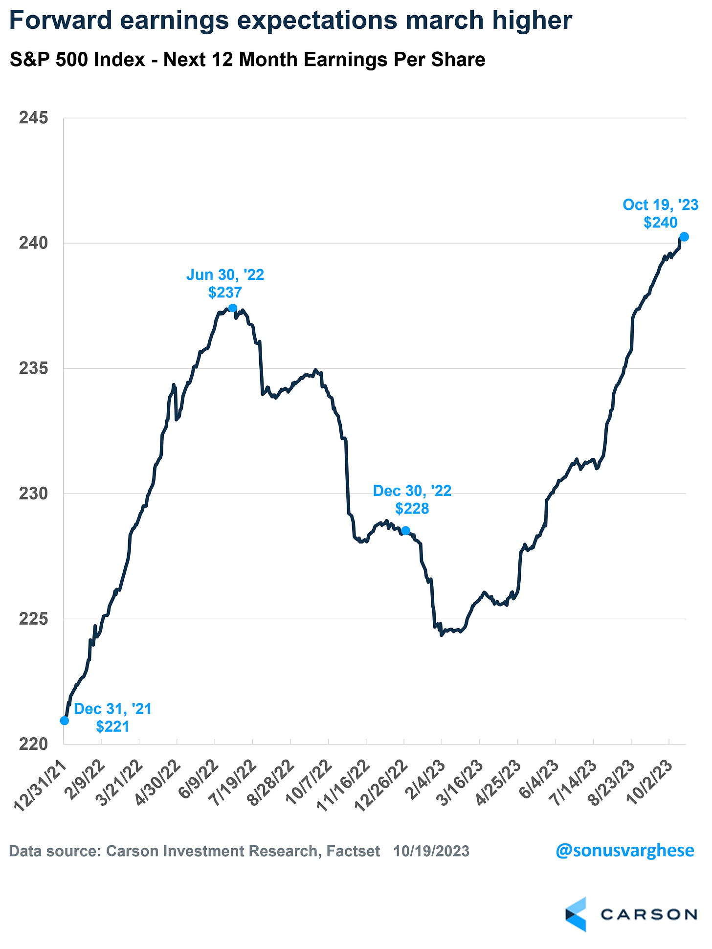
For the stock market to stabilize here, forward earnings estimates will need to keep improving. Earnings estimates over the next 12 months for the S&P 500 is hitting new highs, which has helped the recovery in stock prices this year. We’re just now getting underway with the third quarter reporting season, where the outlooks delivered by corporate management teams will influence how forward estimates keep evolving.
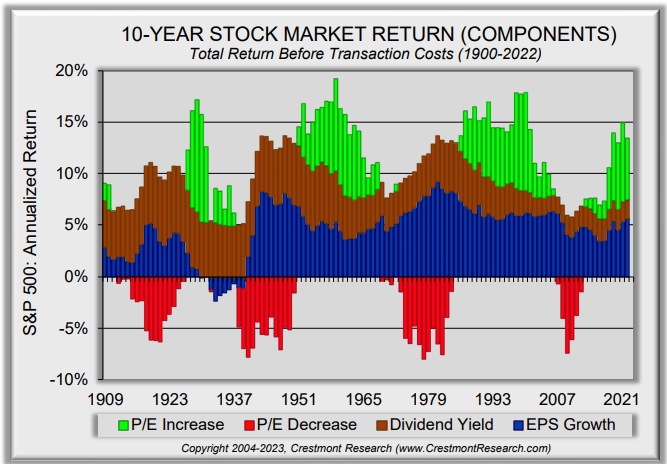
Over longer stretches historically, earnings growth and dividends are relatively stable in their contribution to the S&P 500’s return. The chart below from Crestmont Research shows the 10-year annualized S&P return broken down by return source. What isn’t stable is the price-to-earnings (P/E) ratio, which experiences wild swings from positive to negative territory. Perhaps valuation ratios are just sentiment indicators after all.
Mosaic Tidbits
Here are a few of my recent posts that are still impactful and relevant to the stock market’s next move:
Investors fear that strong economic data will pressure stocks due to tighter monetary policy. But that view is misguided. Here’s why good news is good for stocks.
The combination of oversold breadth and bearish investor sentiment present favorable conditions for a stock market rally to unfold.
But for any rally to be durable, I want to have confirmation with a breadth thrust. Here’s what to watch for, and the last time it happened.
Despite the conventional wisdom, price movements in the stock market are not random. Here’s how stock prices progress through stages, and how to track them.
Chart Updates
As I wrap up my weekly scans, here are a few more trade ideas that I’m monitoring.
AGI
If gold prices continue rallying, then AGI is one of the better mining stocks from a relative strength (RS) standpoint. Ideally, price continues basing just below the $13 resistance level and resets the MACD at the zero line for a breakout attempt.
URA
Uranium stocks could be basing for another move higher. The URA uranium ETF is pulling back to the 50-day MA after testing resistance at the $28 level. That has allowed the MACD to reset, while the RS line is turning higher.
YELP
Trading in a bullish pennant pattern following the rally from $27 in May. Looking for a move above trendline resistance around $45. RS line close to making a new 52-week high.
That’s all for now! As I mentioned above, the third quarter reporting season starts picking up now. In the S&P 500, 160 companies are scheduled to report results this week. If stocks are going to be saved at key support levels, then earnings estimates need to keep moving higher while the performance of the average stock improves.
I hope you’ve enjoyed The Market Mosaic, and please share this report with your family, friends, coworkers…or anyone that would benefit from an objective look at the stock market.
And make sure you never miss an edition by subscribing here:
For updated charts, market analysis, and other trade ideas, give me a follow on Twitter: @mosaicassetco
And if you have any questions or feedback, feel free to shoot me an email at mosaicassetco@gmail.com
Disclaimer: these are not recommendations and just my thoughts and opinions…do your own due diligence! I may hold a position in the securities mentioned in this report.


