The Market Mosaic 10.15.23
S&P 500: How to track the trend.
Welcome back to The Market Mosaic, where I gauge the stock market’s next move by looking at macro, technicals, and market internals. I’ll also highlight trade ideas using this analysis.
If you find this content helpful please hit that “like” button, share this post, and become a subscriber to this always free report if you haven’t already done so!
And be sure to check out Mosaic Chart Alerts. It’s a midweek update covering chart setups among long and short trade ideas in the stock market, along with levels I’m watching.
Now for this week’s issue…
Following September’s payrolls report, better breadth finally came back into the stock market…at least for awhile.
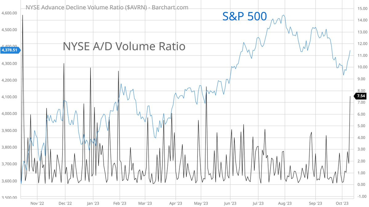
I detailed the stock market’s character change in last week’s market update, with the S&P 500 seeing weak opens but strong closes. And it seemed investor’s were starting to plow back into stocks more broadly, with the volume ratio in the NYSE’s advancing versus declining stocks surging to its best level since May (chart below).
Stocks even shrugged off a higher than expected producer price inflation report this past week. The September Producer Price Index (PPI) increased by 2.2% compared to last year versus expectations for a 1.6% rise. That was the highest headline figure since April.
But eventually, selling pressure came back into the stock market, with the average stock back in the dumps. That was on full display with the smaller-cap segment of the stock market, which I updated in the post below:
And the week ended with all the signs that investors are seeking cover in safe haven assets. Treasury bonds, gold, and the dollar rallied to close out the week. In fact, the surge in gold prices on Friday was one of the largest daily gains in over three years.
Despite the green shoots for stock market early last week, it seems hard to get your hopes up for a rally into year end. But before you get caught up in the stock market’s daily gyrations and throw in the towel on the outlook, it’s worth evaluating the big picture price trends in play.
Here’s how I track the stock market’s natural ebb and flow, and the evolution in momentum and price phases since last October’s low.
Tracking the Stock Market’s Price Phase
I evaluate the path of forward returns by analyzing the stock market’s price trend, participation in that trend (breadth), and investor sentiment.
I’ve written extensively in recent weeks about breadth and sentiment, so today I want to review different phases of price. And when it comes to stock prices, I follow a simple philosophy: prices trend, mean revert, and consolidate.
That echoes a similar framework popularized by Stan Weinstein, and the four different stages of trend (see the chart below from his book Secrets for Profiting in Bull and Bear Markets). Stage 1 is a period of basing and accumulation, which gives way to a trending phase in Stage 2. Trend exhaustion from excessive momentum gives way to Stage 3 distribution and the top, which ultimately leads to the Stage 4 decline. And then the cycle repeats.
In order to help track the different phases (or stages) of the trend, I use the moving average convergence divergence (MACD) in many of my charts. That’s because of the information the MACD can provide about the status of a price trend.
The MACD is simply the difference between two moving averages (black line in the charts that follow), along with a signal line (pink line in the charts). I use this in conjunction with charts of varying time fractals (i.e. daily, weekly, monthly), along with customized values.
That MACD line moves higher when the short-term moving average pulls far ahead of the long-term average, and vice versa. When that line gets too high, it’s reasonable to be on the lookout a mean-reverting move back the other way…like a rubber band that’s being stretched too far.
And to get a bigger picture look at the trend and price phase, I zoom out to weekly charts. Take the weekly chart of the S&P 500 along with the MACD below. You could argue that period from last October through April was the bottoming and accumulation phase for the S&P. During that time, the MACD reset toward the zero line after being stretched too far to the downside.
The breakout over 4200 represented the uptrend phase, which also saw the MACD turn higher from just above the zero line. Those resets near the zero line indicates that a new trend can emerge, like what happened with the MACD on that breakout.
From there, the trend ran too far with the MACD becoming extended to the upside shown with the arrows. That’s given way to a mean-reverting phase to the downside, with the S&P pulling back since late July.
But look at the MACD now. That pullback is resetting the indicator back near the zero line as shown with the circle. That signals the excessive momentum from the last breakout is being worked off, and a new basing period can give way to another uptrend. It is still an uptrend after all, with the weekly chart clearly showing the higher highs and higher lows off last October’s bottom.
Plus the stocks that dominate the S&P 500 got stretched too far as well, but are close to resetting their weekly MACD’s similar to the index. That means they could be close to finishing their pullbacks and consolidations, like what you’re seeing with the Apple (AAPL) weekly chart below.
Microsoft’s (MSFT) weekly chart below also shows something similar, where the uptrend phase from earlier in the year gave way to an extended MACD. Price has pulled back since July in a mean-reverting move lower, with the MACD resetting near the zero line.
You can pull up any number of individual stocks in the S&P 500 and see a similar pattern. The bearish take is the movements since the July peak represent the distribution phase, with the bigger decline yet to be seen. But until we see a further breakdown in price, I’m simply treating the action since late July as a partial retracement of the new bull market underway following 2022’s bear.
Now What…
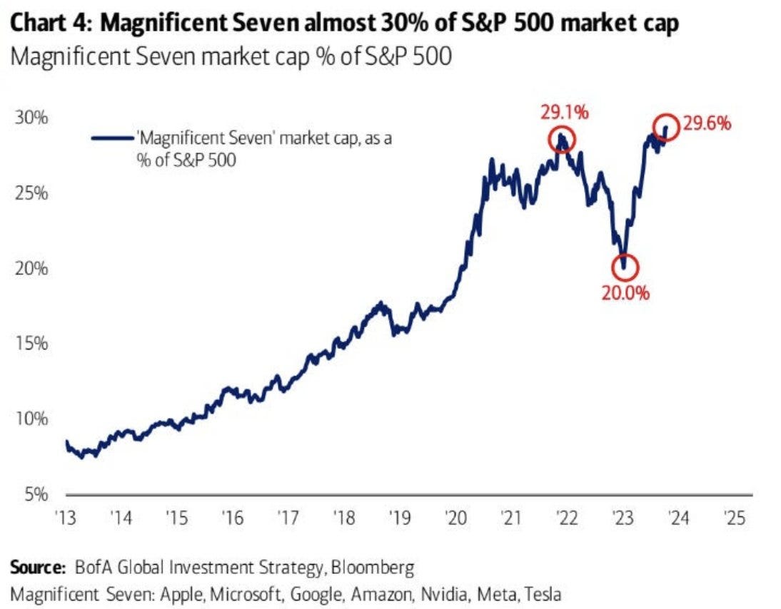
The stocks highlighted in the previous section form part of the “Magnificent Seven”. They’re the largest stocks in the S&P 500, where holdings are determined by their market capitalization. And those seven stocks now make up a record 29.6% of the index as you can see in the chart below.
It’s a well known fact that the mega-cap stocks are propping up the index this year. Those seven stocks are driving the S&P 500 with a gain of over 50% this year, while the remaining 493 stocks in the index are up just 3%.
If the stock market’s trend is able to turn higher, I want to see participation spread beyond the Magnificent Seven driving the S&P’s performance this year. That’s why I’ve been analyzing breadth in recent posts.
And it would be great to see “animal spirits” come back into the more speculative corners of the market, like with small-cap growth. While large-caps look to be progressing in the uptrend off last October’s lows, the IWO small-cap growth ETF lost key trendline support and is again turning lower late last week (chart below).
Given the recent performance of small-caps and the average stock, net new highs are persisting in negative territory and new breakouts have been hard to come by. But my criteria remains the same, where I’m targeting stocks with a strong growth profile that are breaking out from a basing period.
That includes STLA, which is back testing the breakout from the triangle pattern that you can see below. That price action is also taking place just below the prior all time highs.
That’s all for this week. I’ve also maintained that stocks will ultimately follow the path of corporate earnings, and the third quarter reporting season really gets underway this week. Tesla and Bank of America will report earnings among many others, where I’ll closely follow how analysts are revising forward estimates. An ongoing recovery will be key to a new uptrend phase in the stock market.
I hope you’ve enjoyed The Market Mosaic, and please share this report with your family, friends, coworkers…or anyone that would benefit from an objective look at the stock market.
And make sure you never miss an edition by subscribing here:
For updated charts, market analysis, and other trade ideas, give me a follow on Twitter: @mosaicassetco
And if you have any questions or feedback, feel free to shoot me an email at mosaicassetco@gmail.com
Disclaimer: these are not recommendations and just my thoughts and opinions…do your own due diligence! I may hold a position in the securities mentioned in this report.


